Nada en esta categoria todavia.
Designed & coded by Carolina Cerutti
Nada en esta categoria todavia.
Nada en esta categoria todavia.
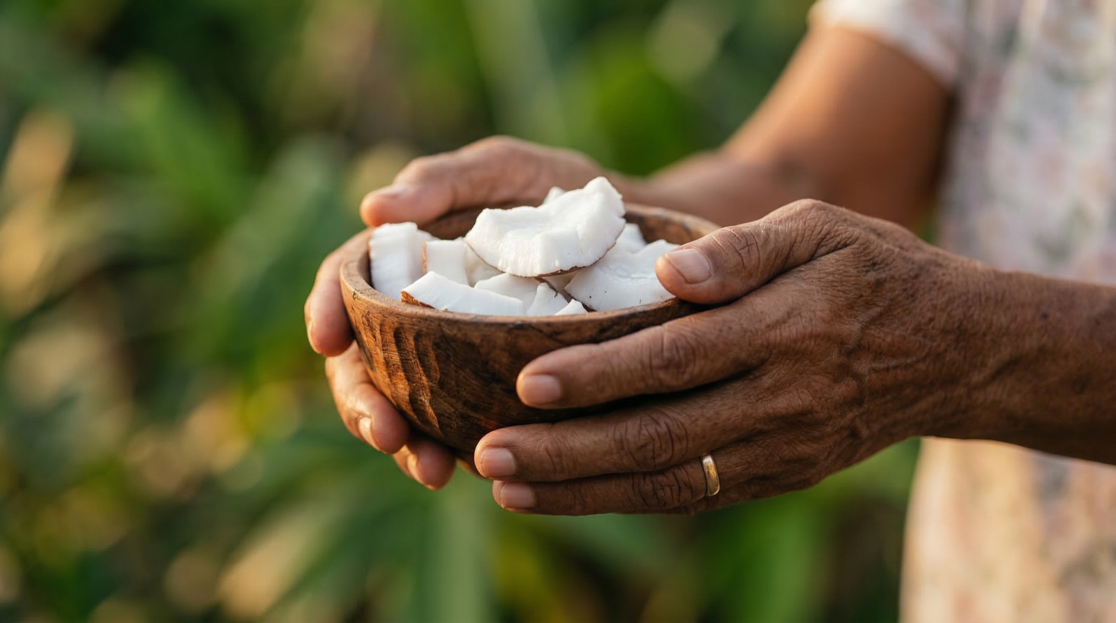
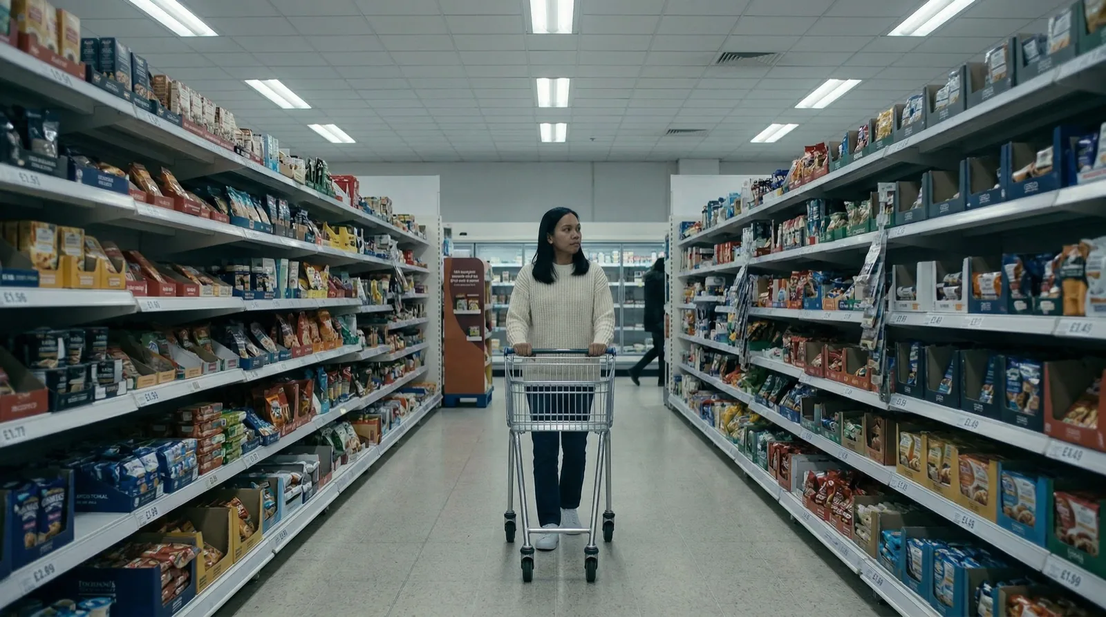
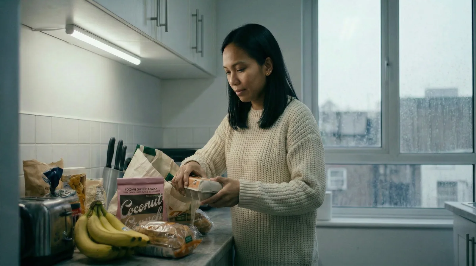
The brief asked for a tropical paradise. I made it a memory instead — a 60-second spec ad where one bite of coconut takes a young Filipina in London back to her grandmother's coastal home.
Concept
The brief: show that one bite of Coconut Crunch transports you to a tropical paradise. The pivot: what if paradise wasn't a destination, but a memory?
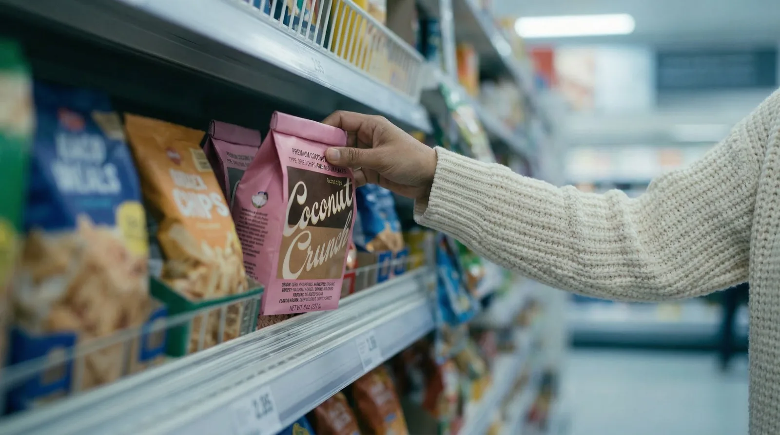
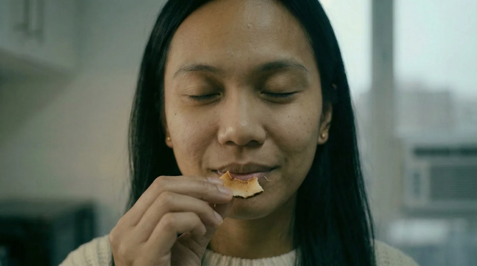
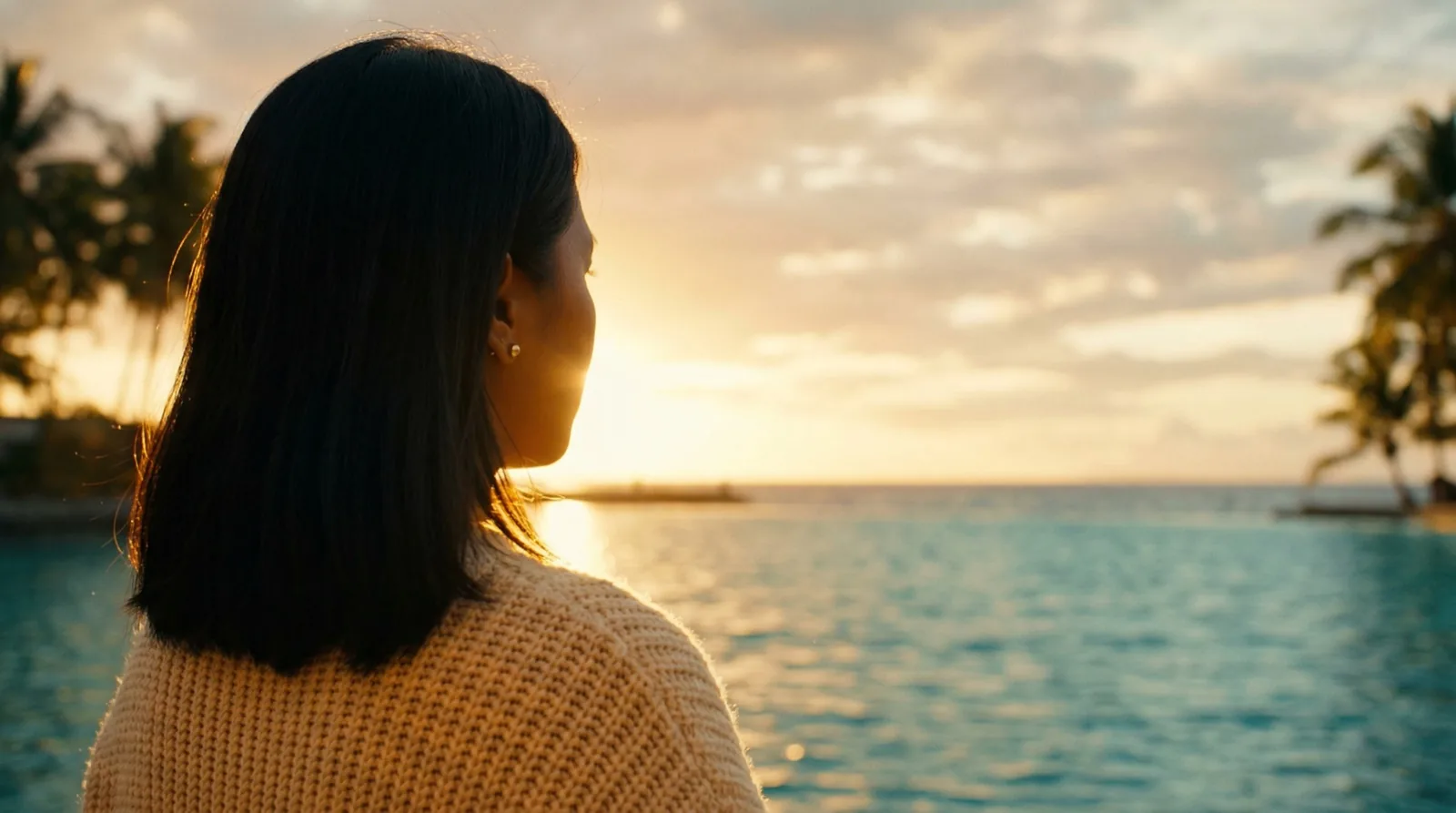
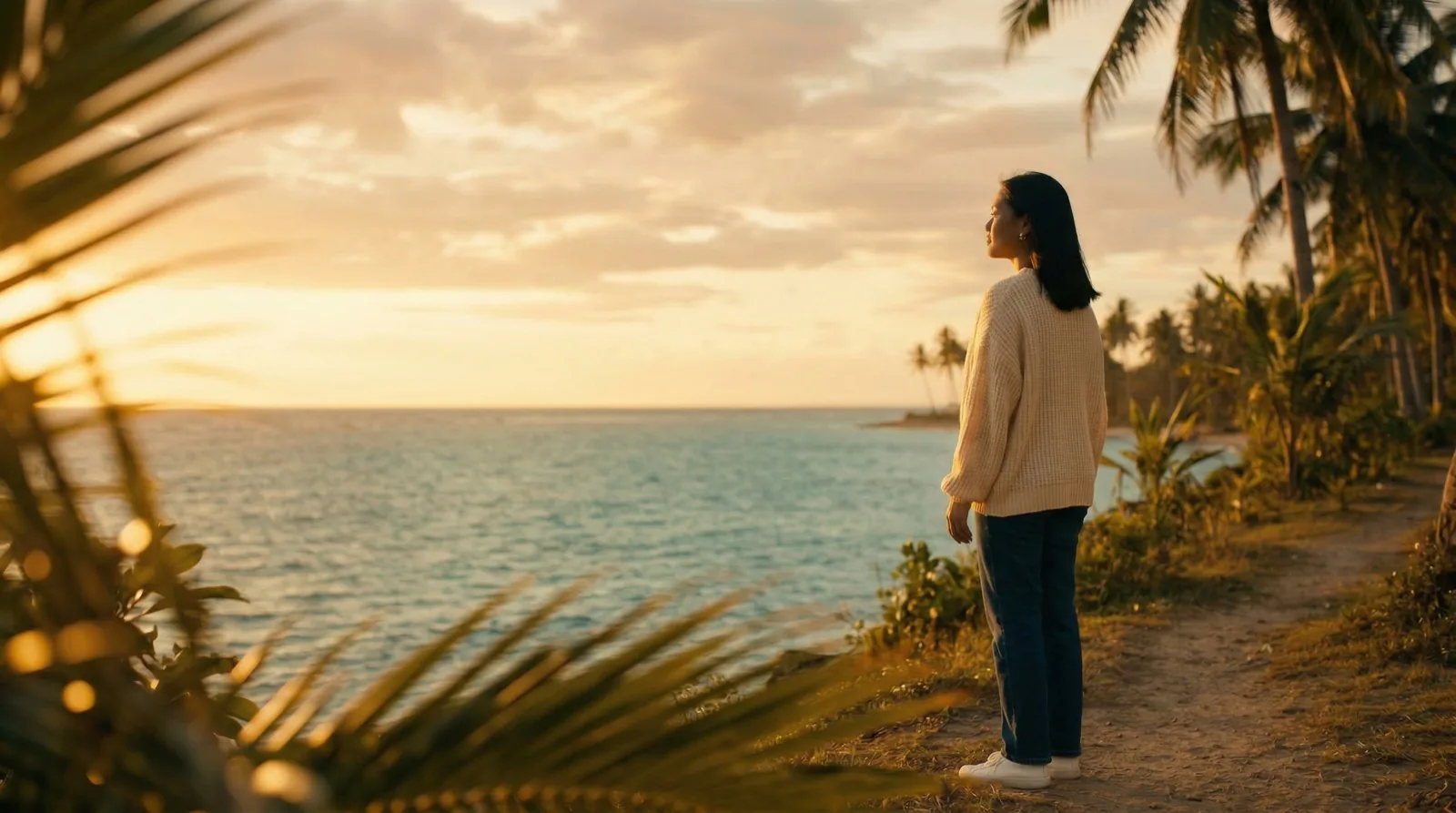
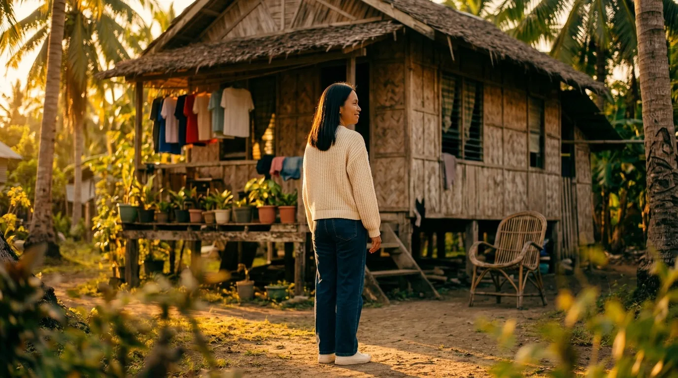
The spot follows Maya, a young Filipina in London, who finds Coconut Crunch at her local supermarket. One bite doesn't take her to a generic beach — it takes her to her grandmother's coastal home in the Philippines.
Emotional core
Identity, belonging, roots. The story is rooted in the ingredient itself — coconut from the Philippines — and uses the product as a vehicle for memory, not escape.
Two visual worlds carry that tension: London in cool, desaturated blue-grey light against the Philippines in deep golden hour warmth. The transition happens through taste — no effects, no dissolves, just a cut.
Workflow
Full creative pipeline directed end-to-end: concept, beat-by-beat script, visual bible (two palettes, character sheets, location references), character casting in Nano Banana 2, video generation in Runway Gen-4.5 and Veo 3.1, audio in Suno and ElevenLabs, post-production in After Effects.
Tools
Runway Gen-4.5 · Veo 3.1 · Nano Banana 2 · Suno · ElevenLabs · After Effects
Challenges
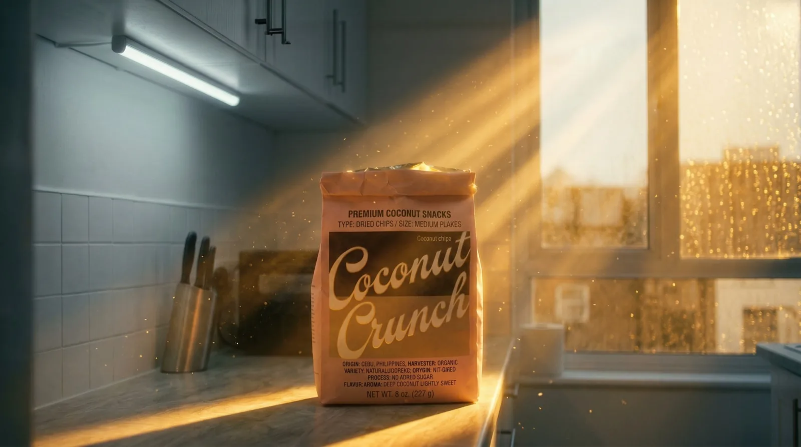
Character consistency across 11 video clips and two visual worlds. Preserving the exact package design — color, typography, label — across every pack shot iteration. Generating an elderly character's dialogue when Runway's voice options didn't fit (resolved with bilingual subtitles instead). Beat 4, the second bite, became the hardest single shot in the project — Gen-4.5 defaulted to chewing every time.
The project started with a brief and a pivot. Runway's contest asked for a spec ad showing that Coconut Crunch could transport you to a tropical paradise. The obvious answer was a beach. The interesting answer was a memory.
Pre-production was structured before a single image was generated: a beat-by-beat script across 8 beats and ~45 seconds, a visual bible with two distinct color palettes (cool London blue-grey, warm Philippine golden hour), full character sheets for Maya and Lola including triptych angles and hand details, and location references for the bahay kubo and the London supermarket. A custom prompt enhancer was built in Runway to enforce character likeness and palette consistency across every generation.
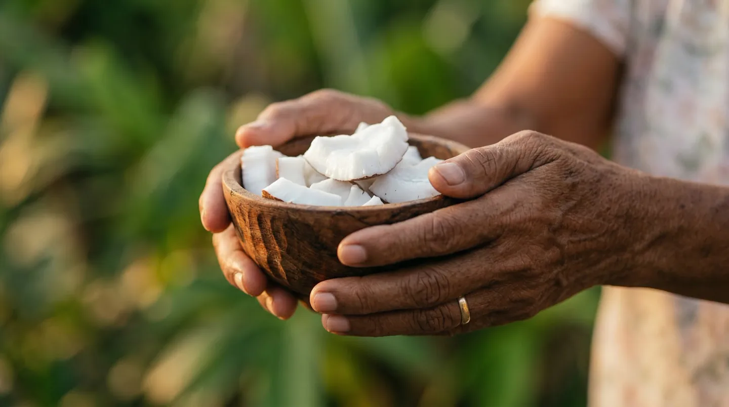
Character casting was done in Nano Banana 2 — master frontals, triptych angles, full-body shots, and dialogue-relevant details like Lola's hands holding the coconut bowl. From there, 11 video clips were generated across Runway Gen-4.5 and Veo 3.1, refined iteratively rather than regenerated from scratch.
Music was generated in Suno, anchored in kulintang and bamboo flute with coastal ambience — the goal was authentically Filipino rather than generically tropical. The only dialogue, Lola's line, was handled as bilingual subtitles when no available voice fit an elderly character with the right warmth.
Post-production in After Effects locked the cuts, the transitions, and the pack shot. Final cut: 59 seconds.
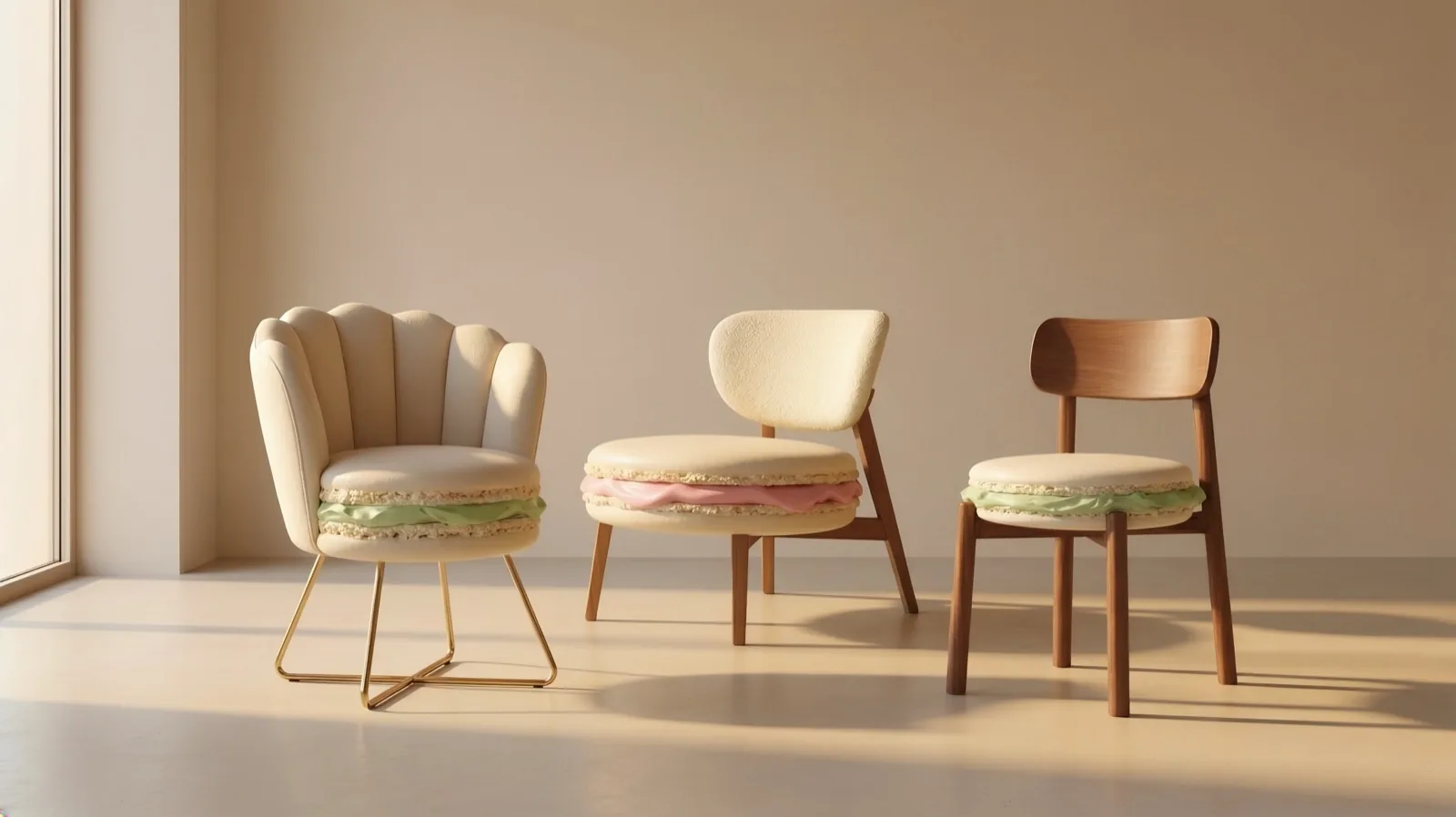
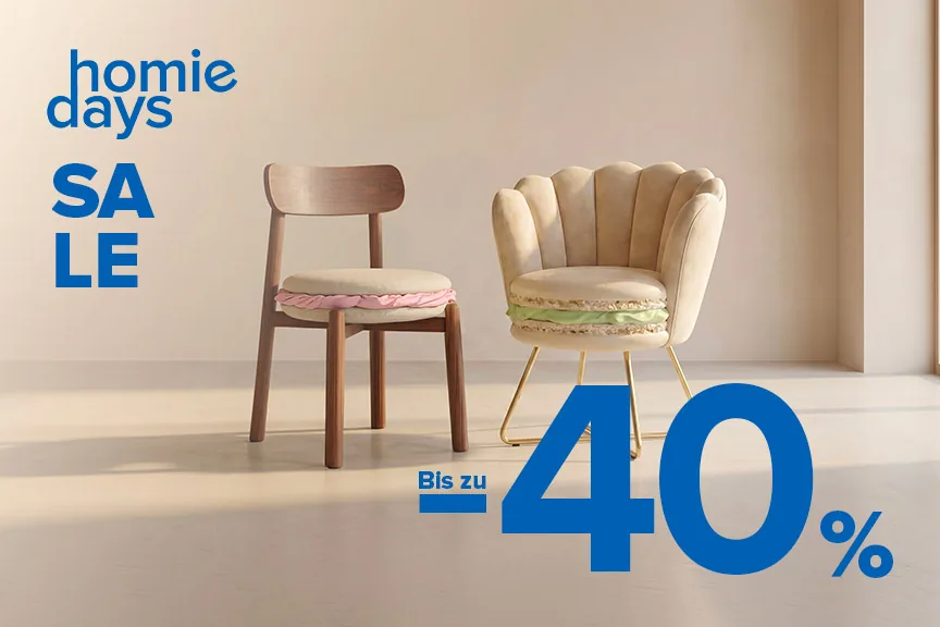
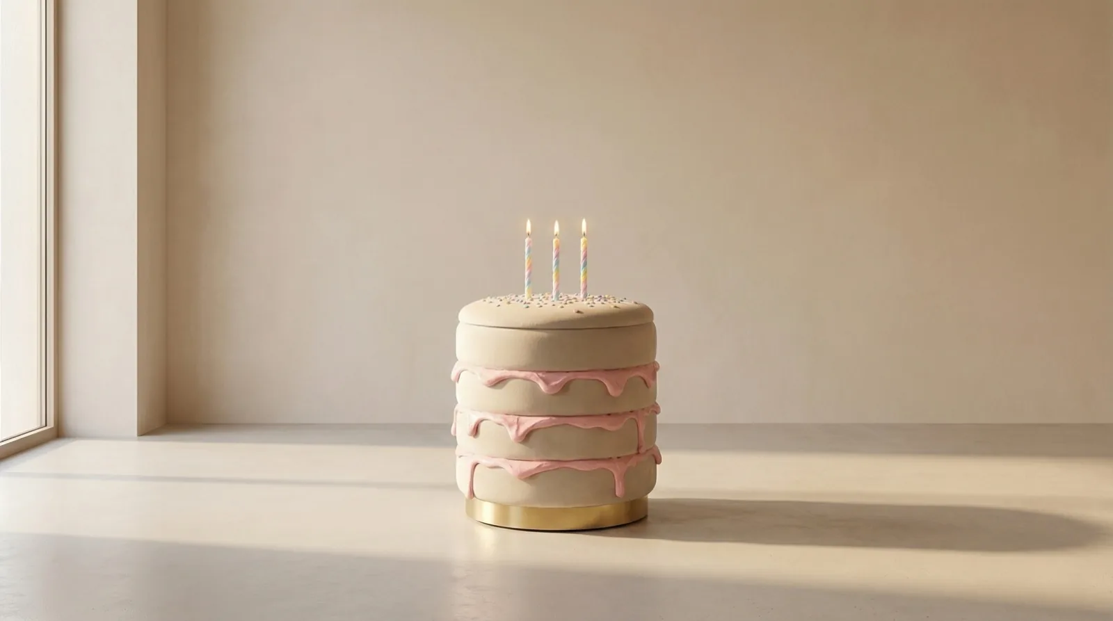
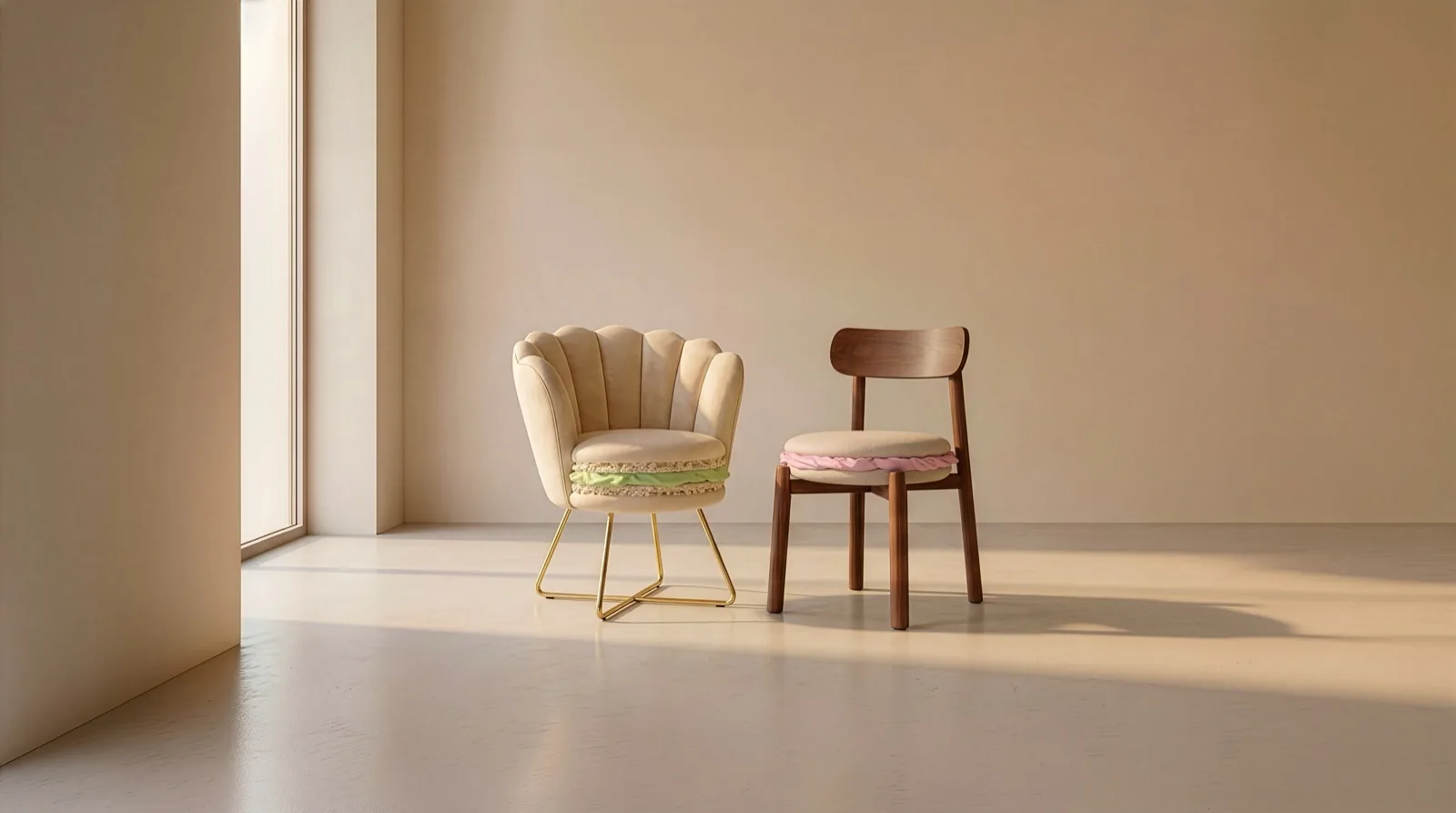
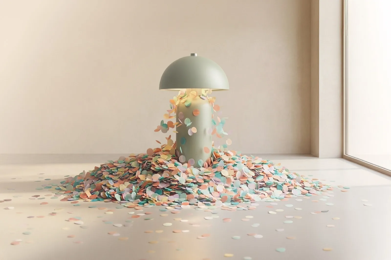
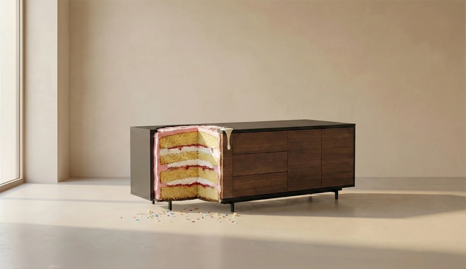
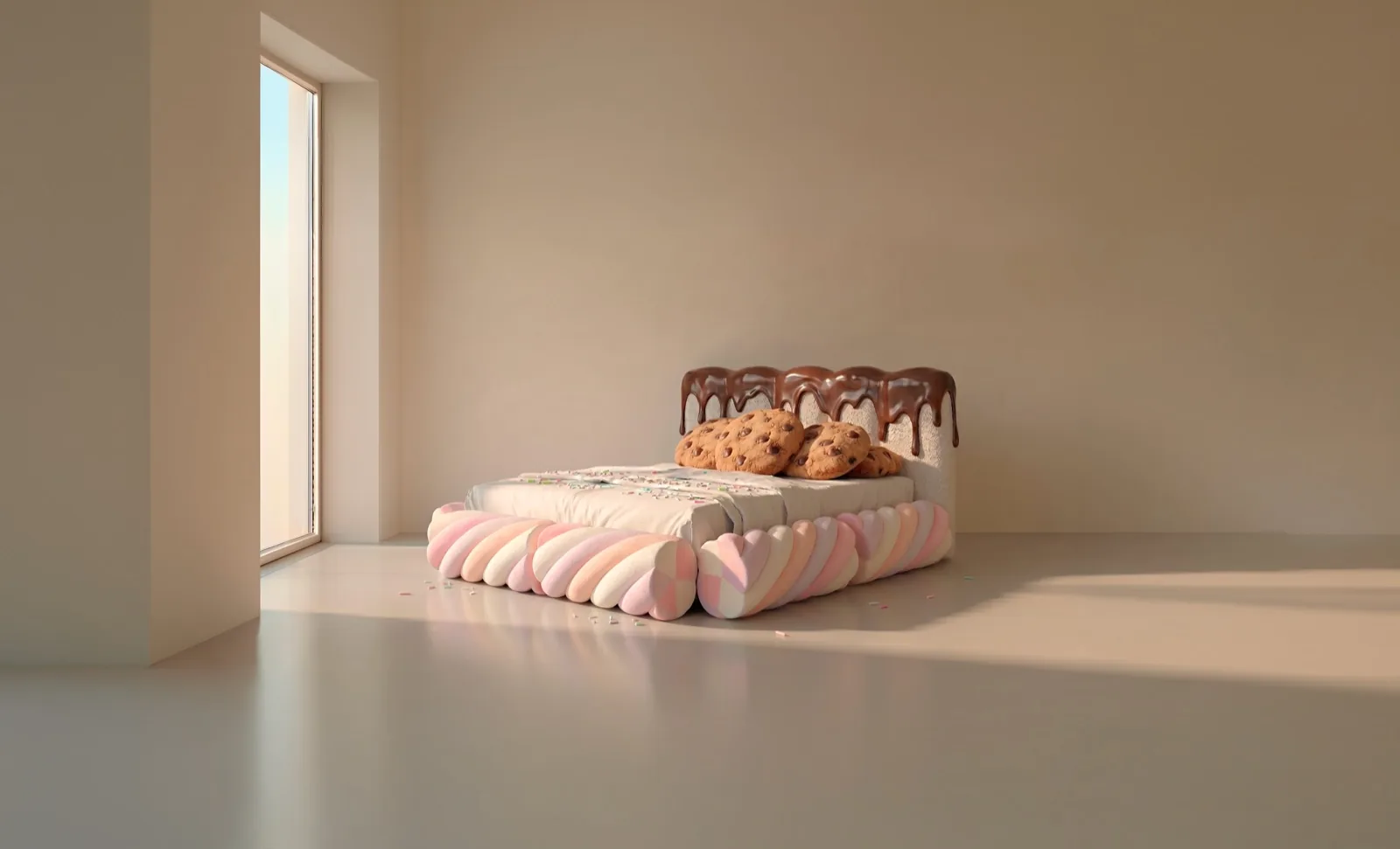
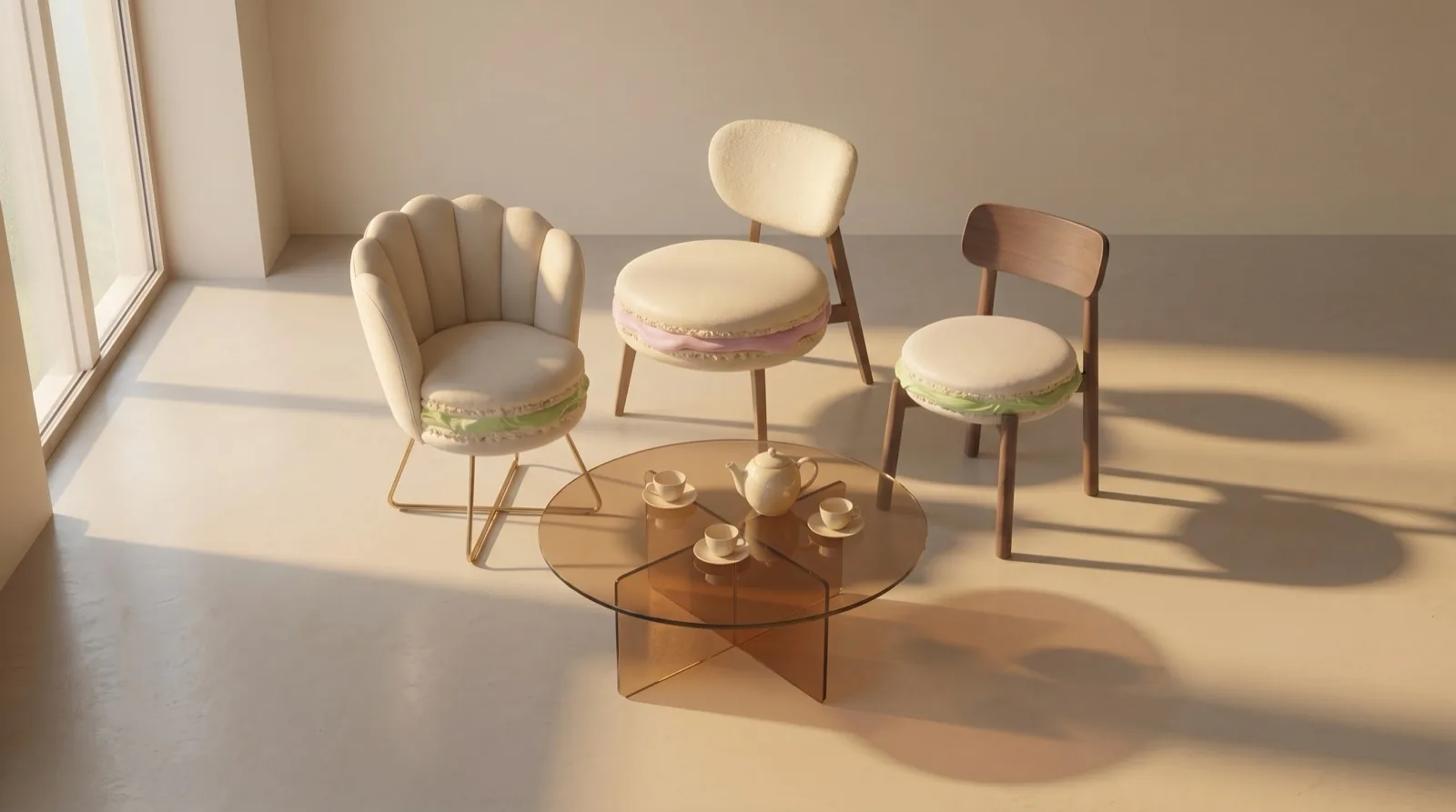
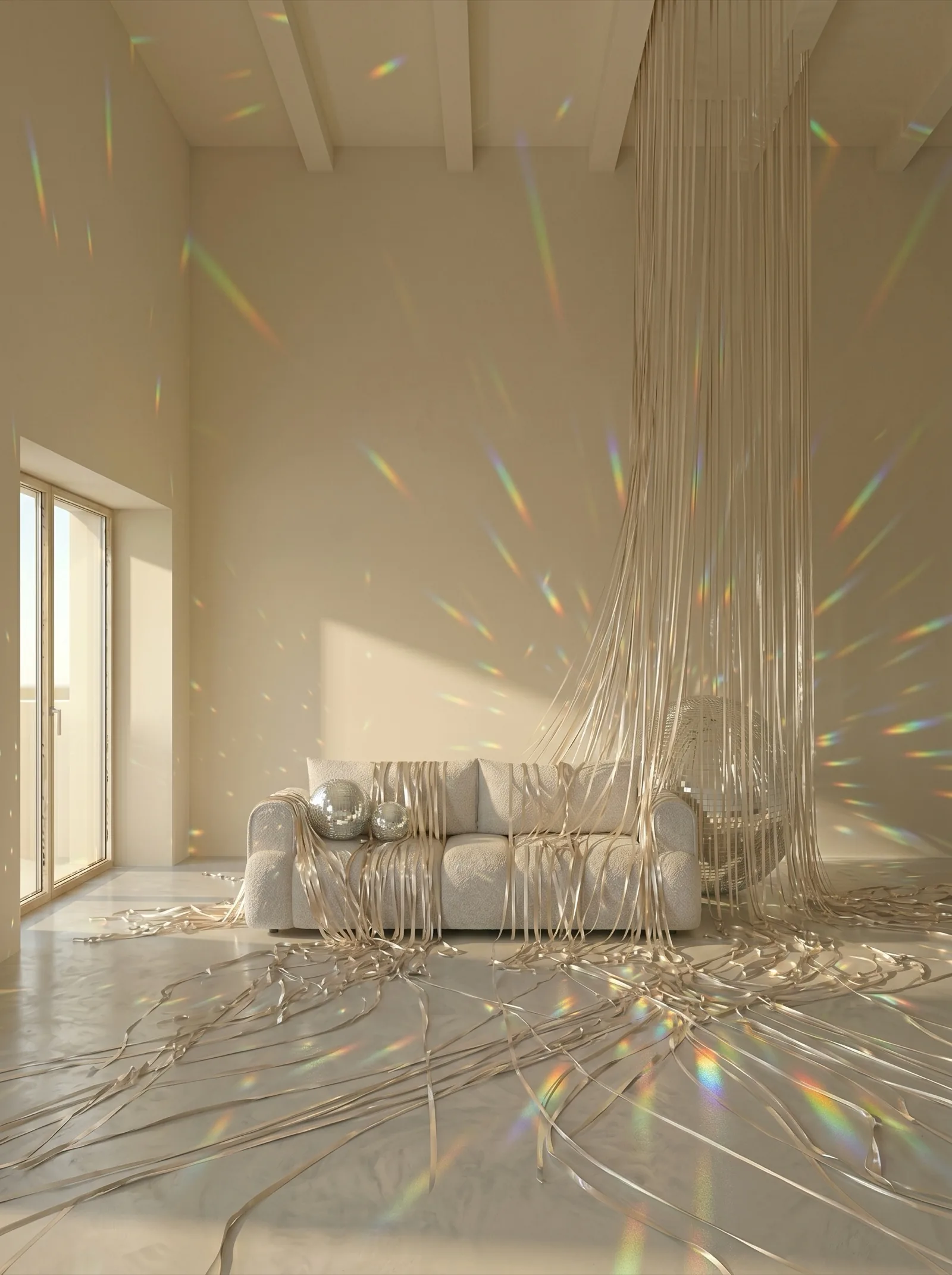
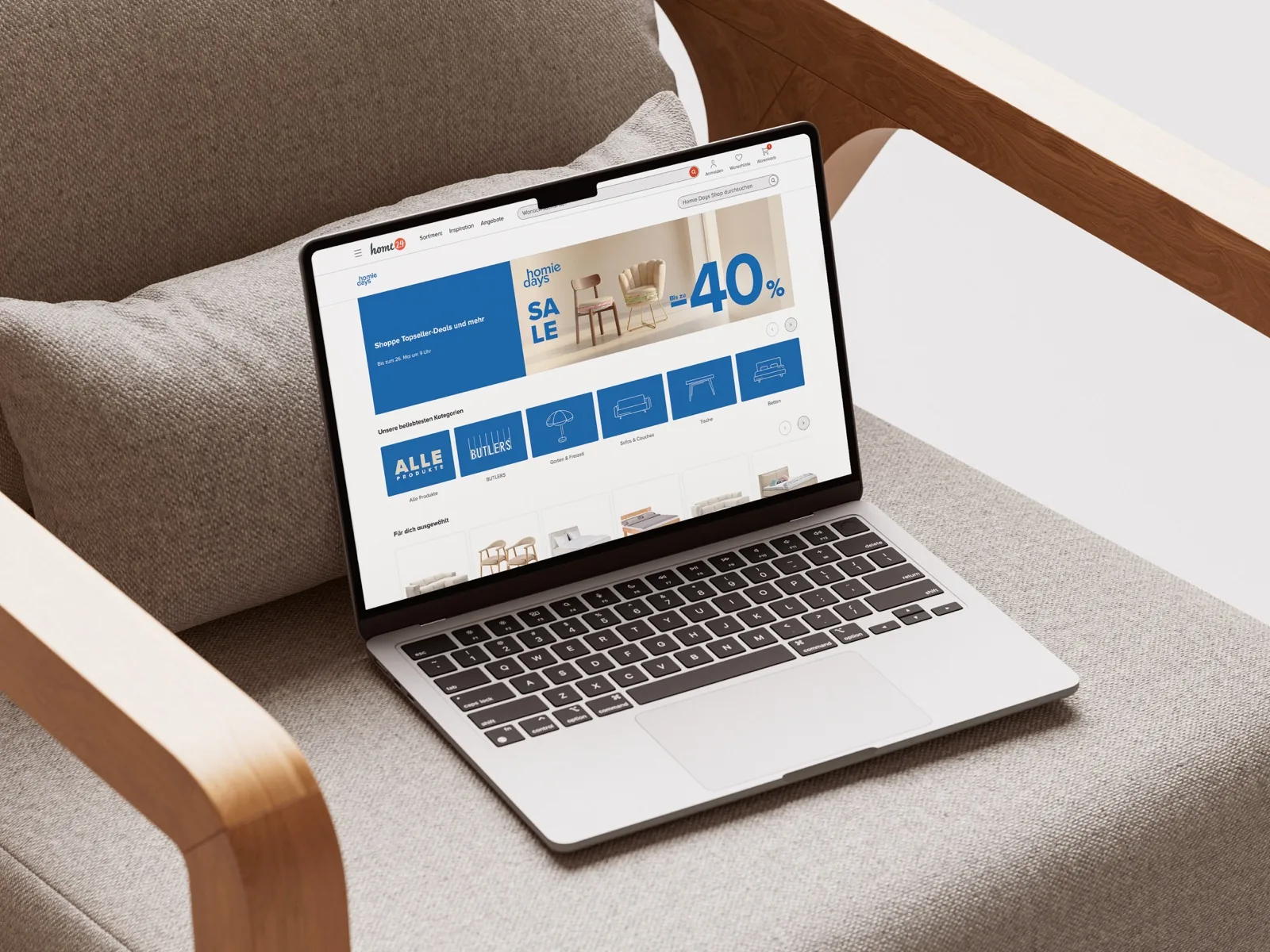
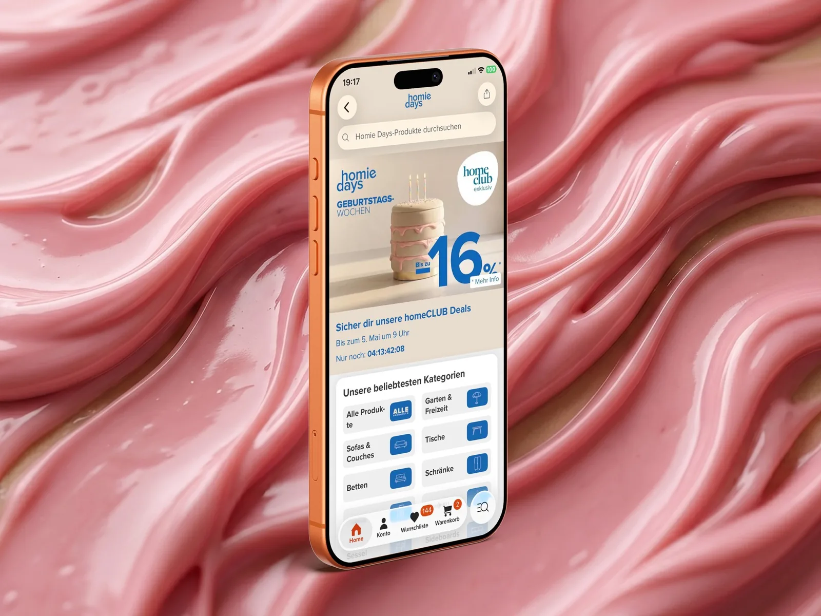
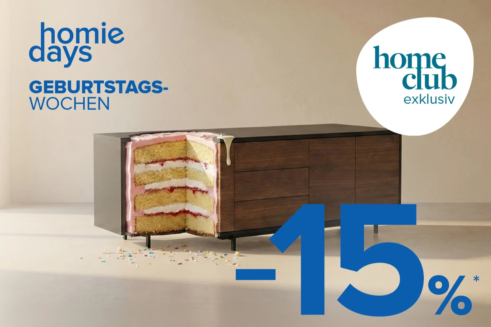
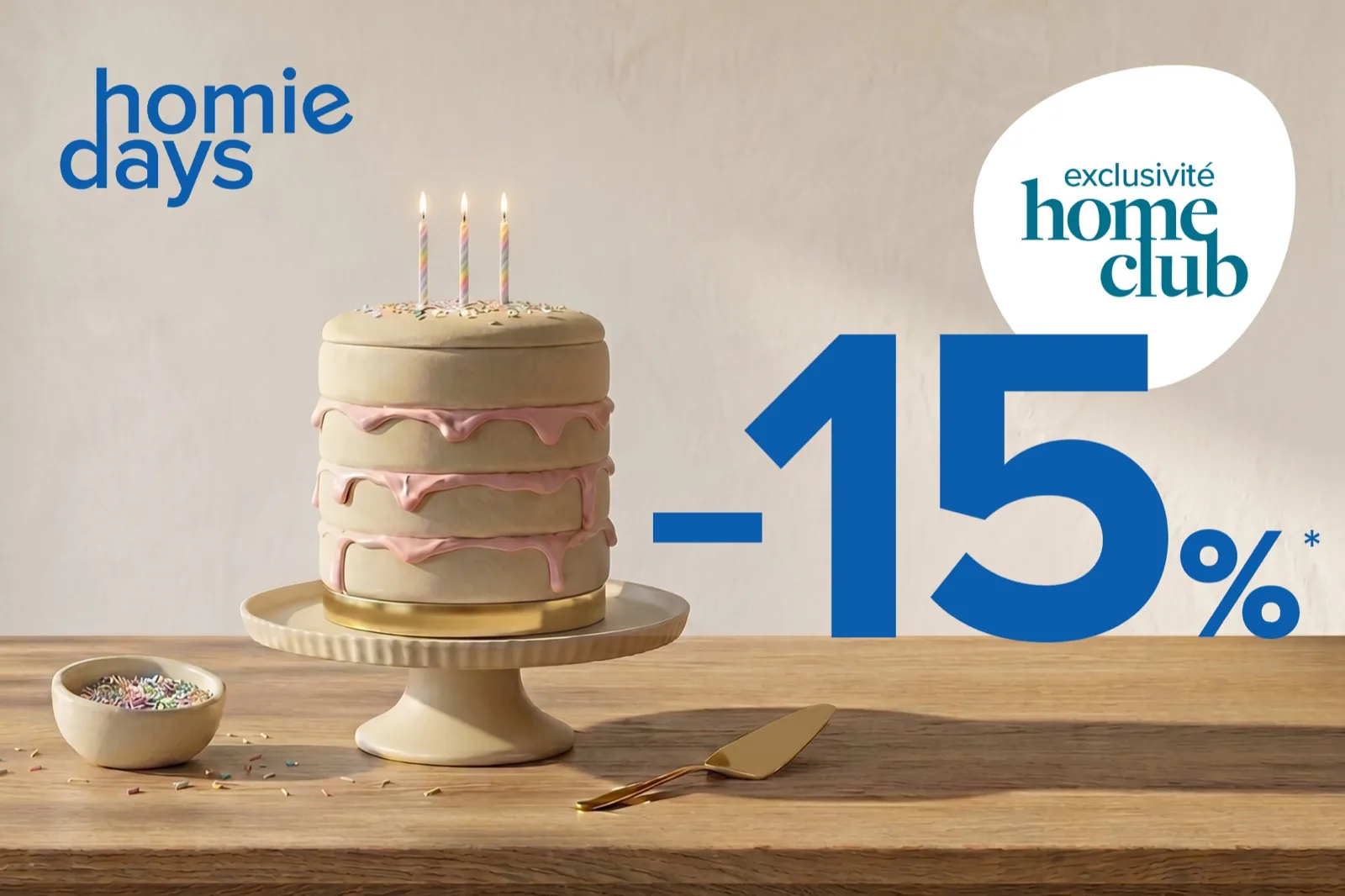
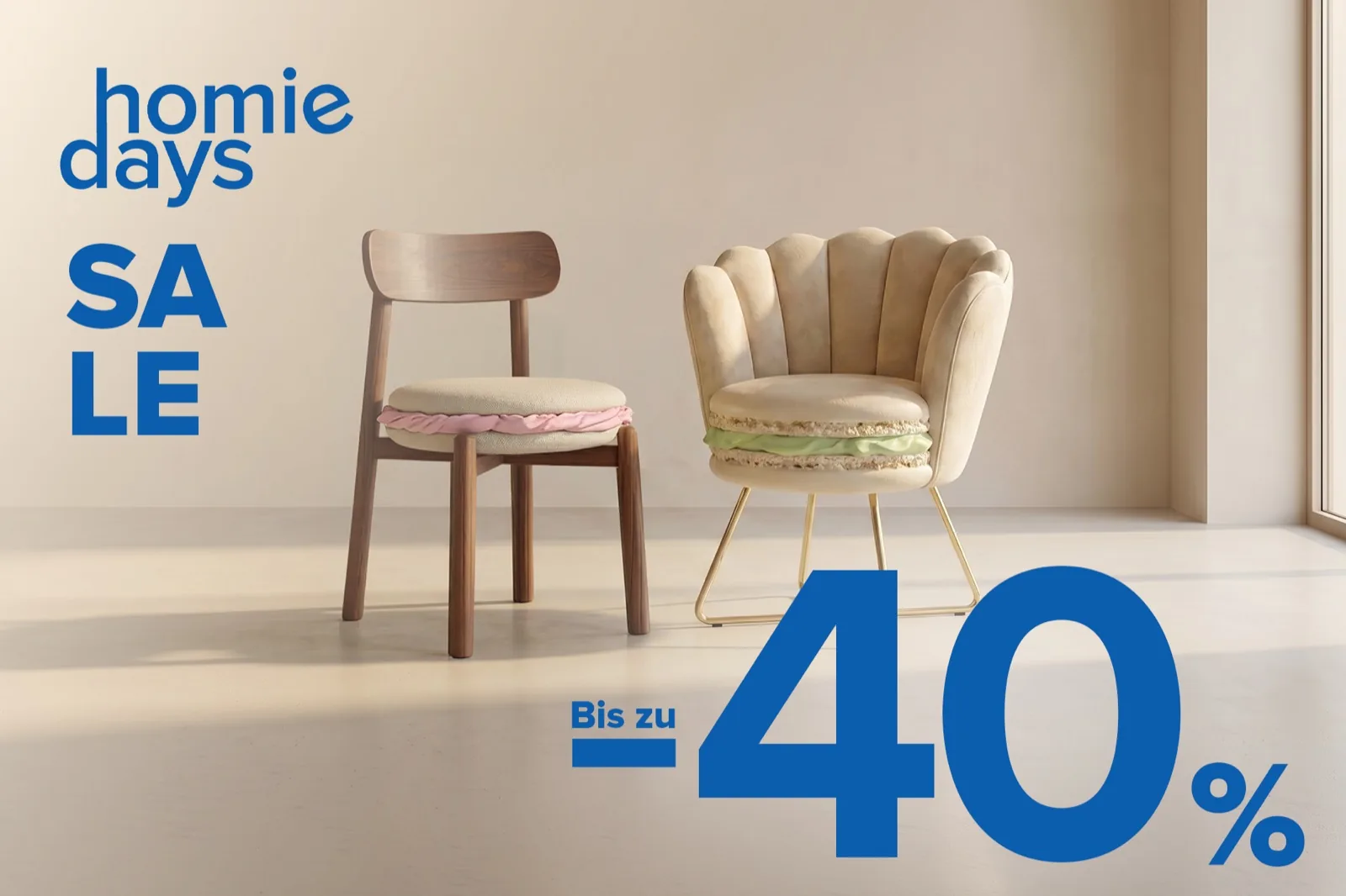
home24's annual birthday campaign across 5 markets. Instead of showing products at a party, we made the products become the party — an ottoman tiered like a birthday cake, a sideboard with a bite revealing sponge layers, a lamp emitting confetti instead of light. All visuals AI-generated. All direction human.
Concept
The brief: a multi-phase birthday campaign (~6 weeks) across DACH, NL, BE, IT, and FR. The constraint: every visual must work at banner scale, maintain system consistency across phases, and be fully producible with AI.
The answer: instead of decorating a scene around the furniture, each product is minimally intervened with a single birthday element. The product stays recognizable and shoppable — but it is the celebration. The concept was selected as the winning pitch in the internal team competition.
Guiding principle
One object, one idea, one strong visual. A piece with air beats a decorated scene. Less is more — applied literally, product by product.
Visual system
Fixed background (warm cream plaster wall, light concrete floor, natural light from the left), cream and pastel palette, consistent camera spec (Hasselblad medium format, 85mm, f/2.8). The system holds across 6 products and 5 markets without losing coherence.
Pipeline
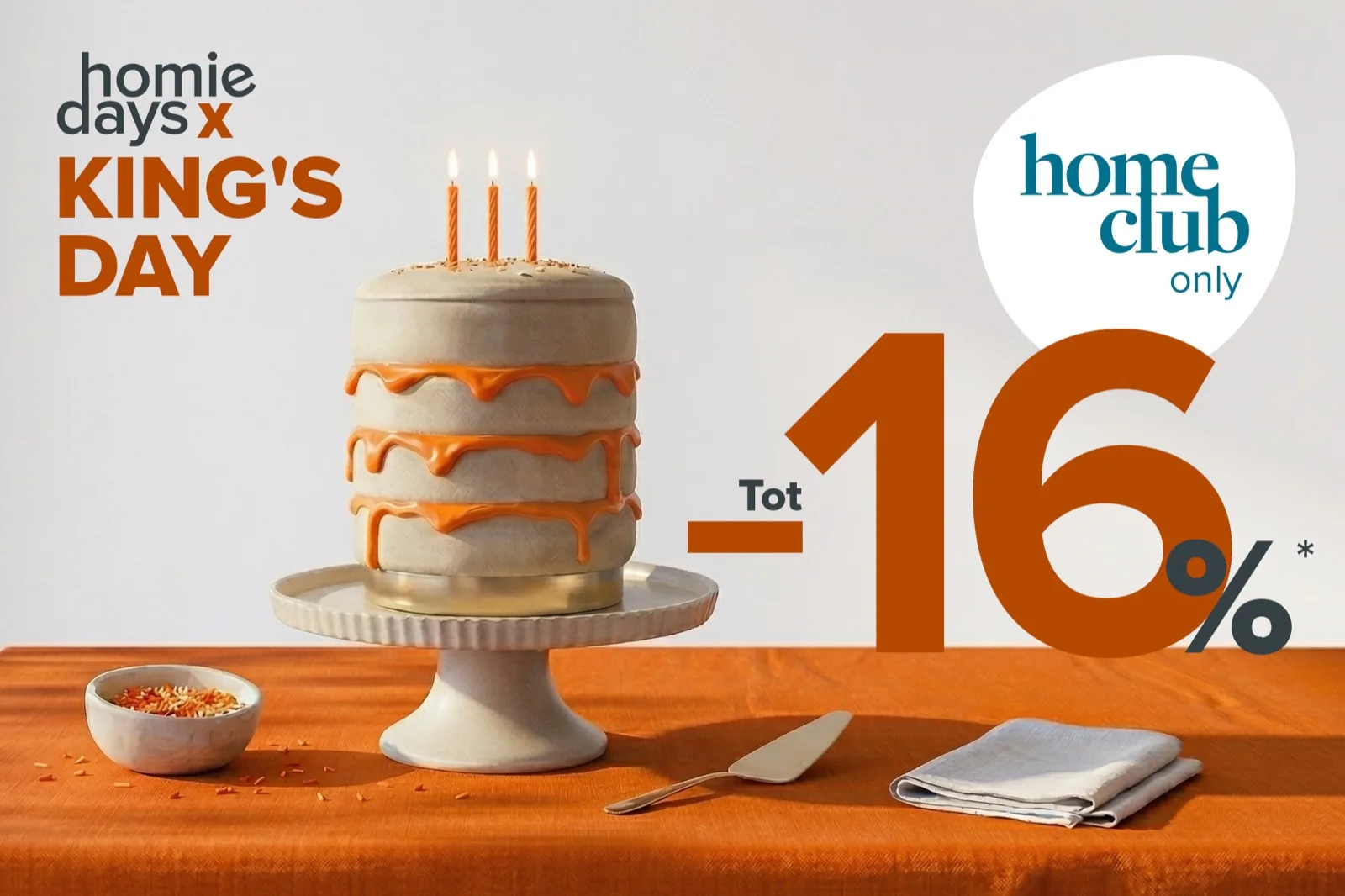
Competitive internal pitch (3 concepts) → concept selected as winner → creative redirection toward more minimalism → visual system lock (background, palette, camera, lighting) → product-by-product AI generation with max 3 changes per round → Photoshop corrections between AI rounds → animation of key visuals in Runway for social channels → market variants (NL King's Day in orange, FR French Days in blue/white/red) → final quality pass.
Tools
Gemini (Nano Banana Pro) · Runway · Photoshop · Claude
Challenges
Precise repositioning of objects — Gemini doesn't control exact placement. Swapping one product reference for another when two references coexist — the tool confuses them. Product fidelity degrades after many accumulated iterations. The key learning: rebuilding from scratch beats iterating when the coherence breaks. Surgical adjustments went to Photoshop before returning to Gemini.
"Made of Party" won an internal pitch of three concepts — the idea that the furniture is the celebration, not just something placed at one. The brand director then pushed for even more minimalism, which sharpened the system.
The visual system was locked before any generation: a fixed studio (cream plaster wall, concrete floor, diagonal natural light), a strict camera spec, and one rule — one object, one intervention, room to breathe at any scale.
Production was fully AI-generated in Gemini (Nano Banana Pro), product by product through iterative rounds: prompt, evaluate, adjust or rebuild. When Gemini couldn't handle precise repositioning or element swaps, Photoshop bridged the gap.
Key visuals were then animated in Runway for social and campaign focal points — same art direction, same restraint. Motion added a layer without breaking what worked.
The system scaled to 5 markets with cultural variants (orange for King's Day, tricolor for French Days) without losing identity — designed tight enough to flex.
A campaign that once took 2 months of physical production was delivered in 3 weeks, same editorial standard.
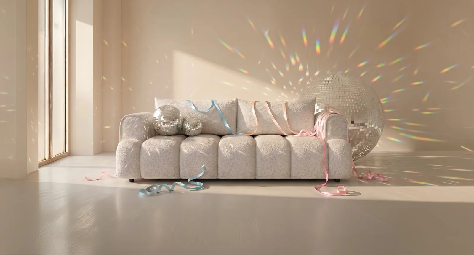
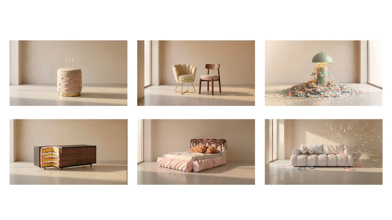
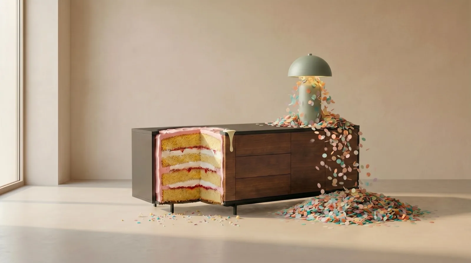
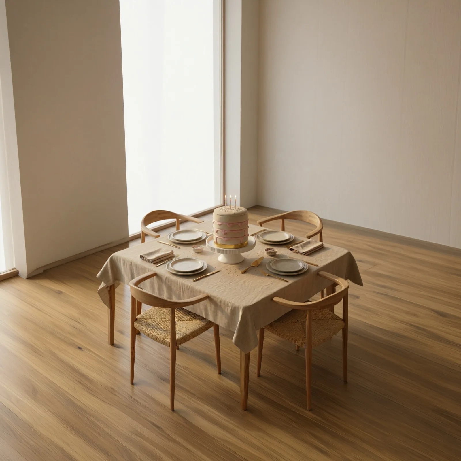
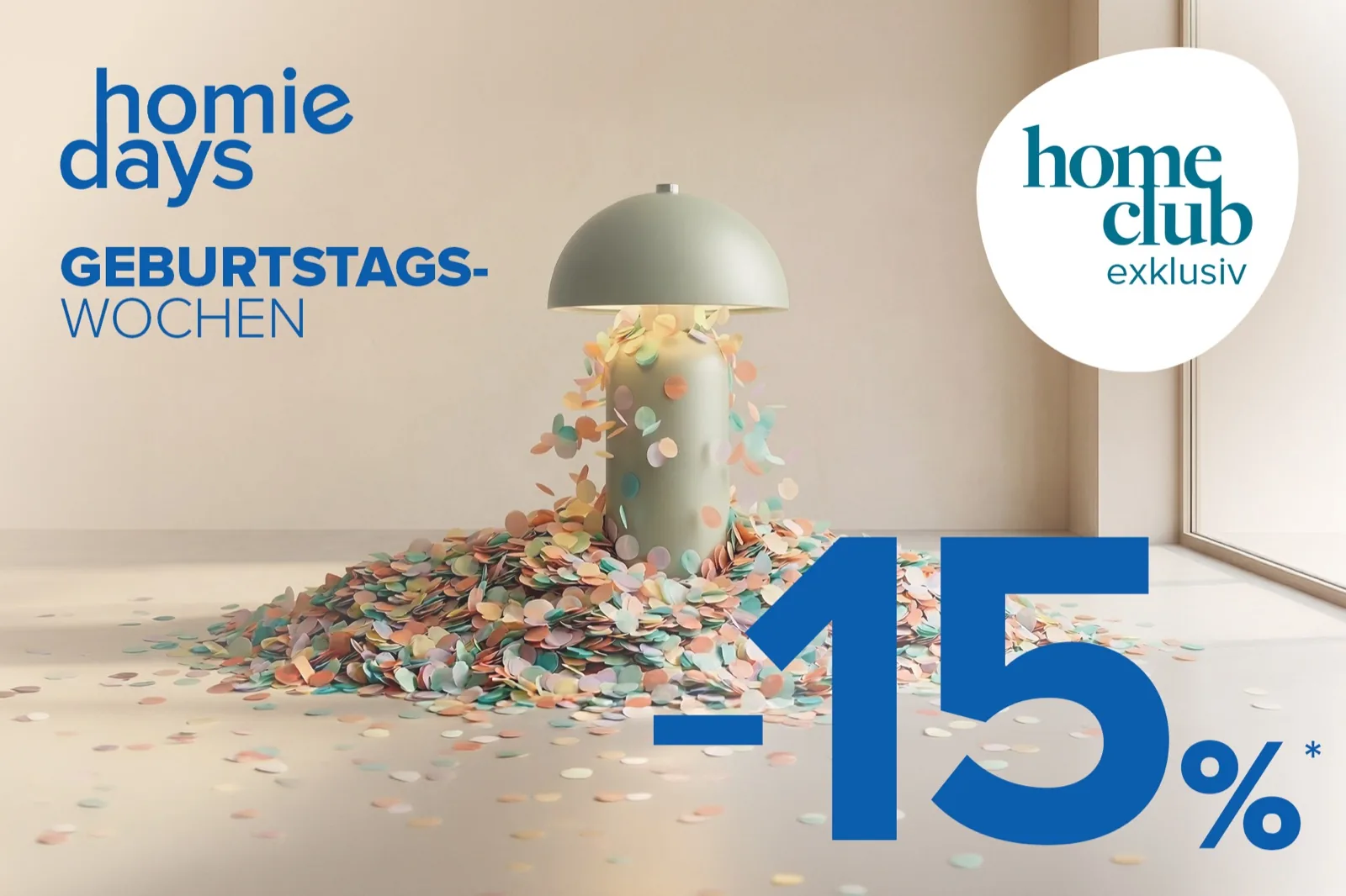
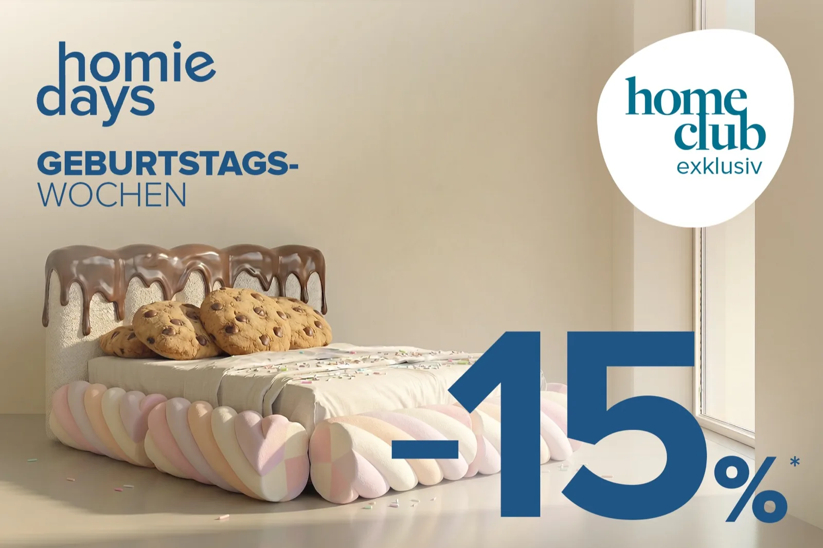
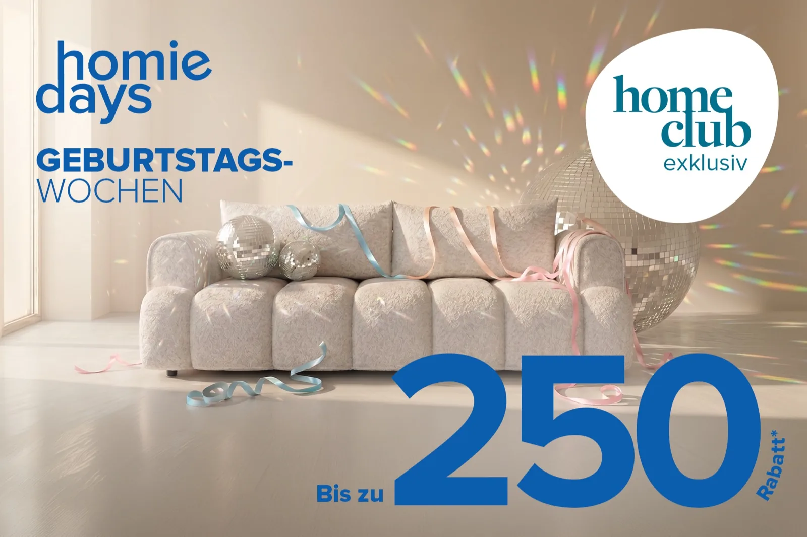
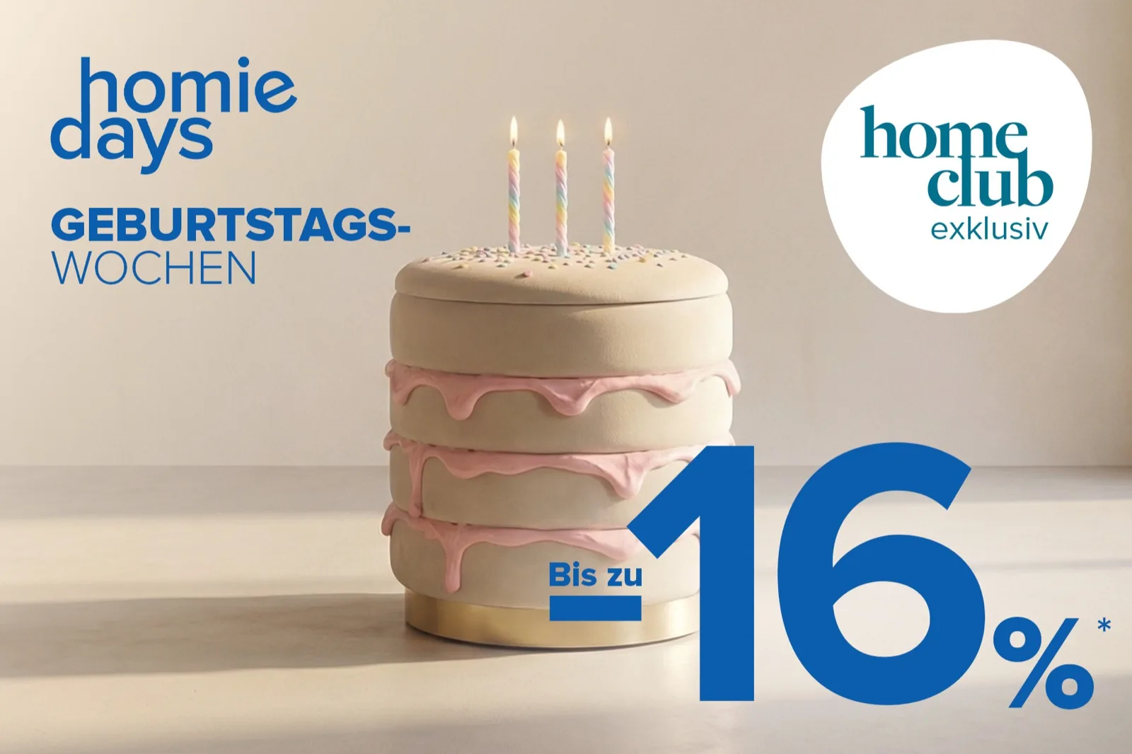
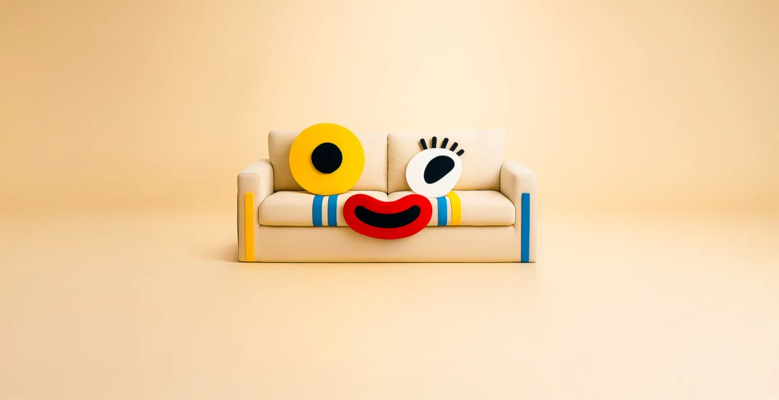
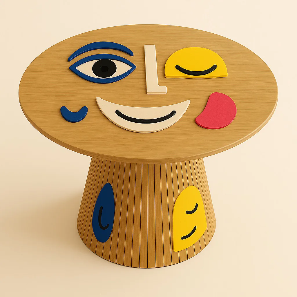
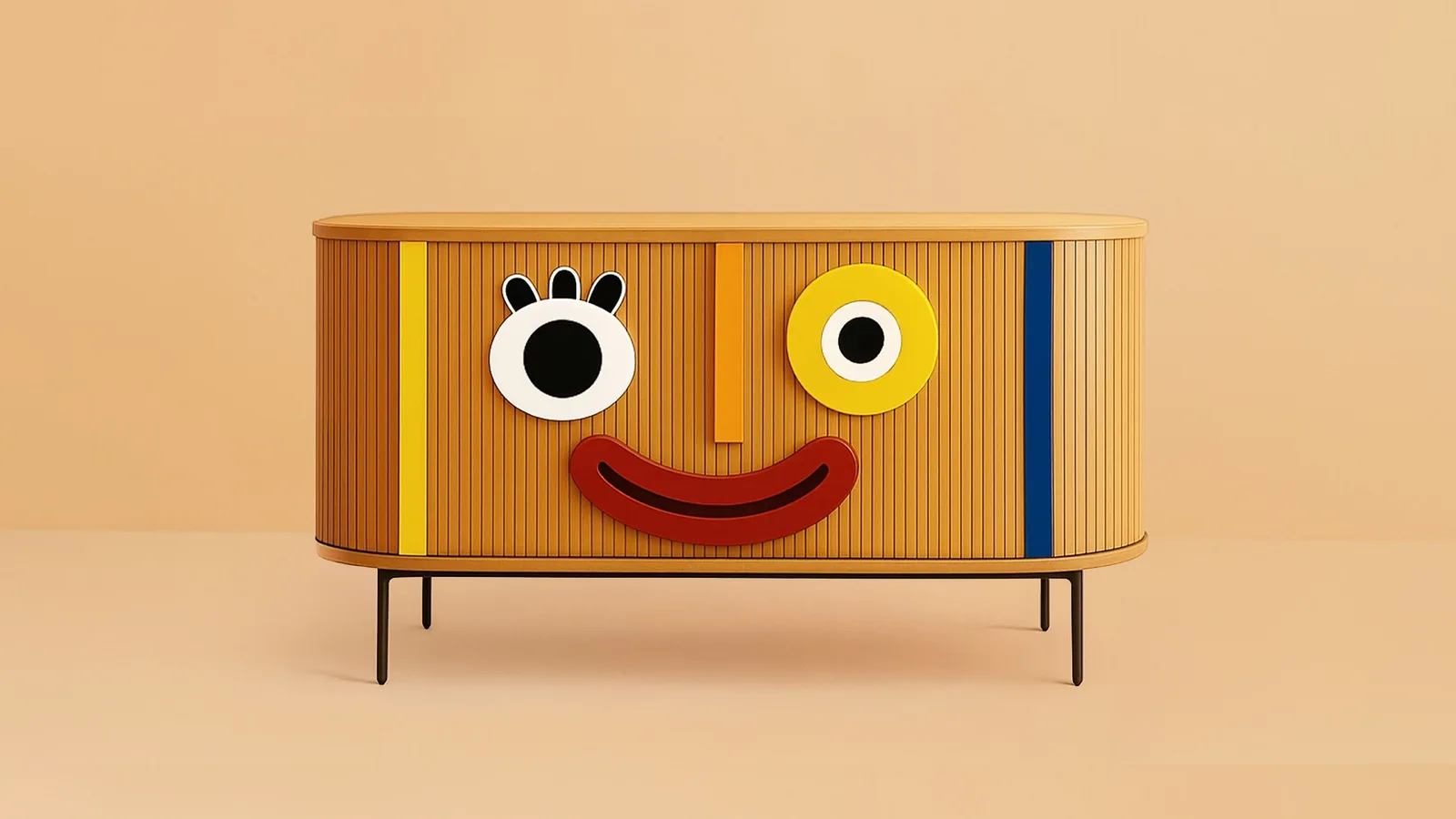
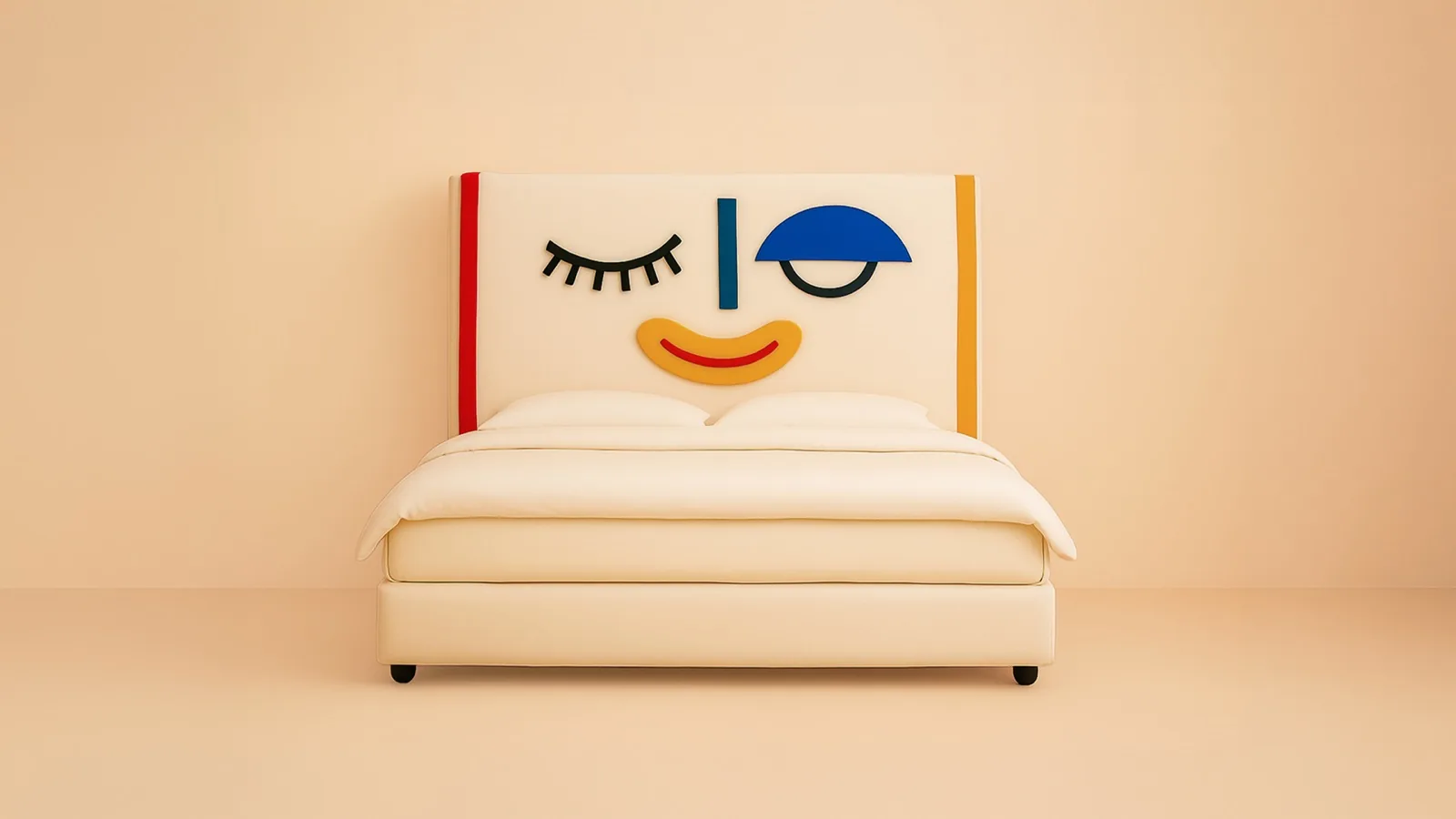
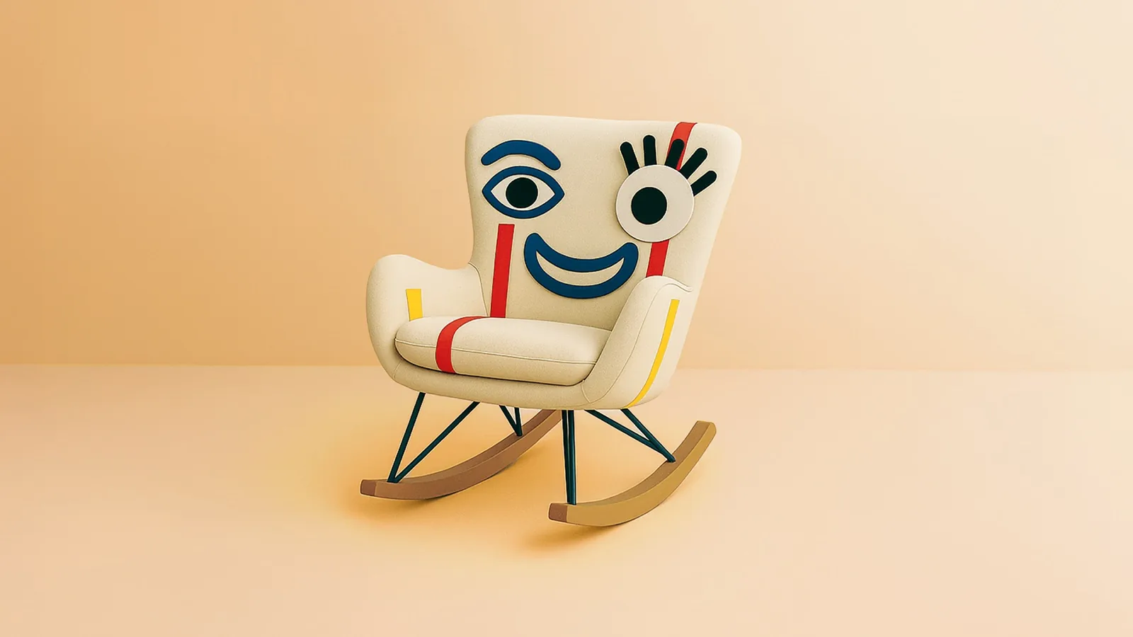
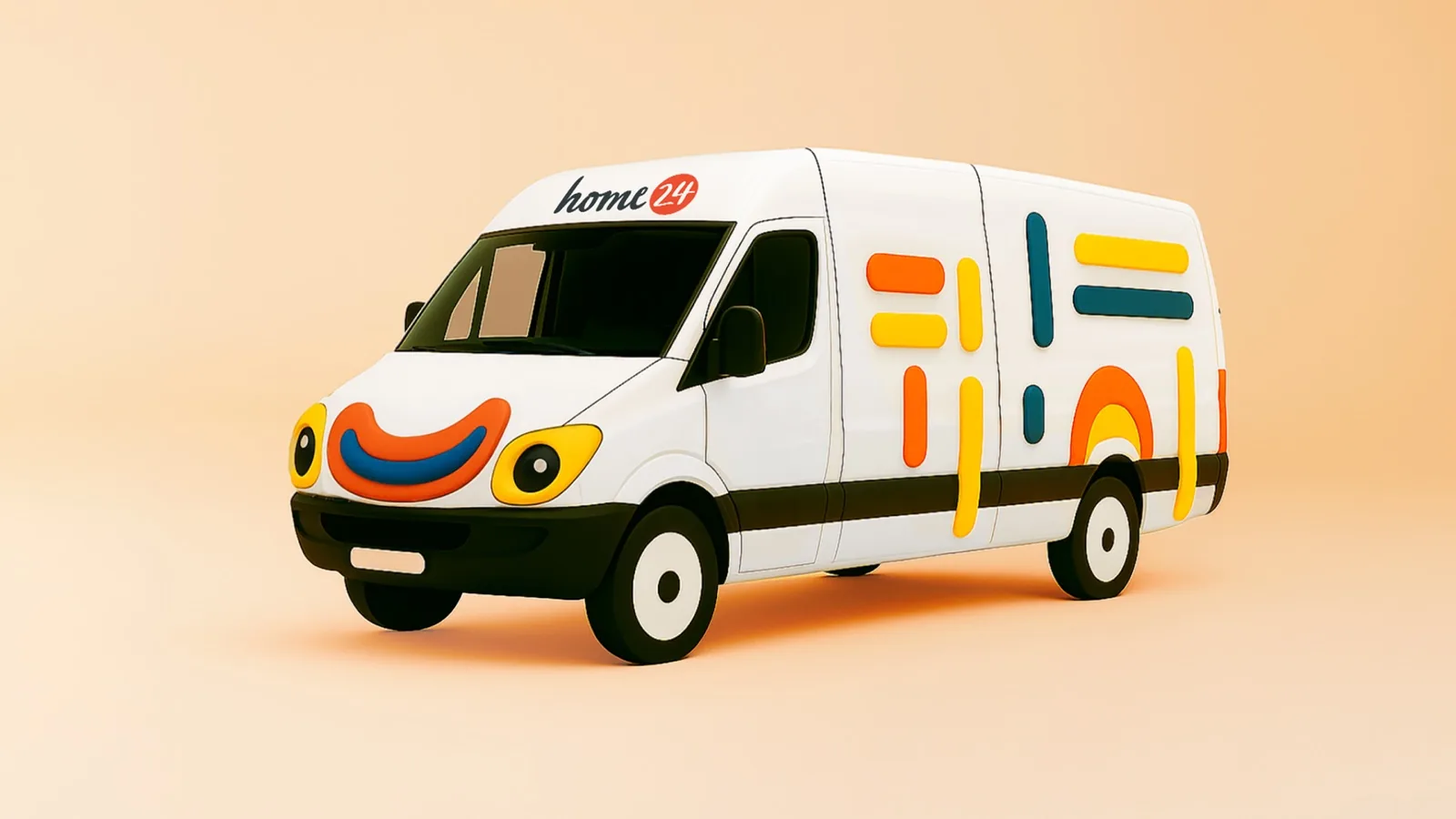
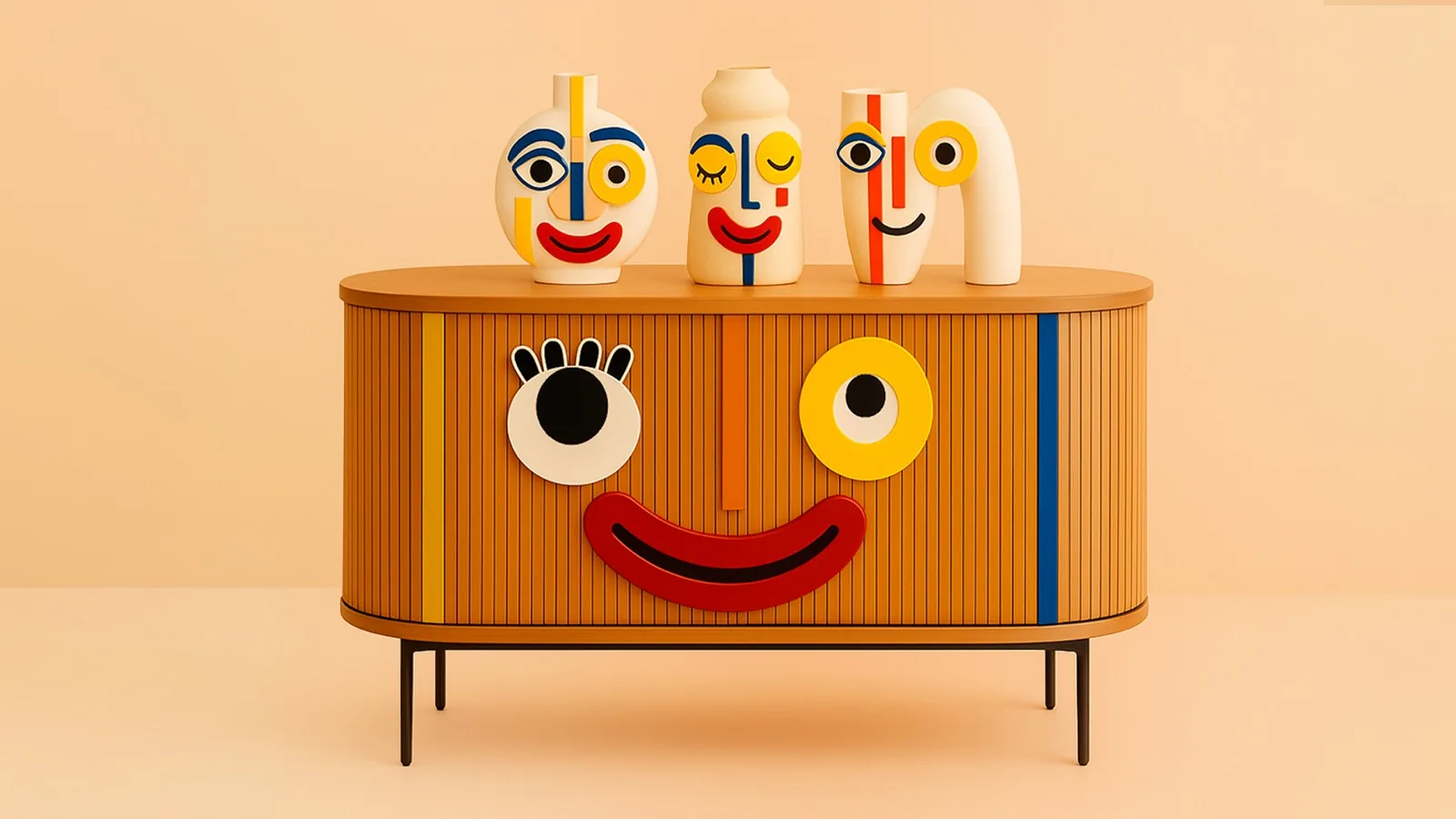
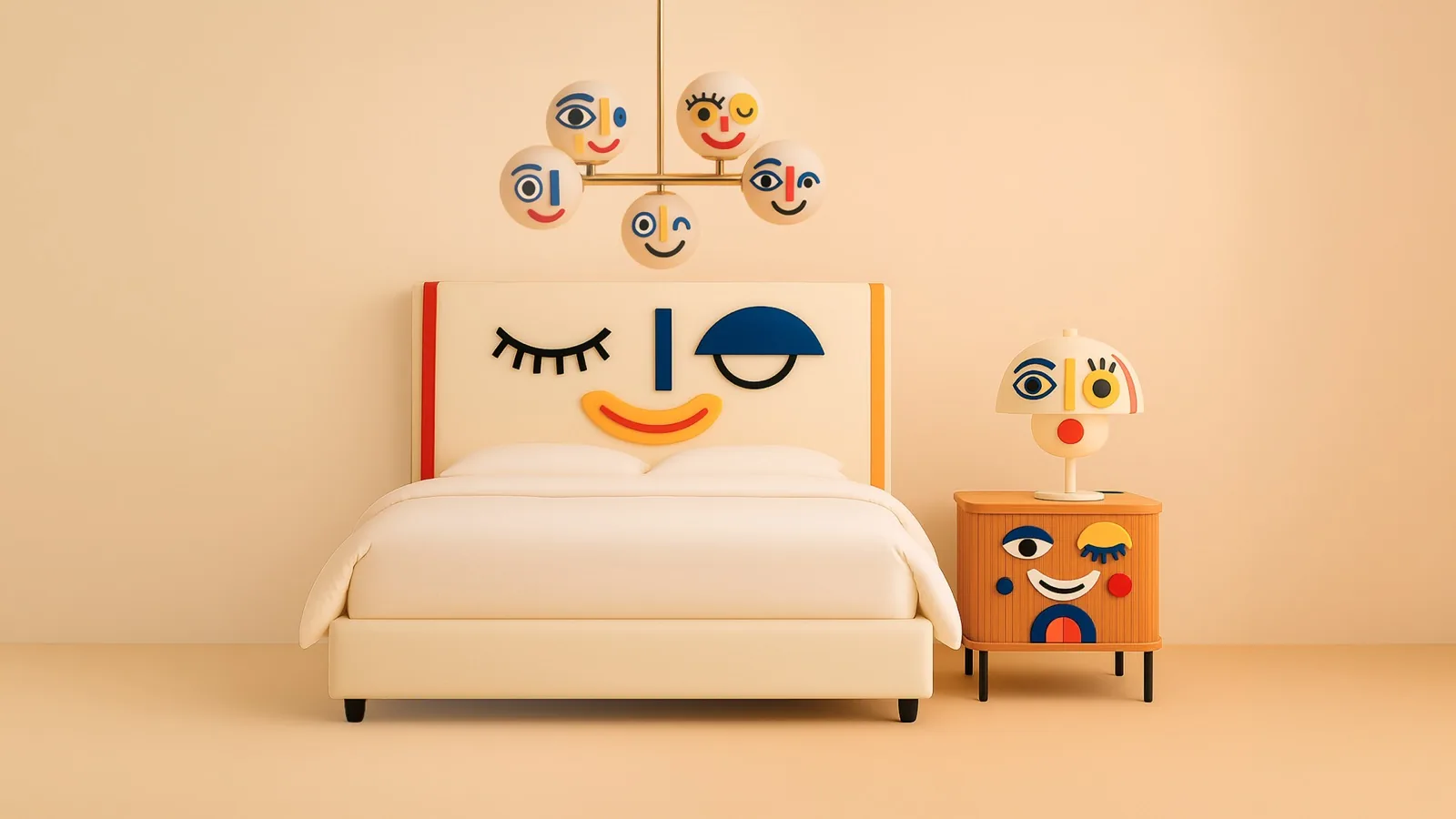
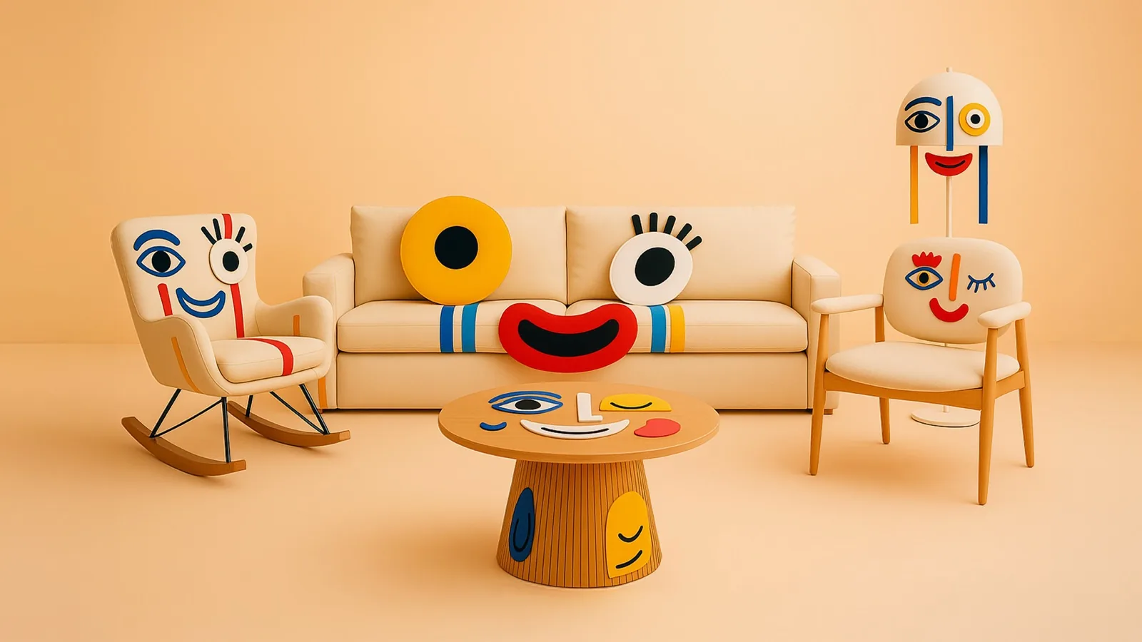
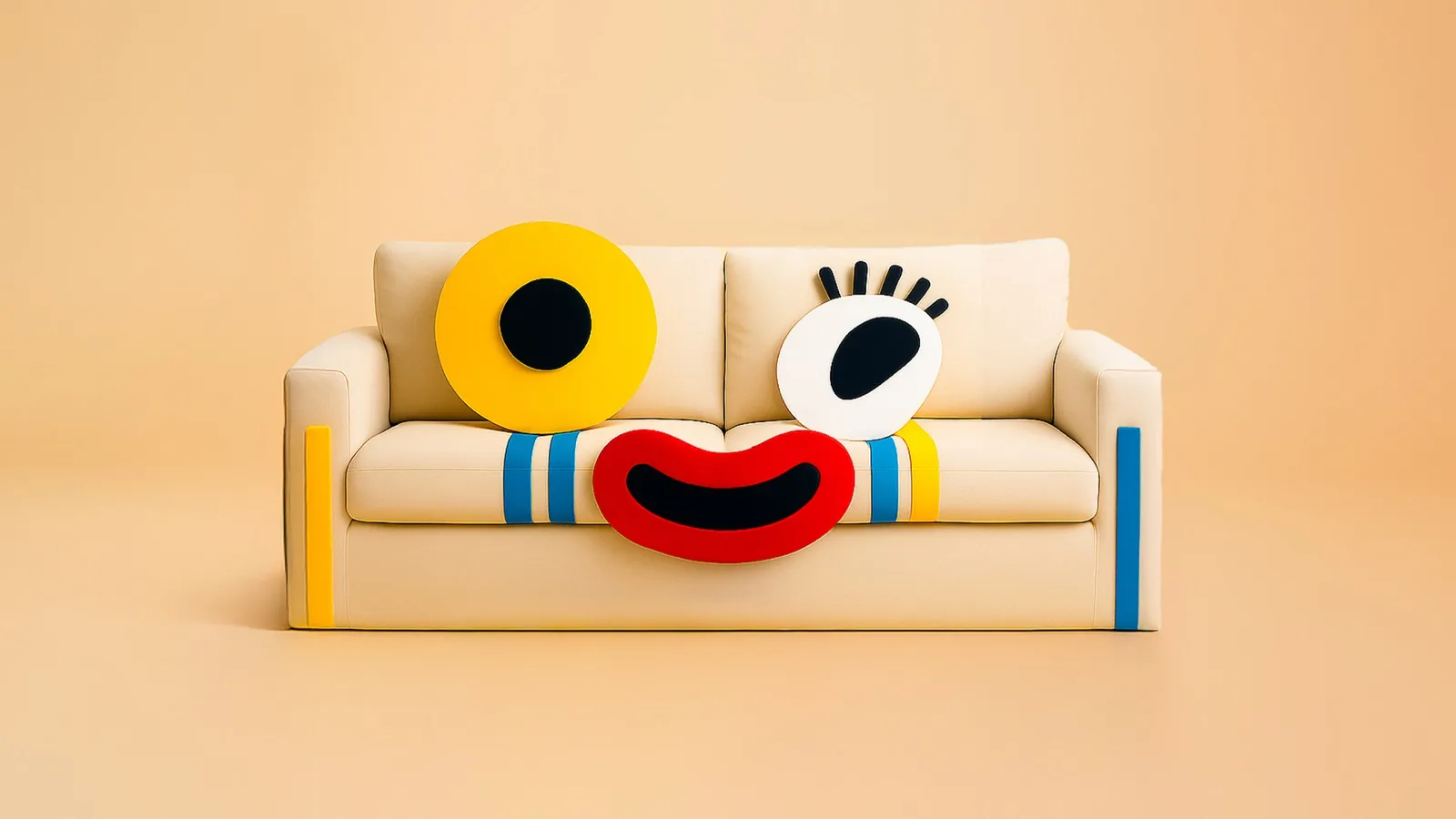
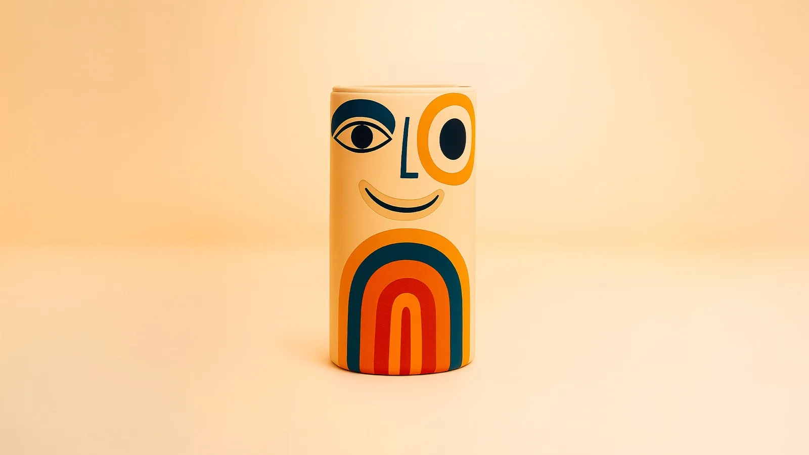
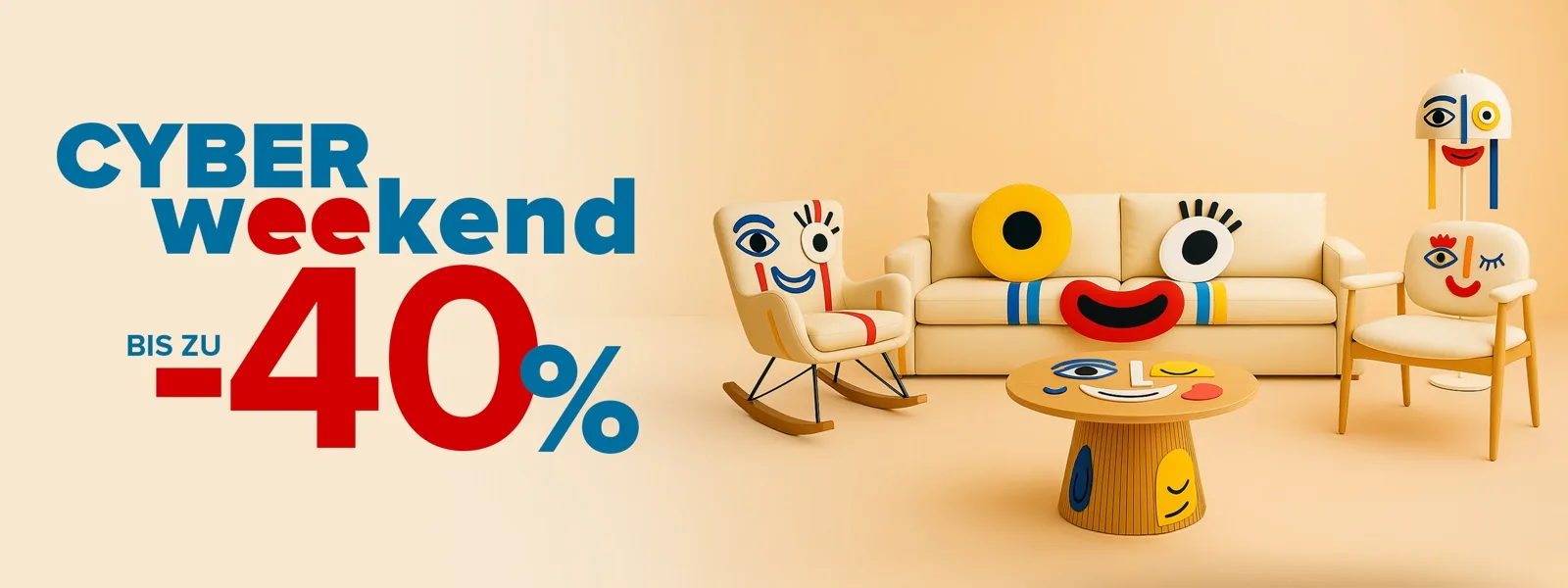
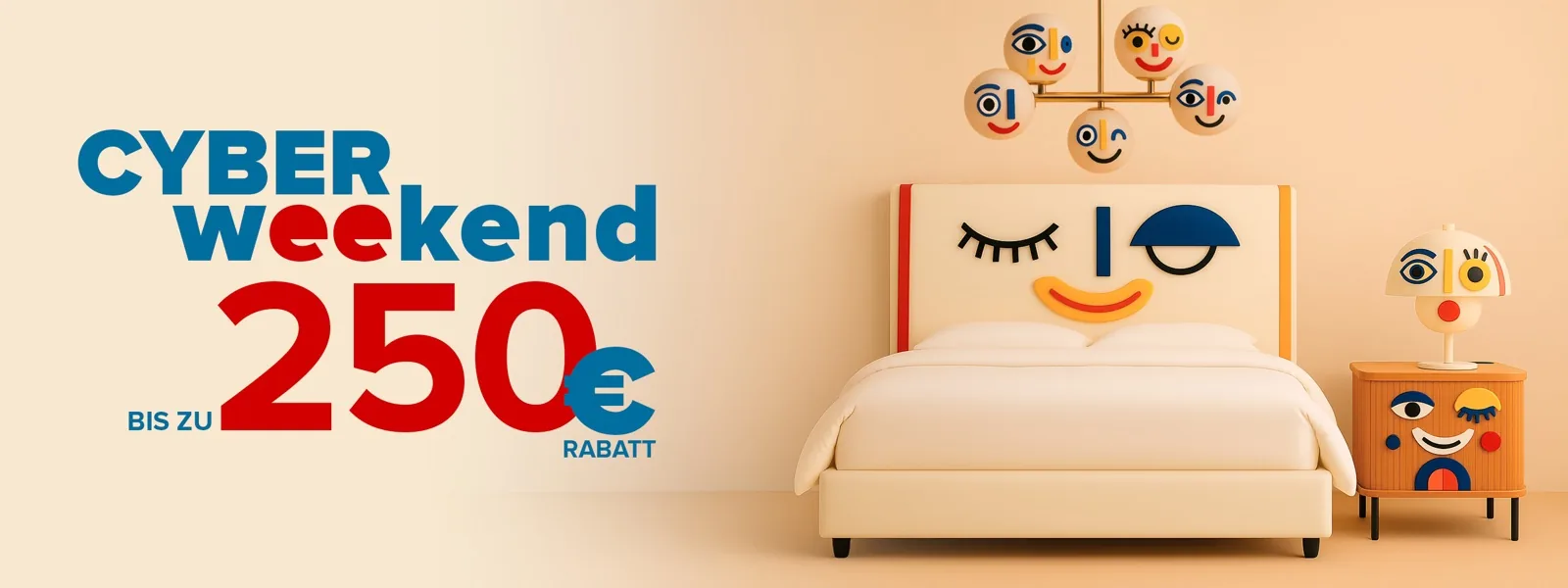
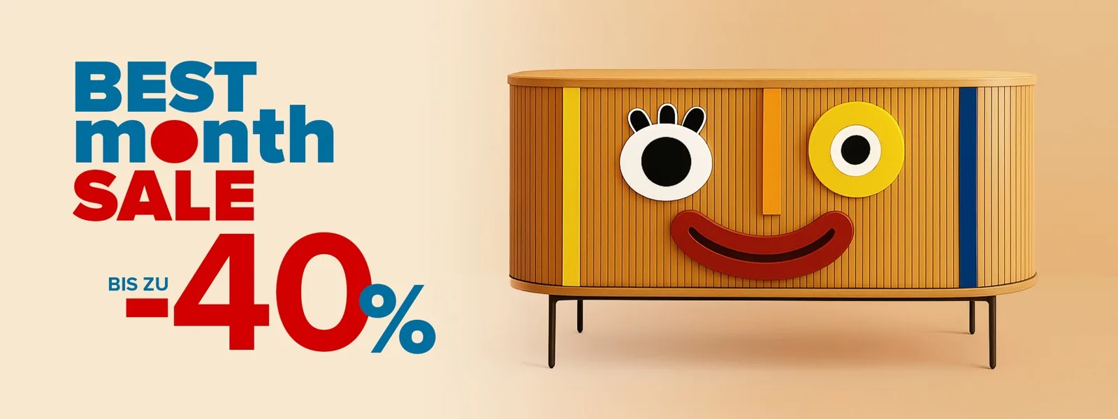
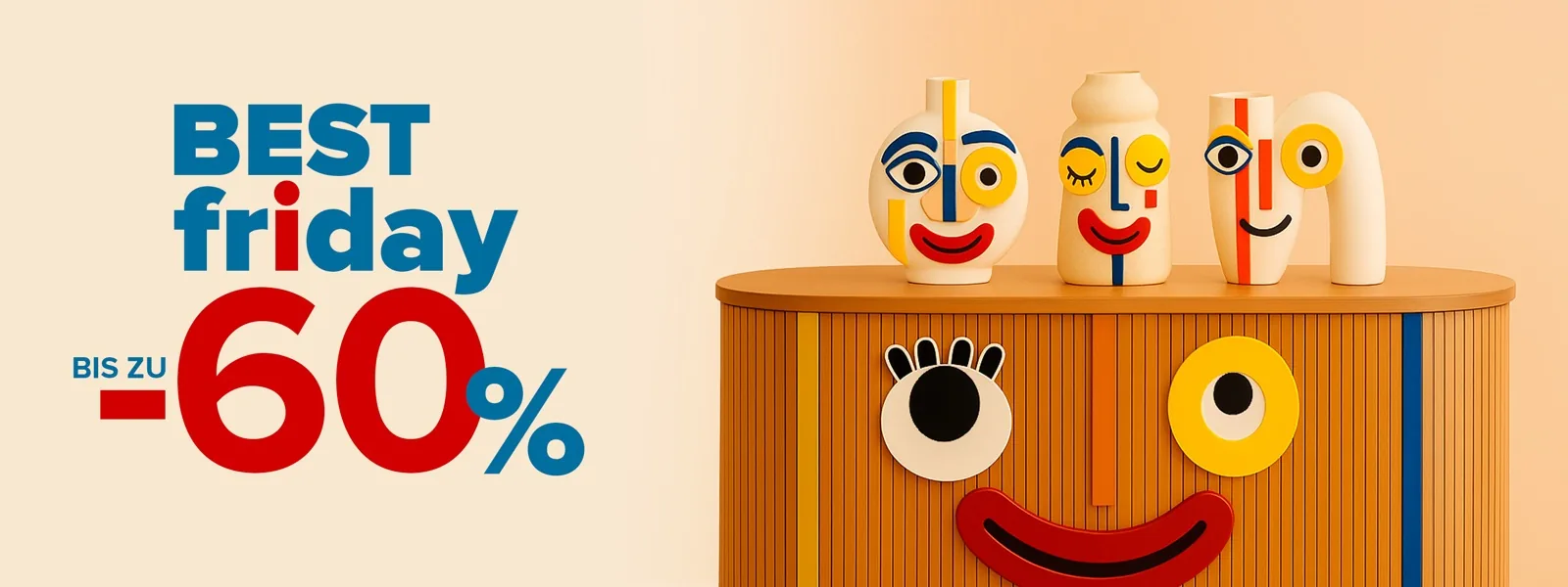
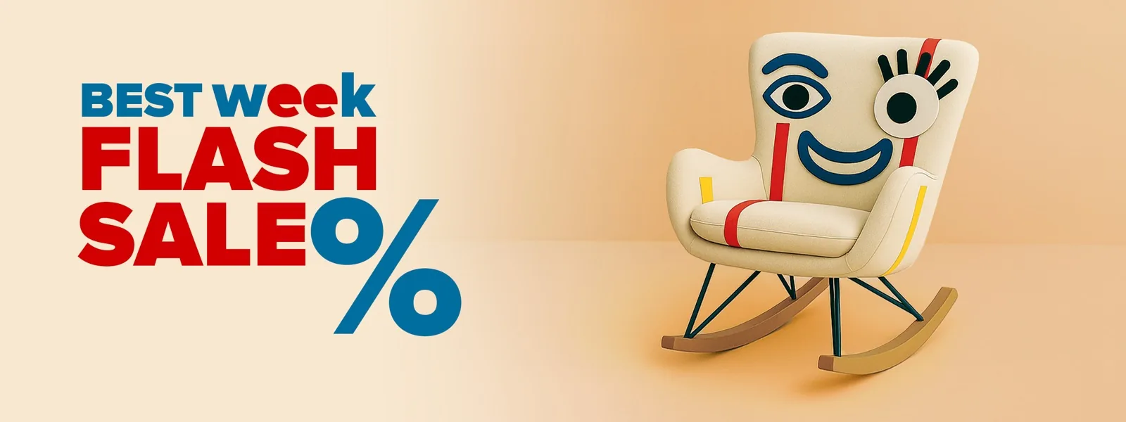
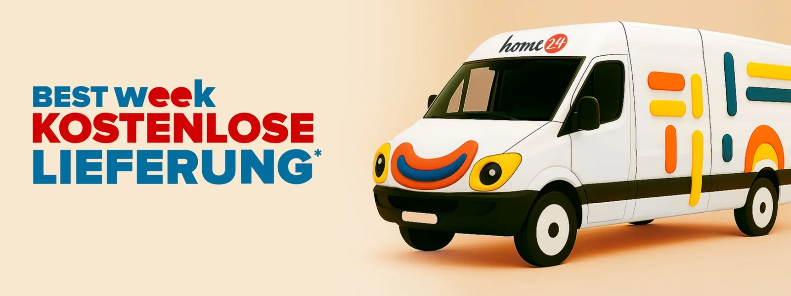
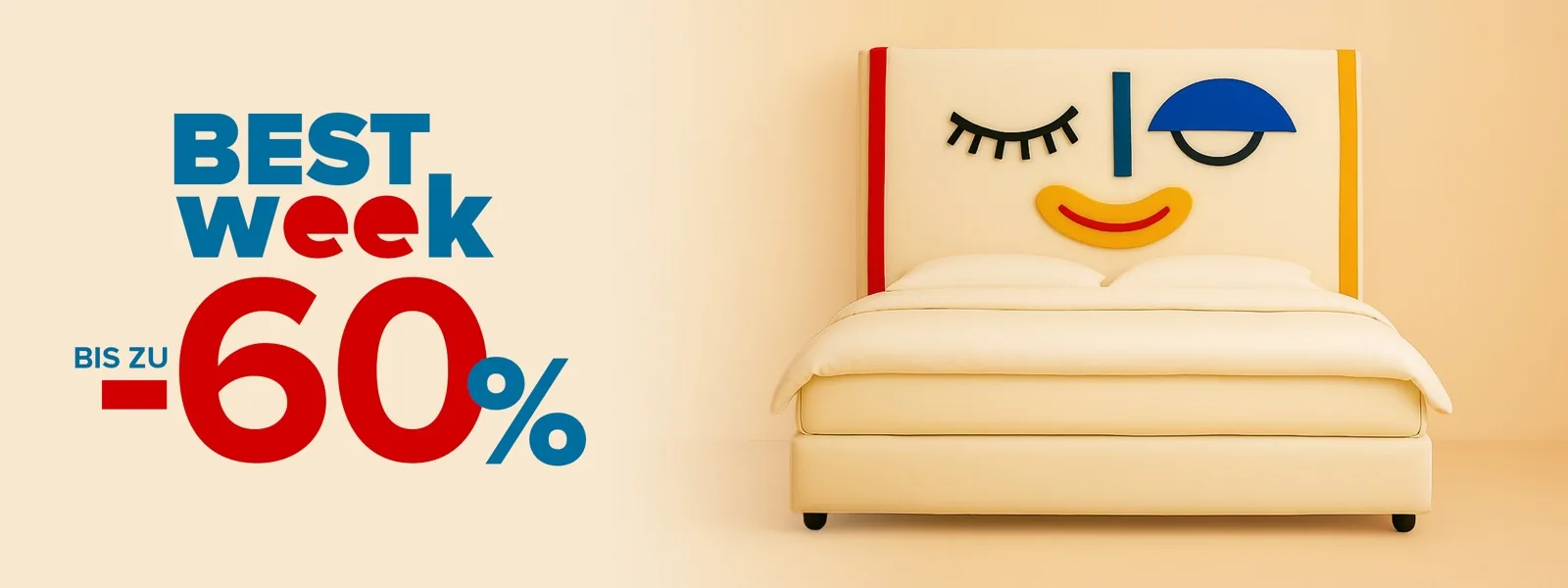
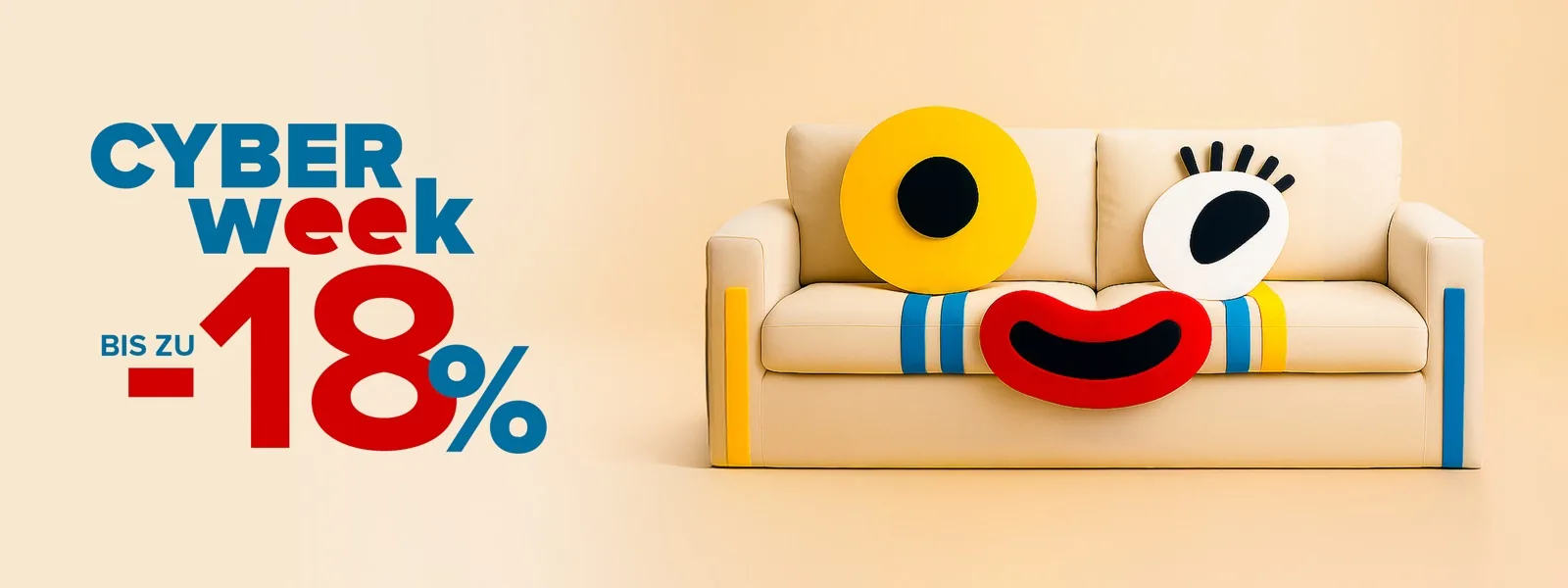
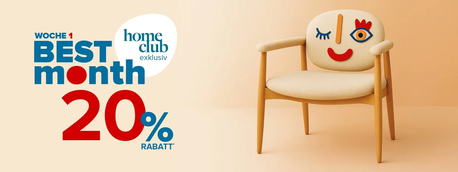
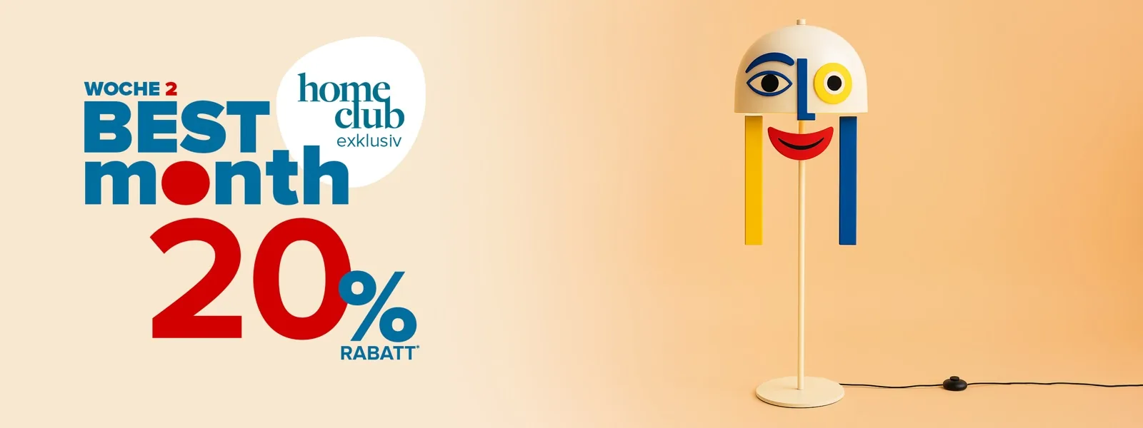
home24's highest-stakes campaign of the year. I proposed the winning concept: give every piece of furniture a face — abstract, geometric, playful, always shoppable. 500 assets in two weeks, 748 AI outputs to get there.
Concept
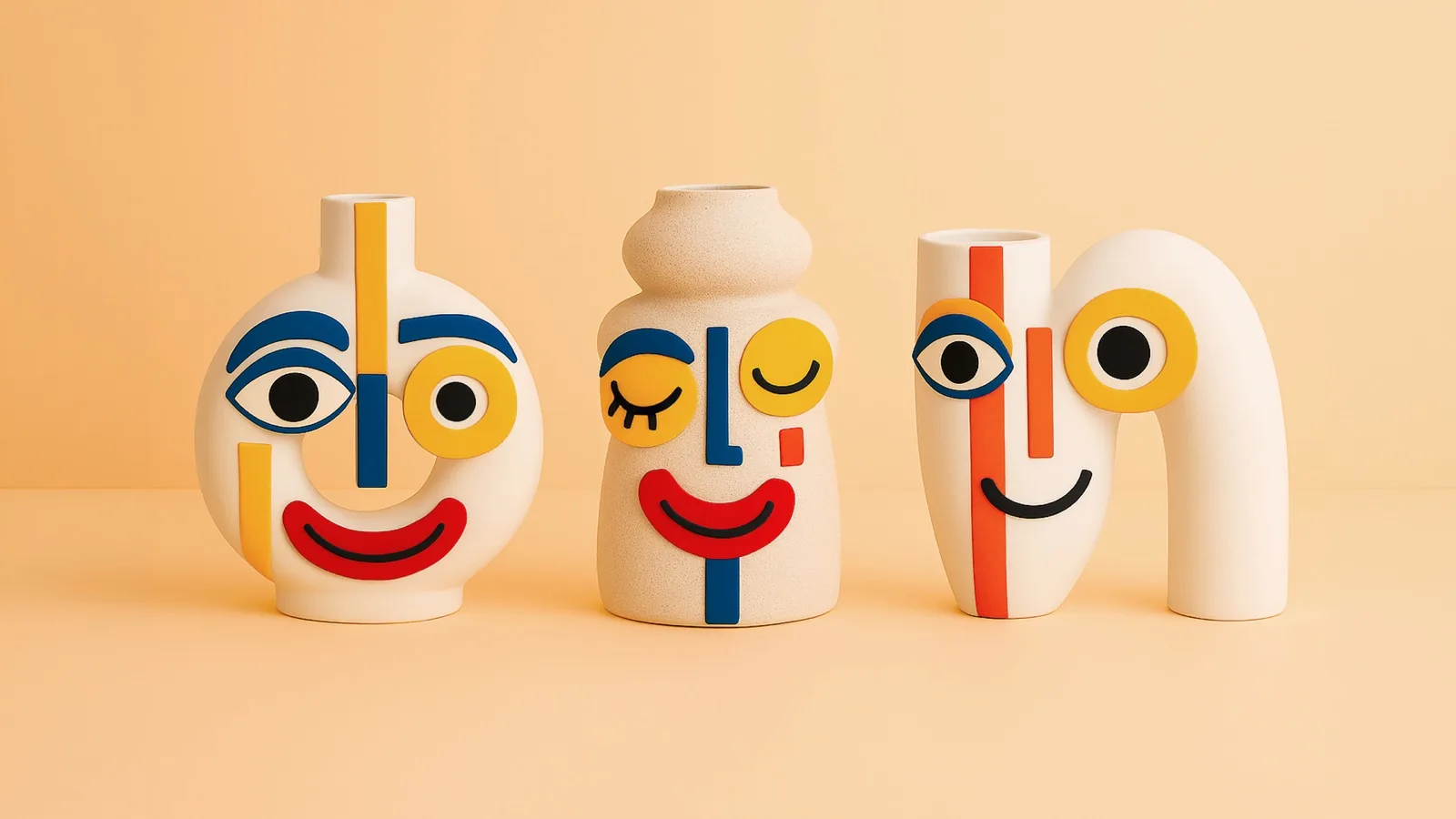
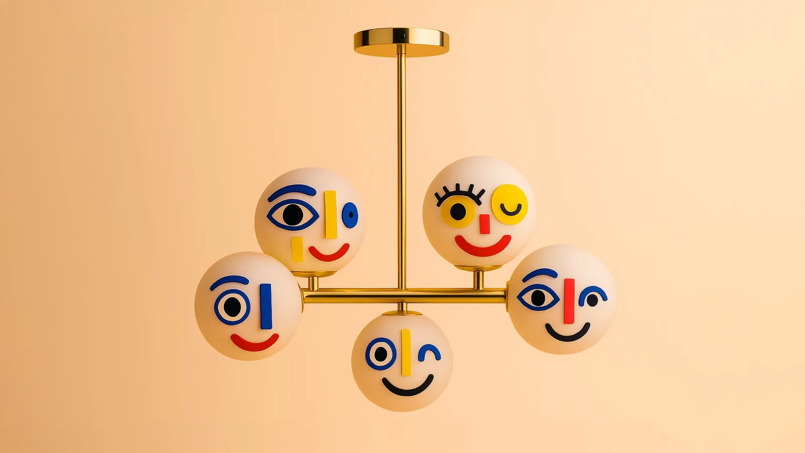
Three routes explored — Origami, Retro, Faces. I proposed Faces: abstract geometric eyes, mouths, and graphic marks applied directly onto each product. The furniture becomes a character without losing its identity.
System
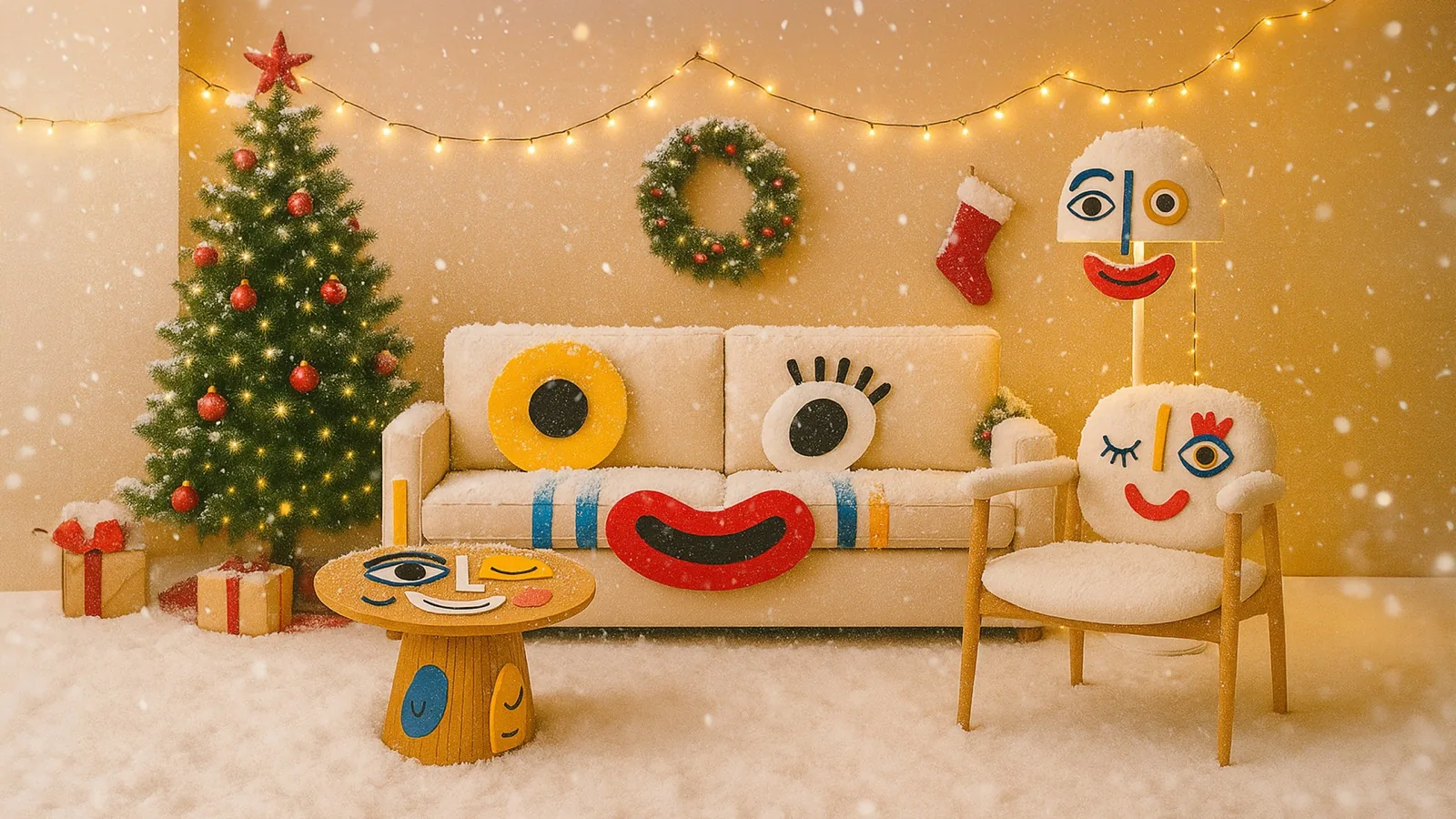
Warm peach background, consistent studio light, bold primary accents. One visual language across 11 products, six campaign phases, and seasonal variants — from weekly banners to a full living room of characters together.
Pipeline
Concept pitch → moodboard & visual direction → tool testing across 6 platforms → Sora selected as primary → iterative generation per product → Photoshop compositing → back to Sora → final in Photoshop + Firefly → banner production across all phases.
Tools
Sora · Runway · Photoshop + Firefly · Nano Banana · Midjourney · Gemini · Claude
Challenges
11 distinct personalities within one coherent system. Constant cycling between Sora and Photoshop — selecting the best variation, combining elements from multiple outputs, feeding refined composites back into generation. Sora won on visual quality; Gemini understood the brief better but couldn't execute.
The concept came from a question: what if sale furniture wasn't just on discount — it was on display as a personality? During an internal AI experimentation week, I proposed Faces and developed the full visual direction: moodboard, key visuals, character system, and phase structure.
Tool selection was empirical. The original direction came from Runway, but testing across six tools revealed Sora as the strongest for photorealistic output — materials looked real. The production workflow became a deliberate loop: prompt with references → select → refine targeting specific details (eye shape, pupil style, mouth) → combine best parts in Photoshop → feed back into Sora.
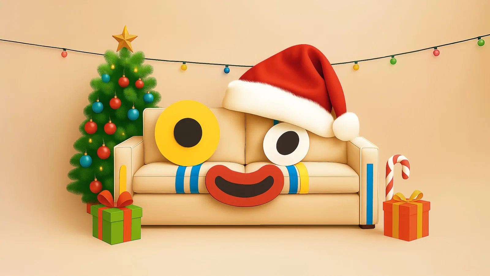
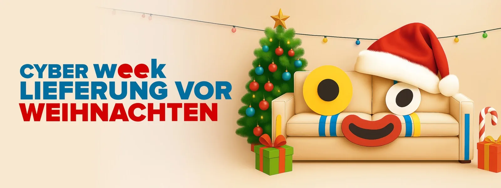
748 outputs across 11 products. The system scaled from single banners to multi-character compositions to the same sofa in a Santa hat for Christmas. 500 final assets delivered in two weeks — 70% faster than previous production cycles, saving a month. Presented the full workflow at the company town hall.
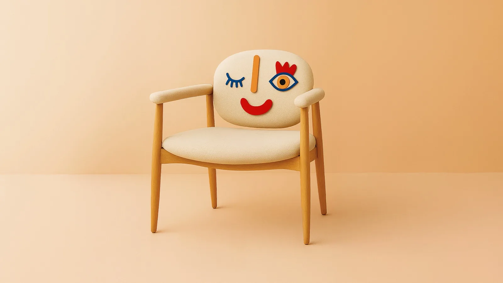
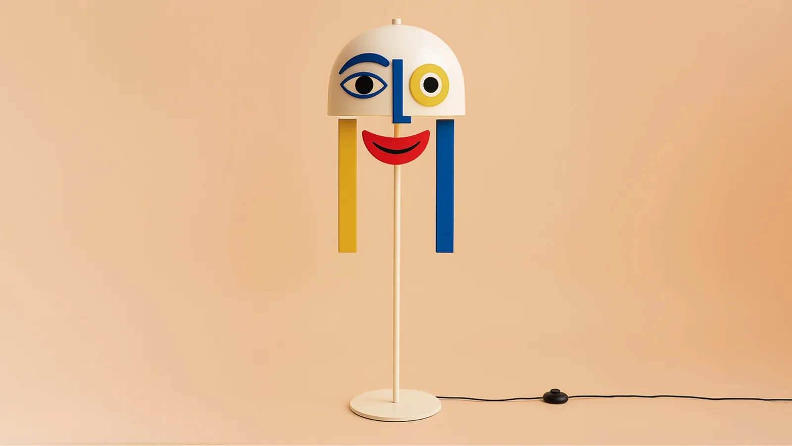
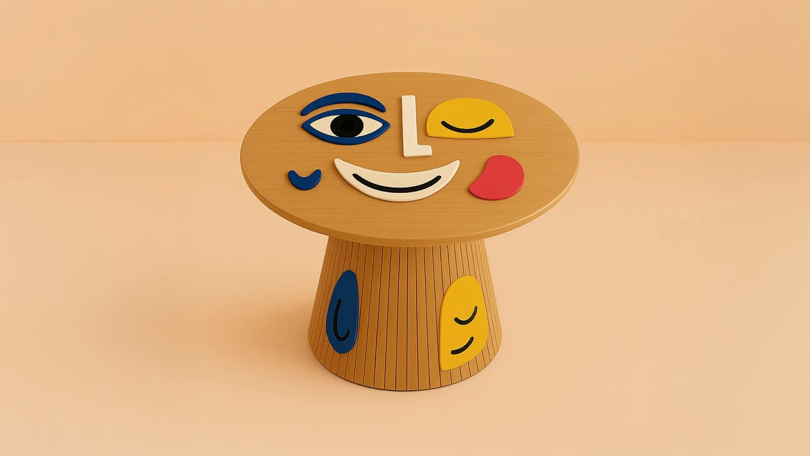
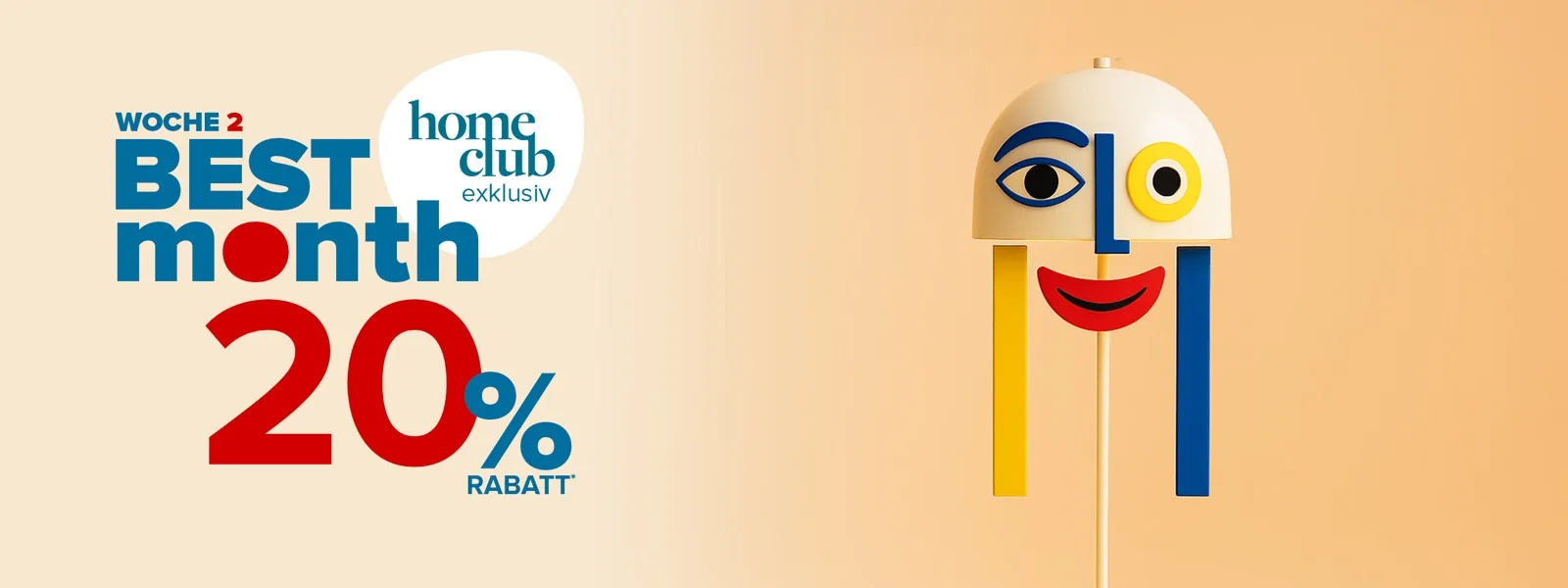
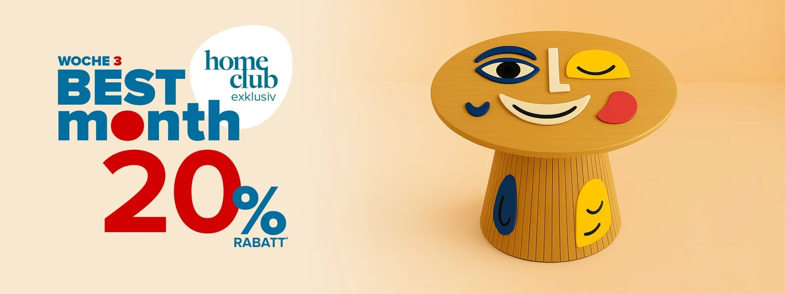
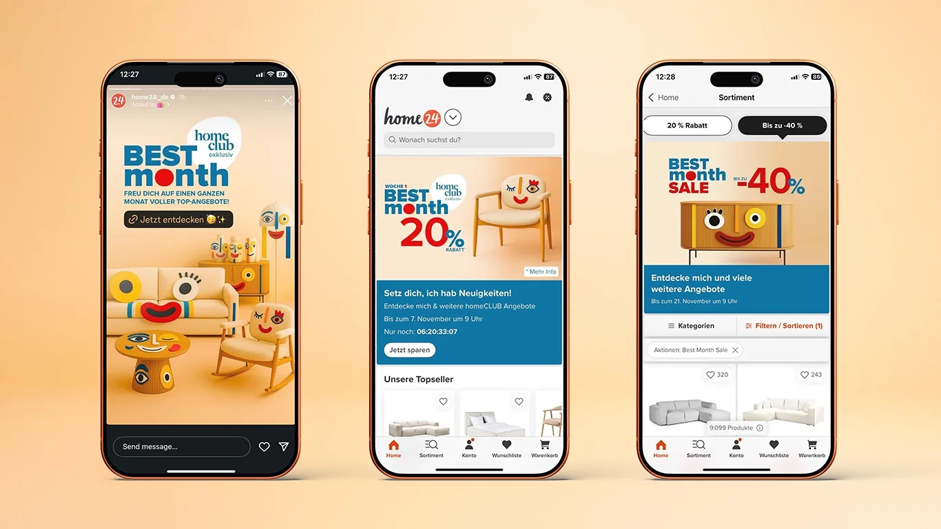
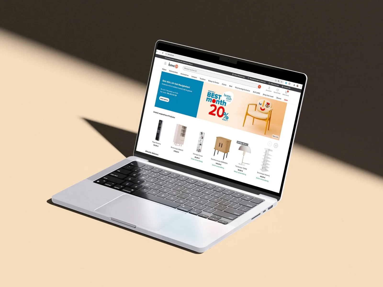
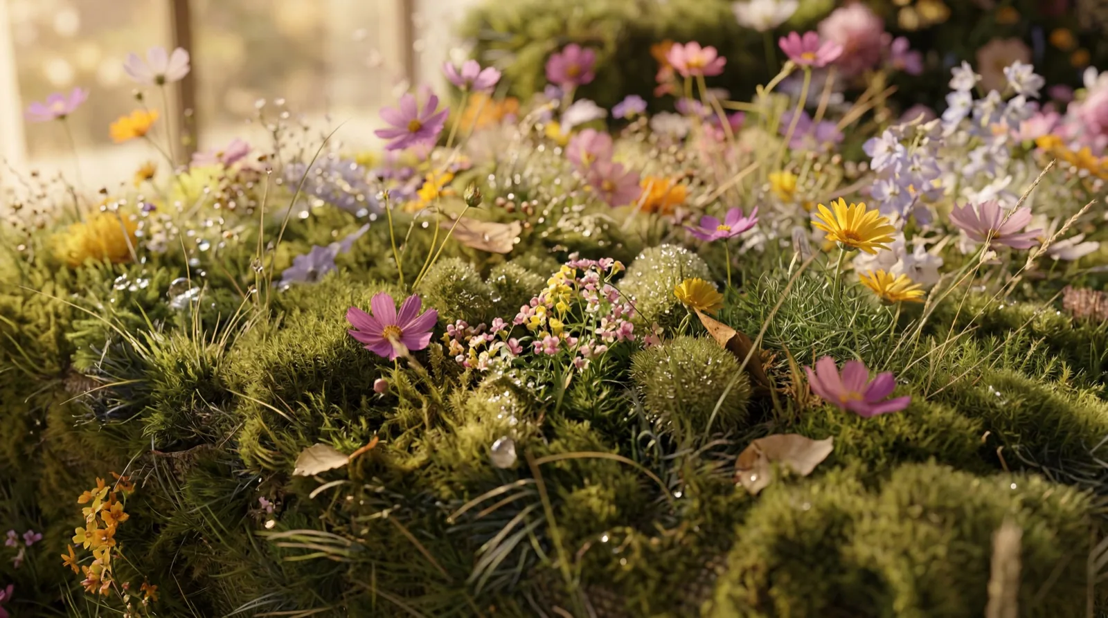
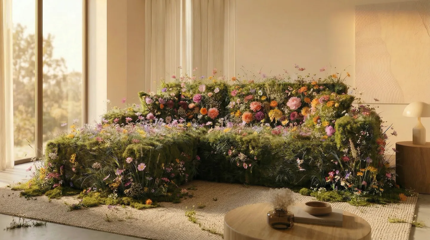
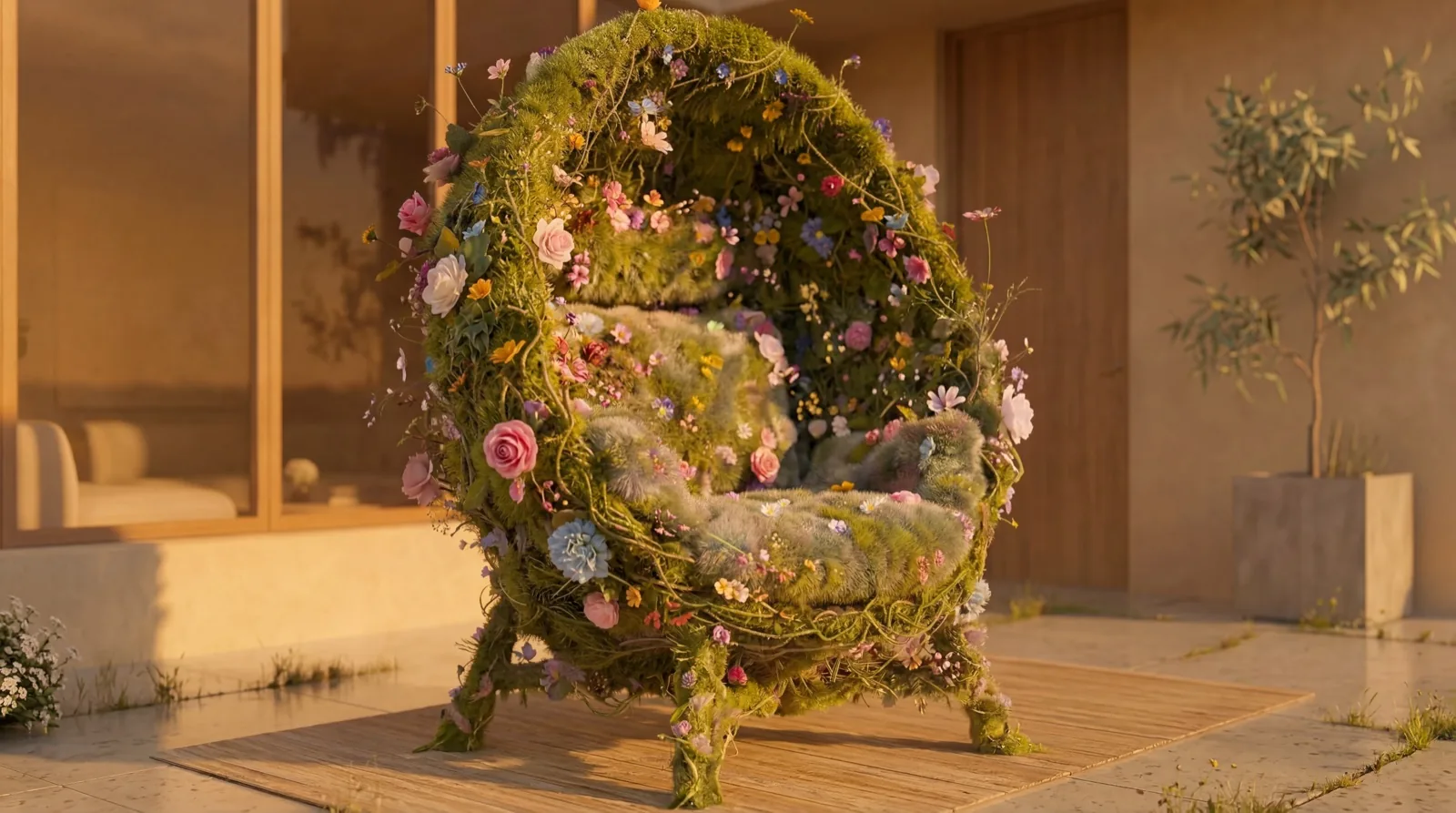
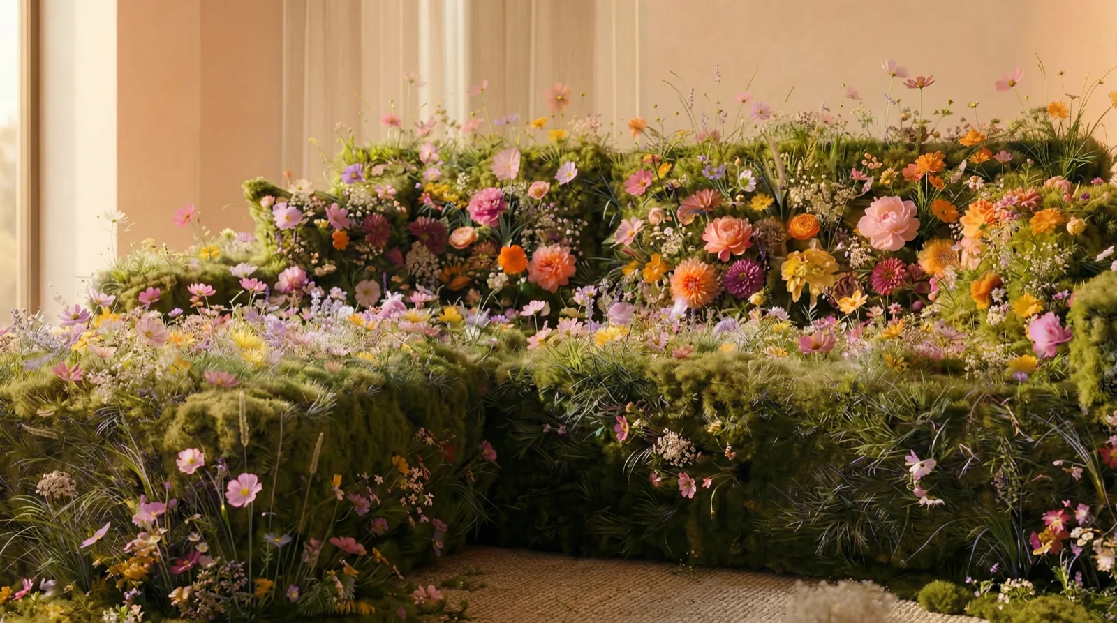

home24's spring sale across 6 markets. The concept: products physically constructed from living nature — moss, wildflowers, vines. Both campaign phases share one location: the botanical sofa lives inside, the overgrown chair sits in the same house's garden. Spring awakening, indoors and out. ~150 assets, produced through a custom pipeline built to keep one visual direction consistent at scale.
Concept
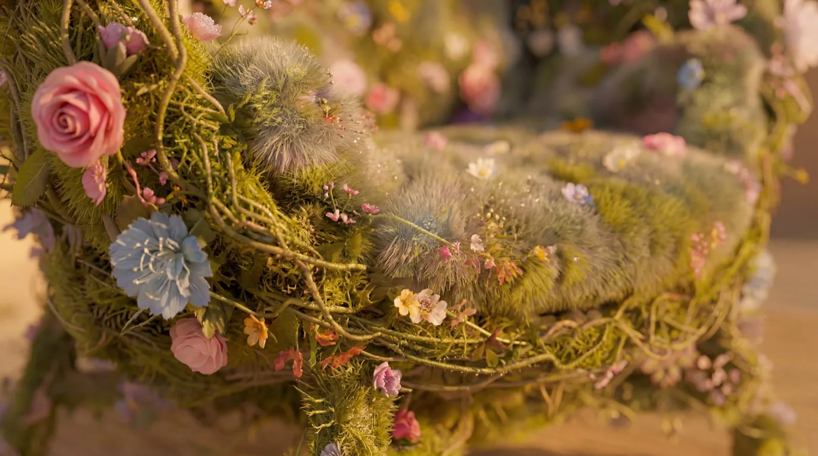
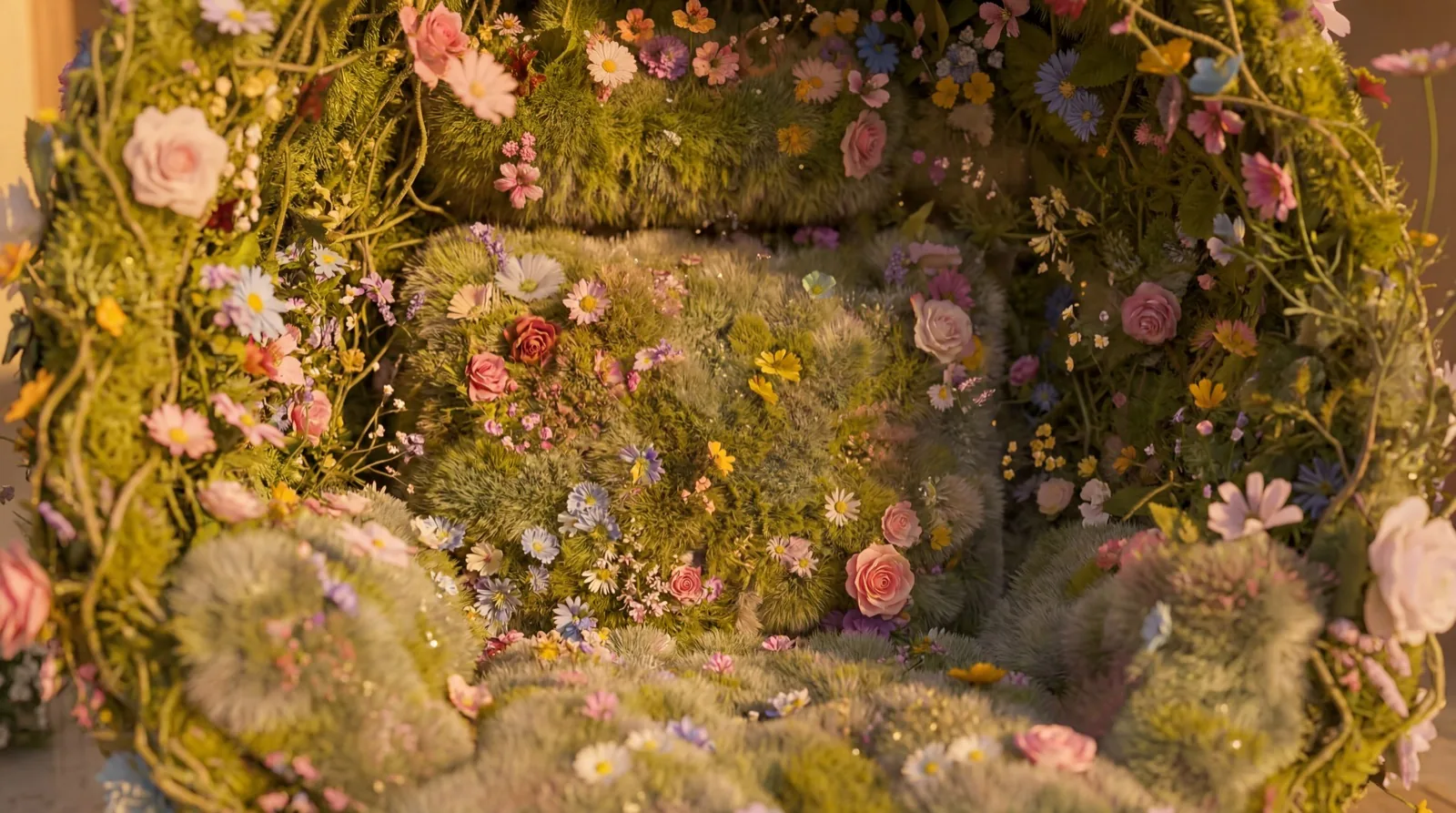
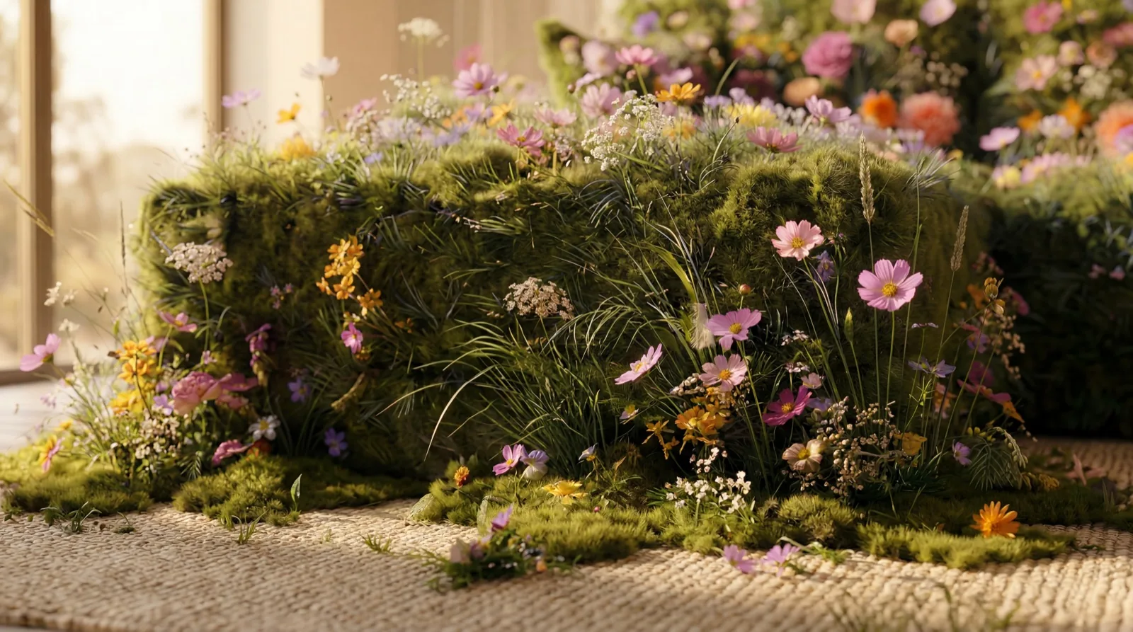
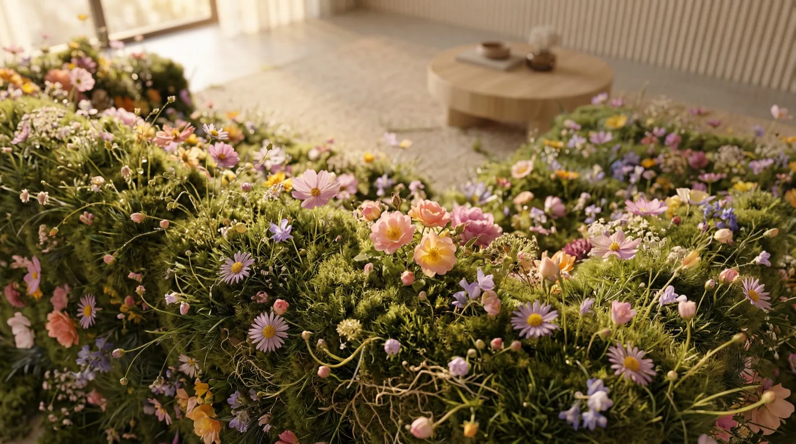
The brief: a 4-week spring sale across 6 markets in two phases. Instead of the usual "products in a spring setting," I flipped it — the products are physically constructed from living nature. A modular L-shaped sofa becomes a dense meadow of wildflowers blooming from moss and grass. An egg chair becomes a topiary of vines and peonies. The furniture is recognizable by its silhouette, but its material is spring itself.
Visual direction
Warm golden-hour light, luxury interiors with floor-to-ceiling windows opening onto gardens. The botanical furniture sits in real spaces — photorealistic, no fantasy effects. The goal was master-florist quality: wild but curated, dense but varied. Phase 1 (outdoor chair, -20%) and Phase 2 (indoor sofa, -30%) each got a distinct hero product — but both live in the same location. The garden of the house is Phase 1, the living room is Phase 2. One world, two moments of spring.
Pipeline
Built a custom workflow in Runway connecting Gemini Flash (prompt generation from reference images + art direction brief) → Nano Banana 2 (image generation) → iterative refinement through the pipeline → Photoshop for final adjustments and banner production.
Tools
Runway (pipeline orchestration) · Gemini Flash (prompt writing) · Nano Banana 2 (image generation) · Photoshop
What makes this different
The art direction is encoded in the system. Instead of prompting one image at a time, the workflow translates reference images and written direction into structured prompts, generates, and loops back through refinement — so every one of ~150 assets answers to the same creative brief. A system under direction, not one-off prompting.
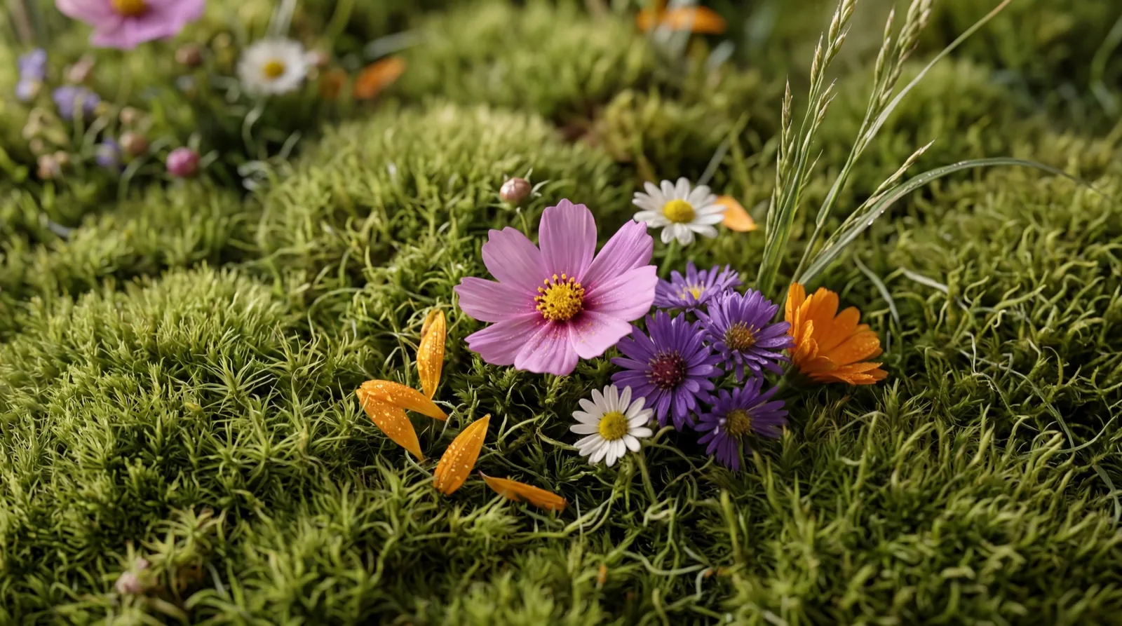
The concept started with a question: what does "spring awakening" actually look like if you take it literally? Not flowers next to furniture — flowers as furniture. Each product's silhouette is preserved, but its surface becomes a dense botanical structure of moss, wild grasses, and thousands of varied wildflowers.
To hold this direction at campaign scale, I designed a custom pipeline in Runway. Product reference photos and art direction briefs feed into Gemini Flash, which generates structured prompts specifying botanical density, flower variety, lighting, and composition. Those prompts flow into Nano Banana 2 for generation, then cycle back through refinement nodes — "clean up the flowers on the corners," "improve quality keeping it realistic," "place plants and vines on the legs." The pipeline made iteration systematic rather than manual.
While building the two hero visuals, I realized both phases could share one location — the same house, inside and out. The overgrown egg chair sits in the garden, the botanical sofa lives in the living room. That connected the two phases into a single narrative instead of two separate campaigns.
Around 150 final assets were delivered across 6 markets and 2 campaign phases — each with its own hero product, discount structure, and banner set.
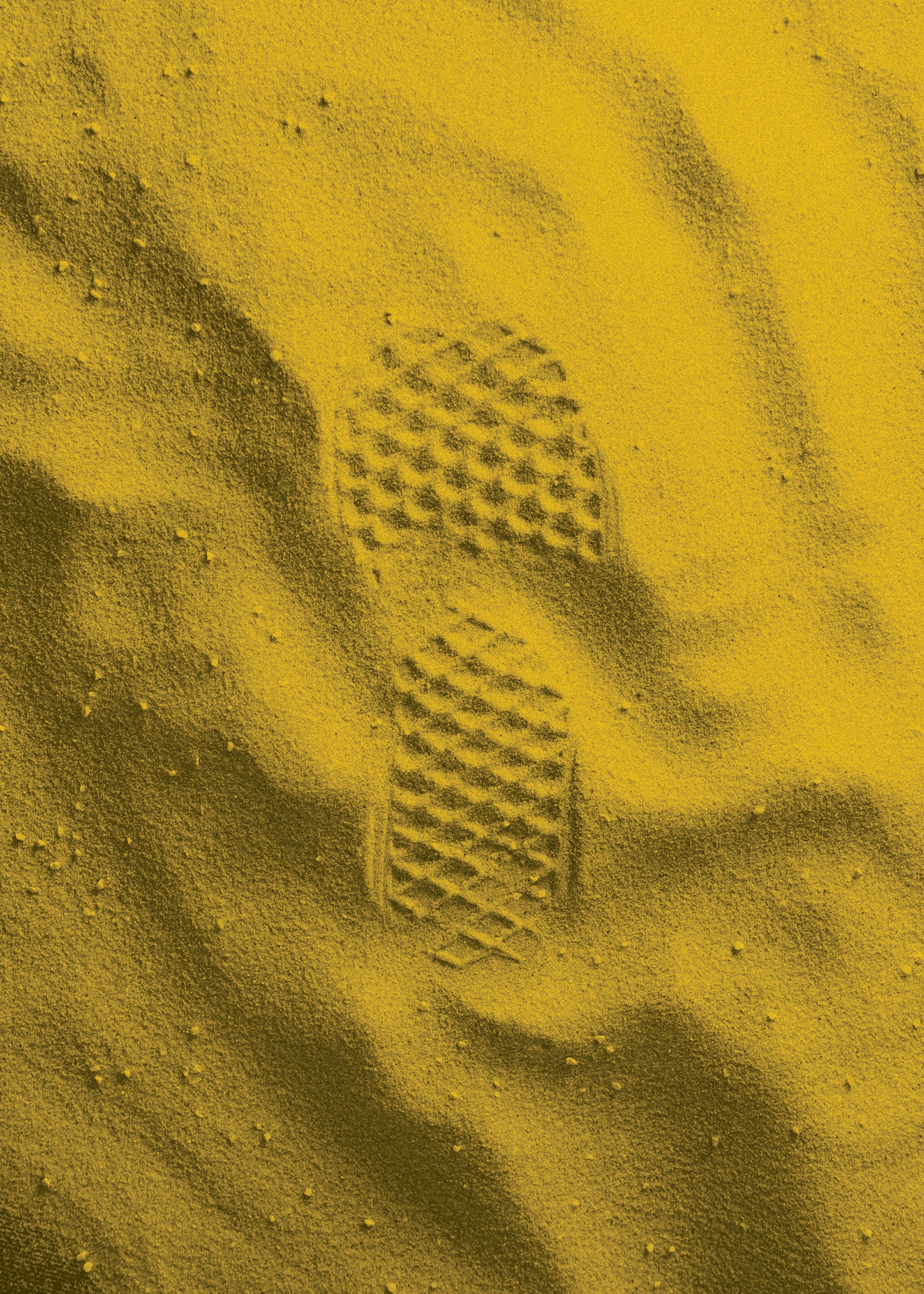
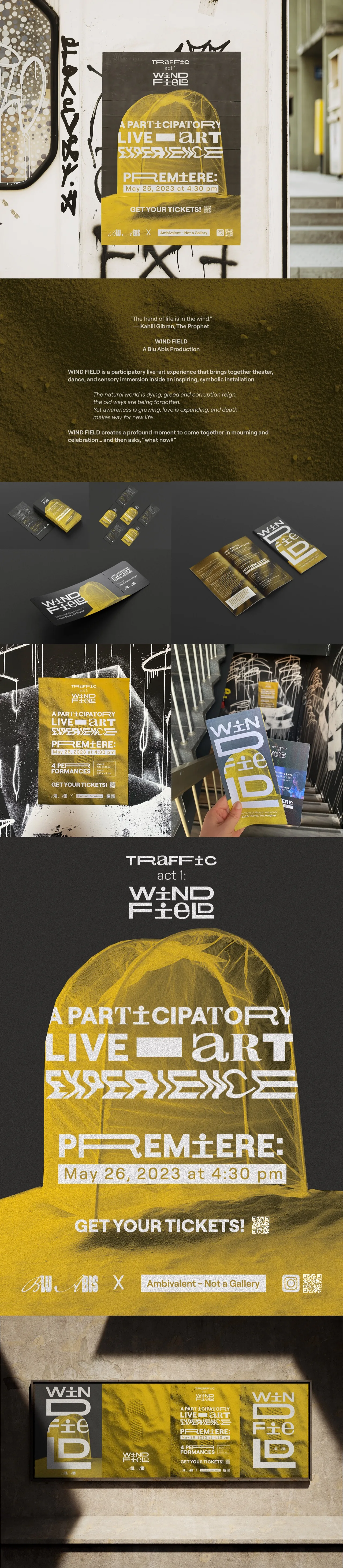
Visual direction for a participatory live-art experience blending theater, dance, and sensory installation. Started with building and photographing a physical set — curated objects, symbolic compositions. Then extended the visual world through AI-assisted concepting and motion design.
Concept
Wind Field is an immersive experience about mourning and renewal — the natural world dying, awareness growing, death making way for new life. The visual language needed to carry that tension between decay and growth.
The starting point was physical: a set built from curated objects arranged into symbolic compositions, then photographed. Those images became the raw material for everything that followed.
Pipeline
Physical set design & photography → AI-assisted narrative development (ChatGPT, Claude) → moodboards and visual prototyping (Midjourney) → final visuals (Photoshop) → motion assets (After Effects).
Tools
Physical set design · Midjourney · ChatGPT · Claude · Photoshop · After Effects
What this shows
The foundation is physical. The set existed before any prompt was written. AI extended the visual world — it didn't replace the scenography.
The project began with hands and materials, not screens. I built a physical set focused on curated objects and symbolic arrangements, then photographed it as the raw visual base.
From there, Claude and ChatGPT helped refine the narrative arc and conceptual framework. Midjourney was used for rapid moodboarding and visual prototyping — testing directions before committing.
Final visuals were crafted in Photoshop and animated in After Effects to produce the campaign's motion assets.
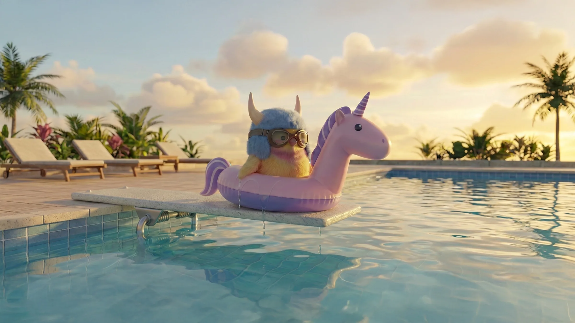
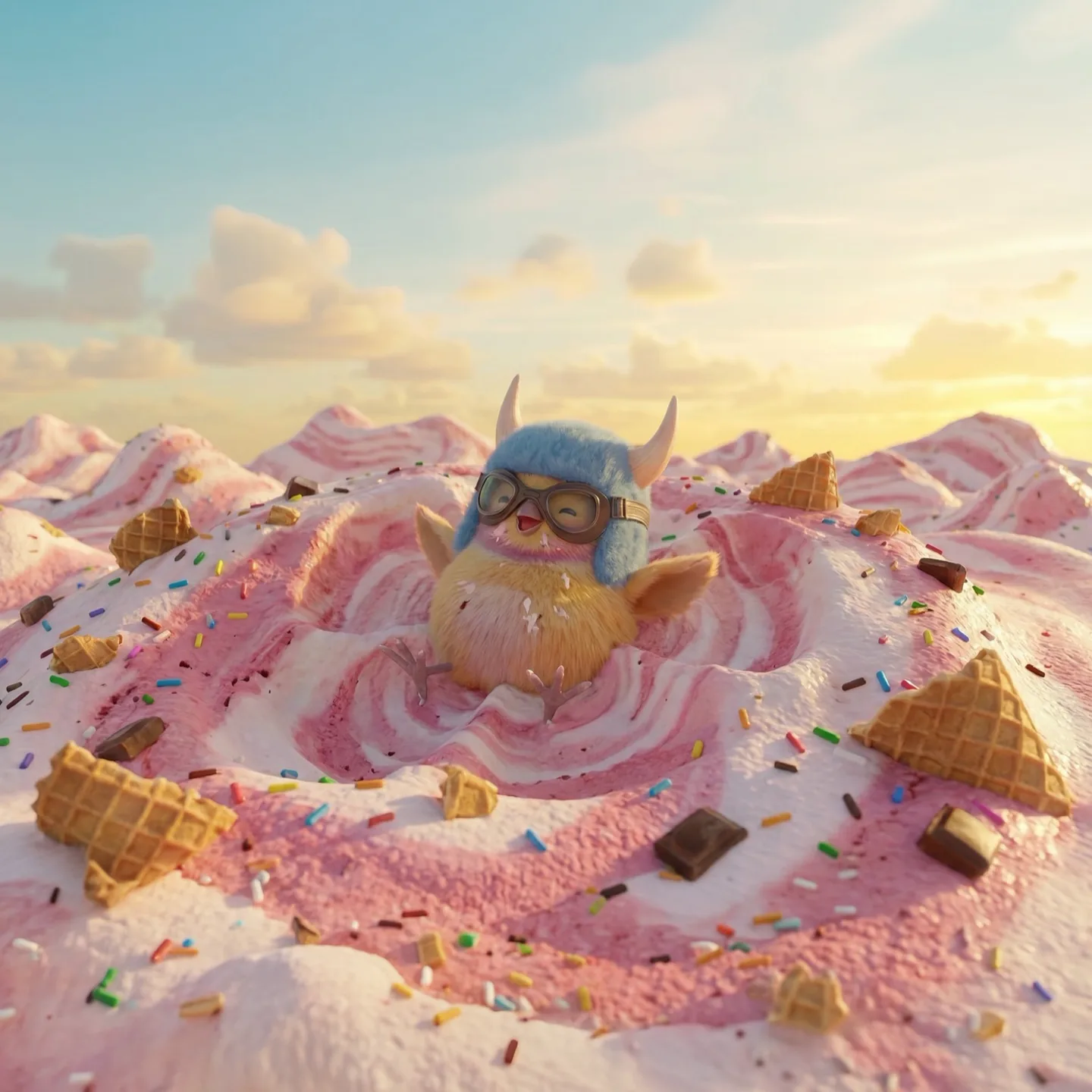
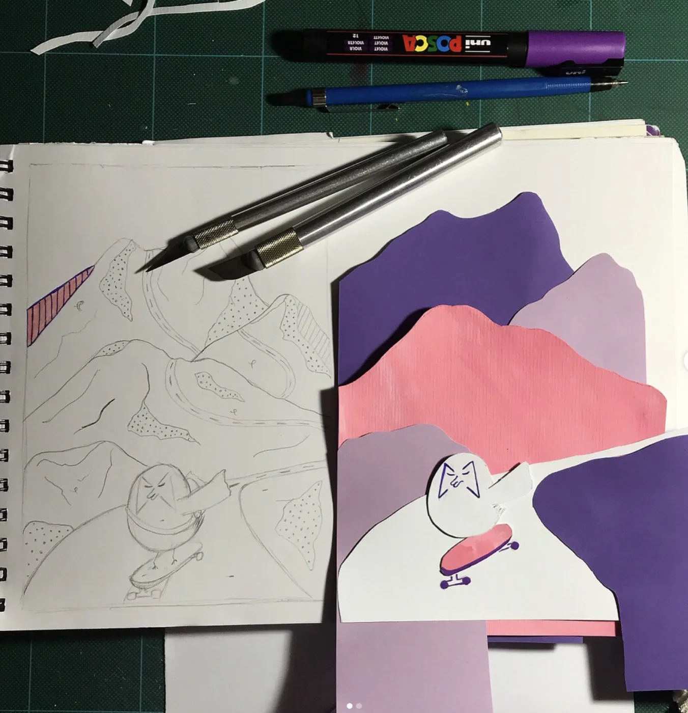
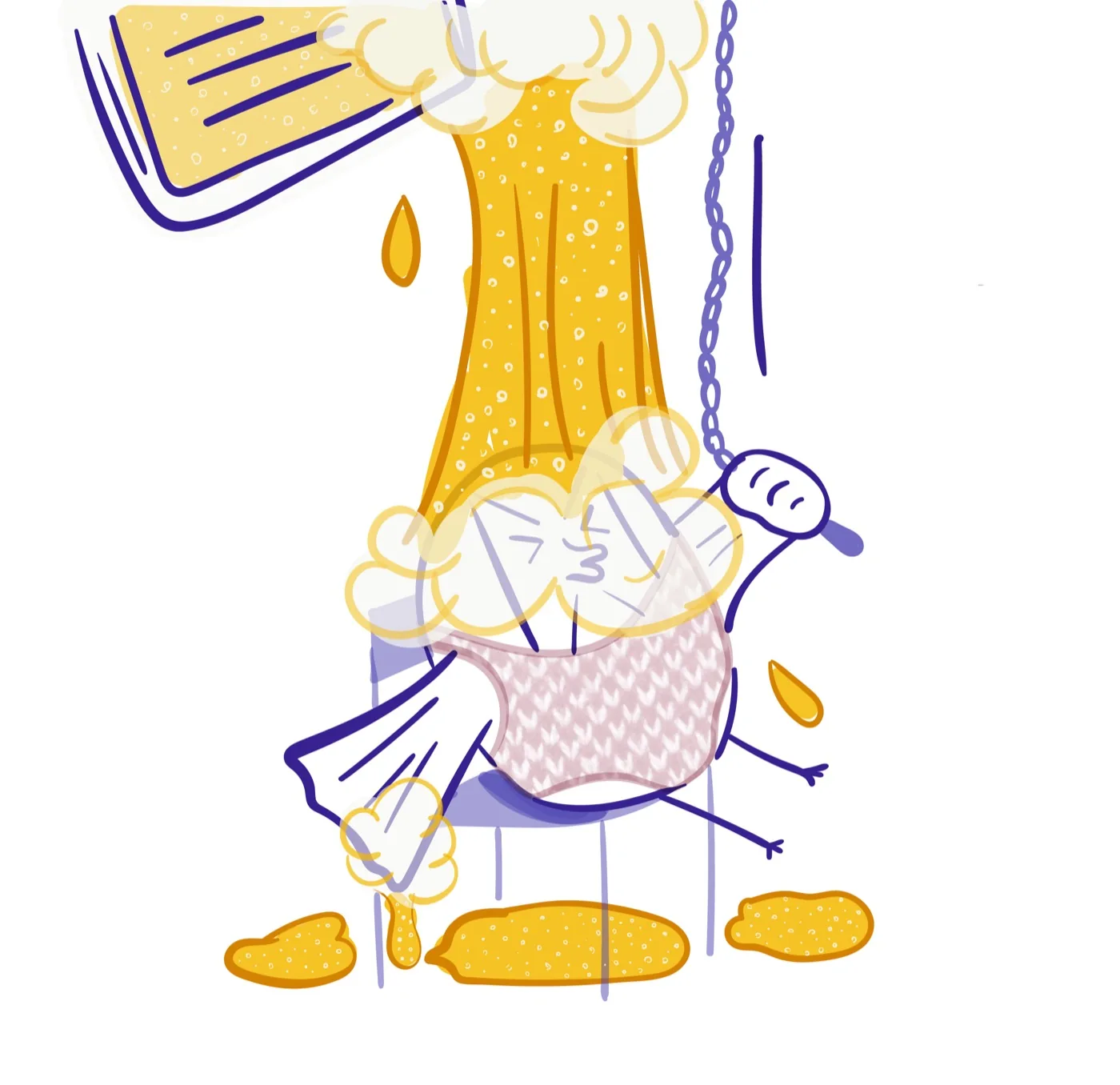
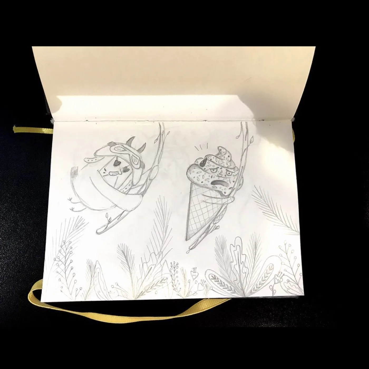
Wallace was born on paper in a character design course. A round, grumpy, sweet-toothed bird in a horned helmet — I gave him my personality and let him keep it. I drew him, posted him, and left him there for nine years. Not because he didn't work. Because he couldn't move, and animating him meant a team and a budget I didn't have.
AI changed what was possible. Nine years of decisions were still sitting there, waiting.
The character
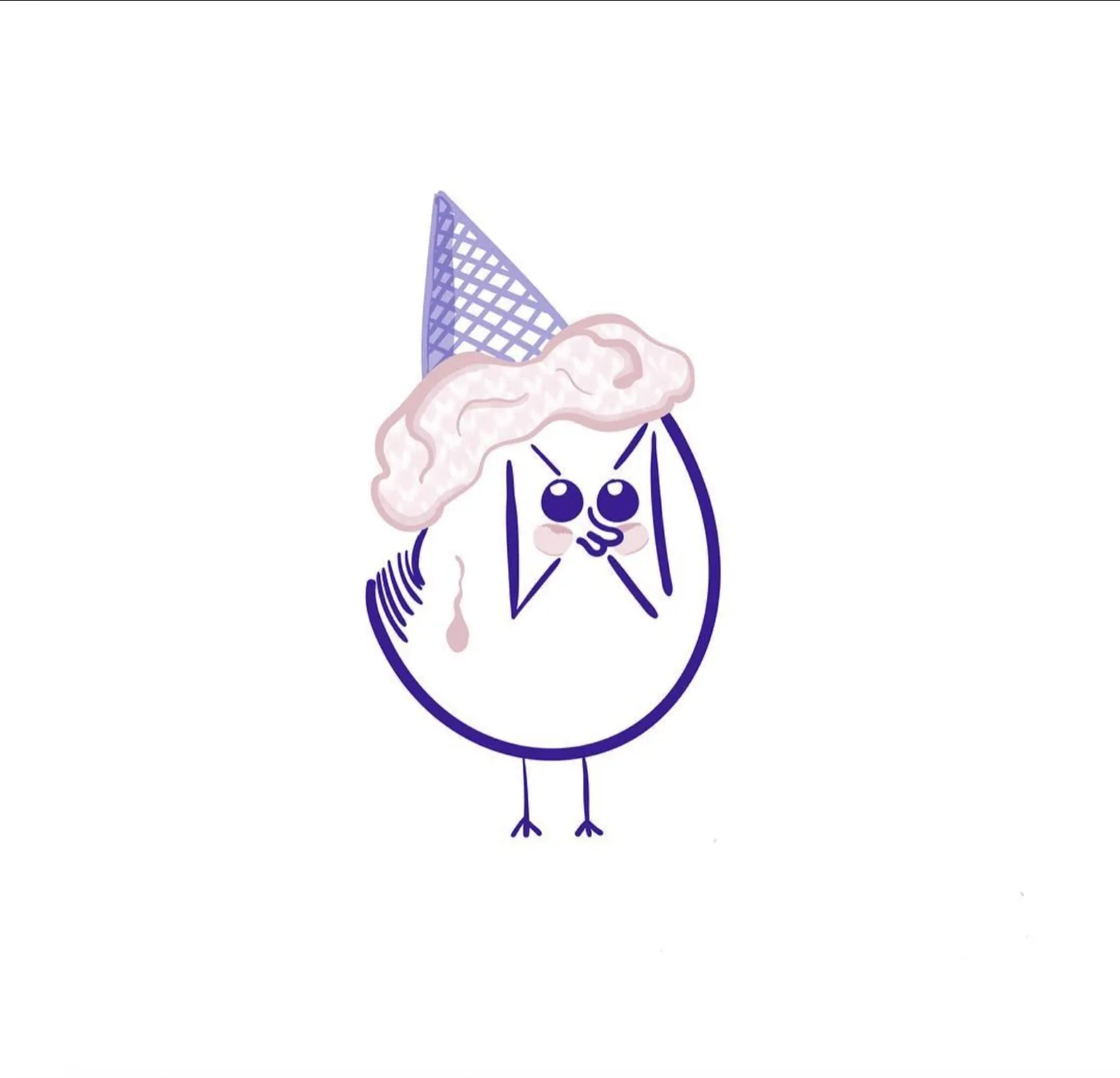
Grumpy, greedy, permanently convinced he's fine. He's been obsessed with ice cream since 2017 and I have the drawing to prove it.
The pattern
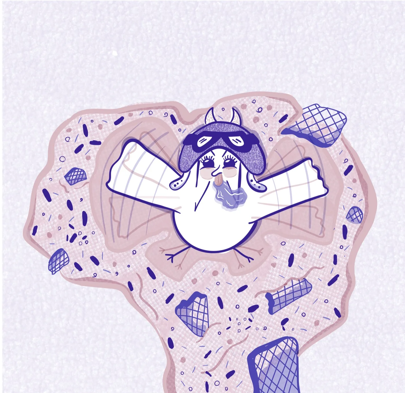
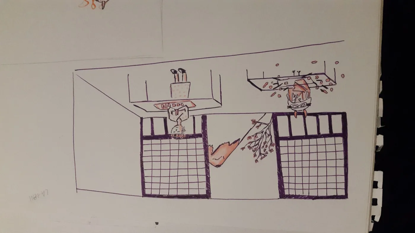
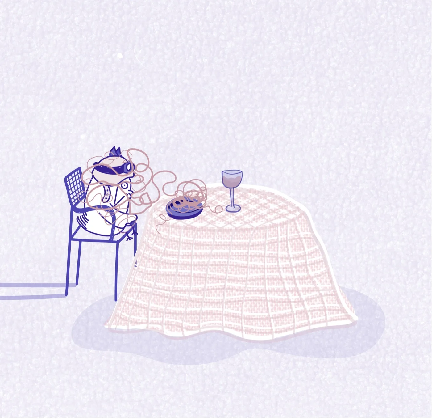
Three scenes, written separately, turned out to share one structure: a world of pure pleasure, total confidence, an absurd interruption, a hard cut. I didn't plan it. I recognized it — and then I directed it.
Pipeline
Paper exploration → character sheet → identity lock → image generation in Gemini → animation in Veo → scene direction across three worlds.
Tools
Veo · Gemini
Challenges
Paper Wallace is a black line. Generative 3D has no idea what a line is — it does volume, fur, light. Feeding the drawings in and hoping would have given me a different bird.
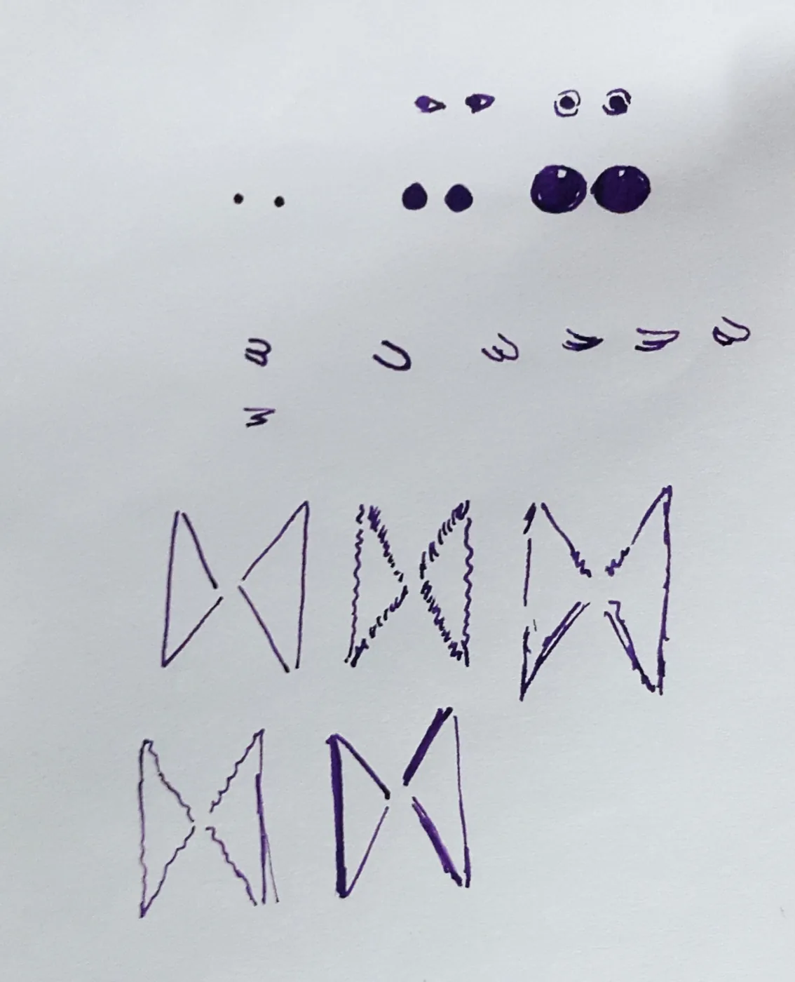
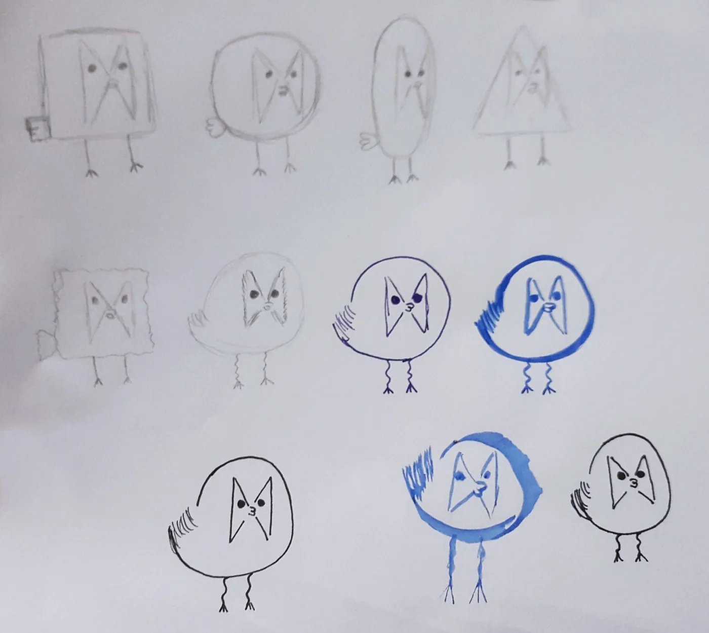
Silhouette first: square, oval, triangle, circle — tested and rejected. The teardrop won because it carries the contradiction. A body too heavy for its legs. A bird who shouldn't be able to move fast, and never stops trying.
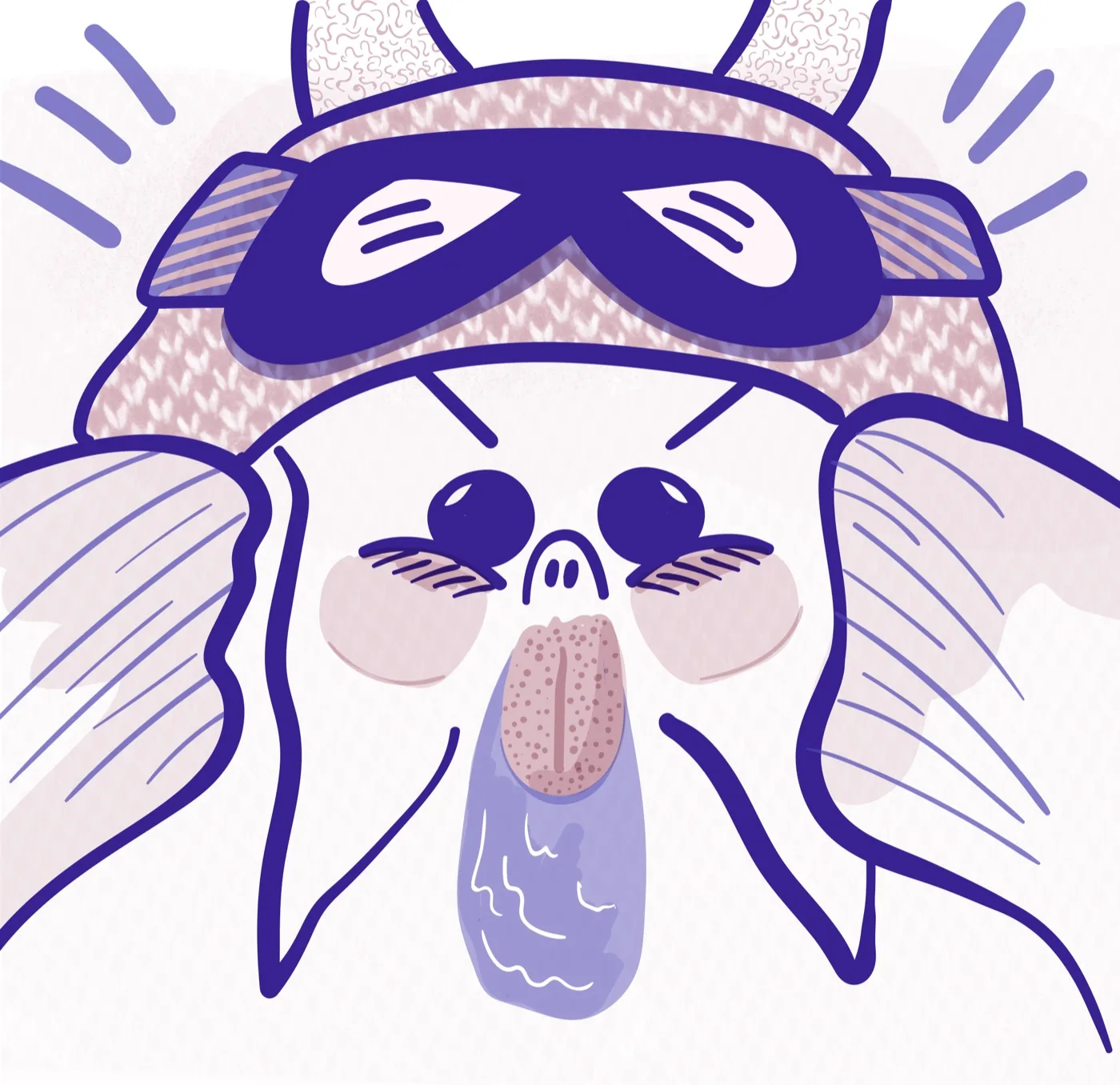
Then the face, studied as parts instead of a drawing: eye weights from pinpoint to full gloss, beaks in isolation, the inverted-V mask that makes him look furious without a single eyebrow.
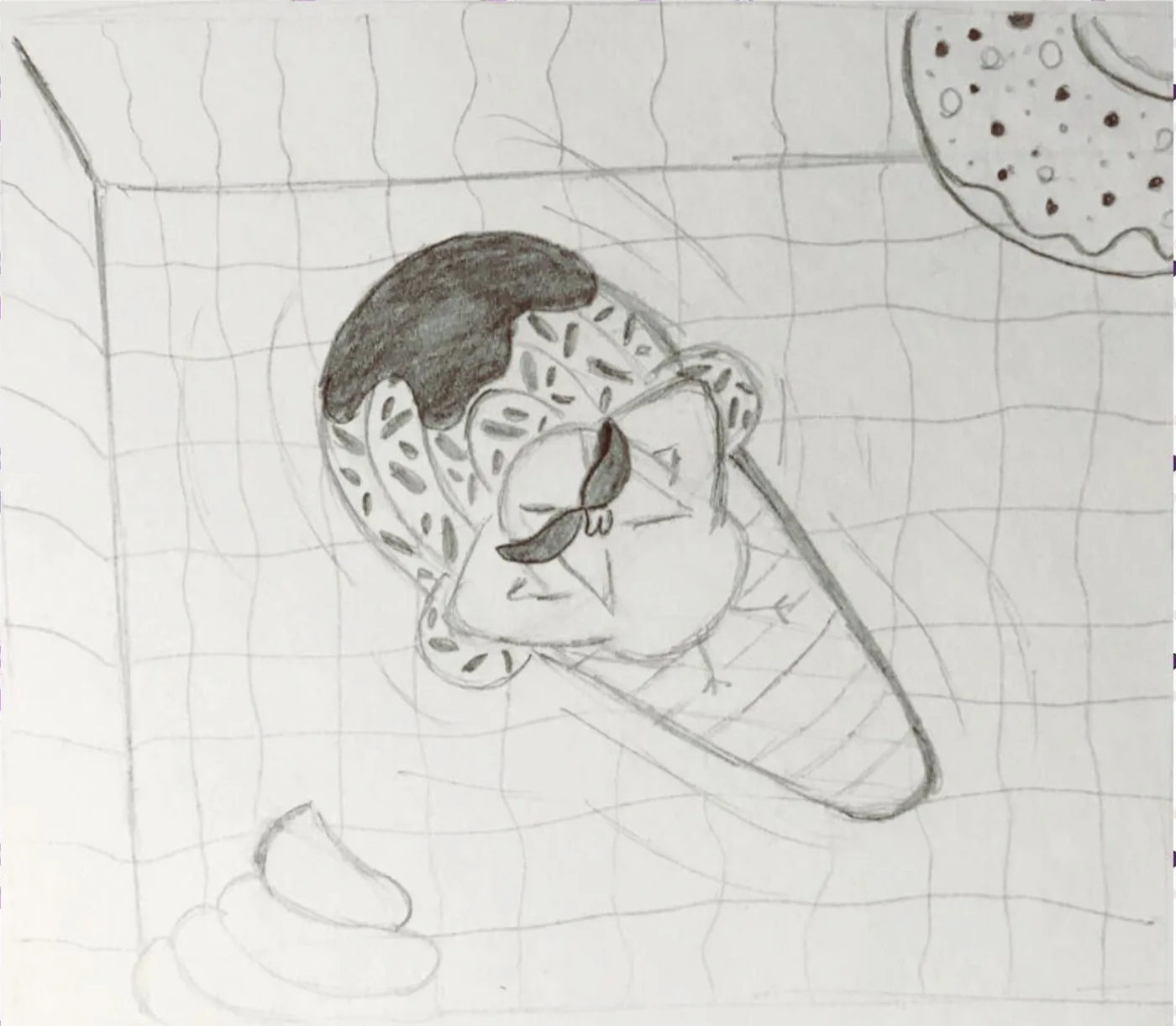
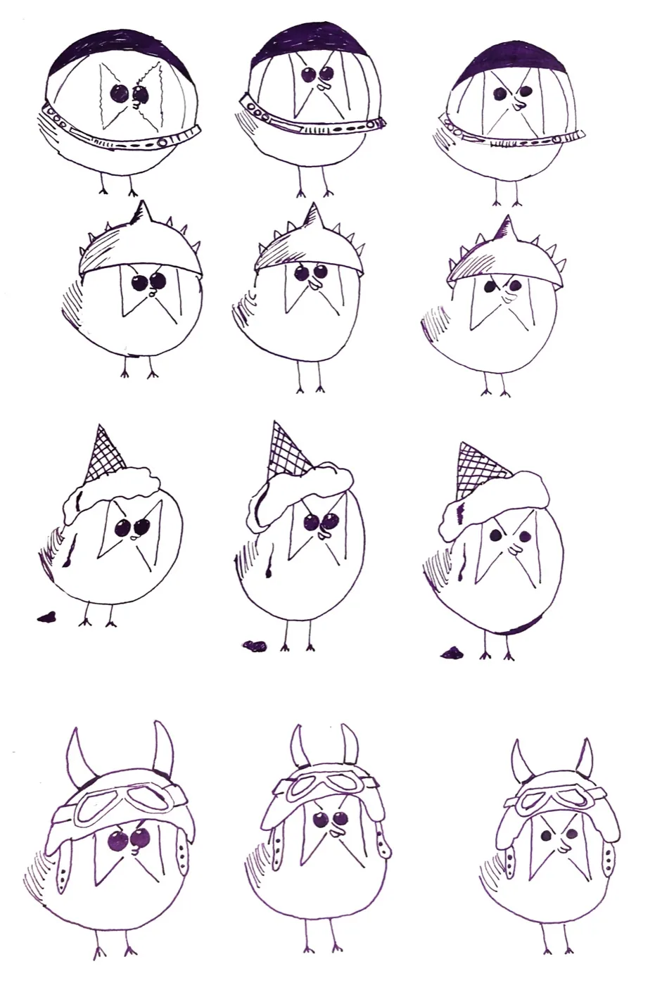
Then accessories, numbered and compared on one sheet: astronaut helmet, punk crest — "Rock Bird" in my handwriting next to it — an ice cream cone melting over his head, aviator helmet with horns. The Viking helmet won because it holds three things at once: rock, flight, and a bird who takes himself seriously when nothing justifies it.
I didn't call it a character sheet. That's what it is.
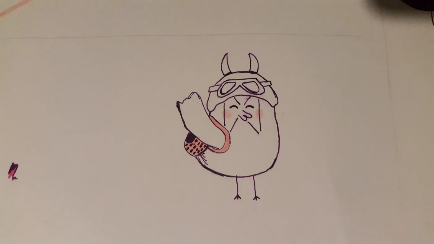
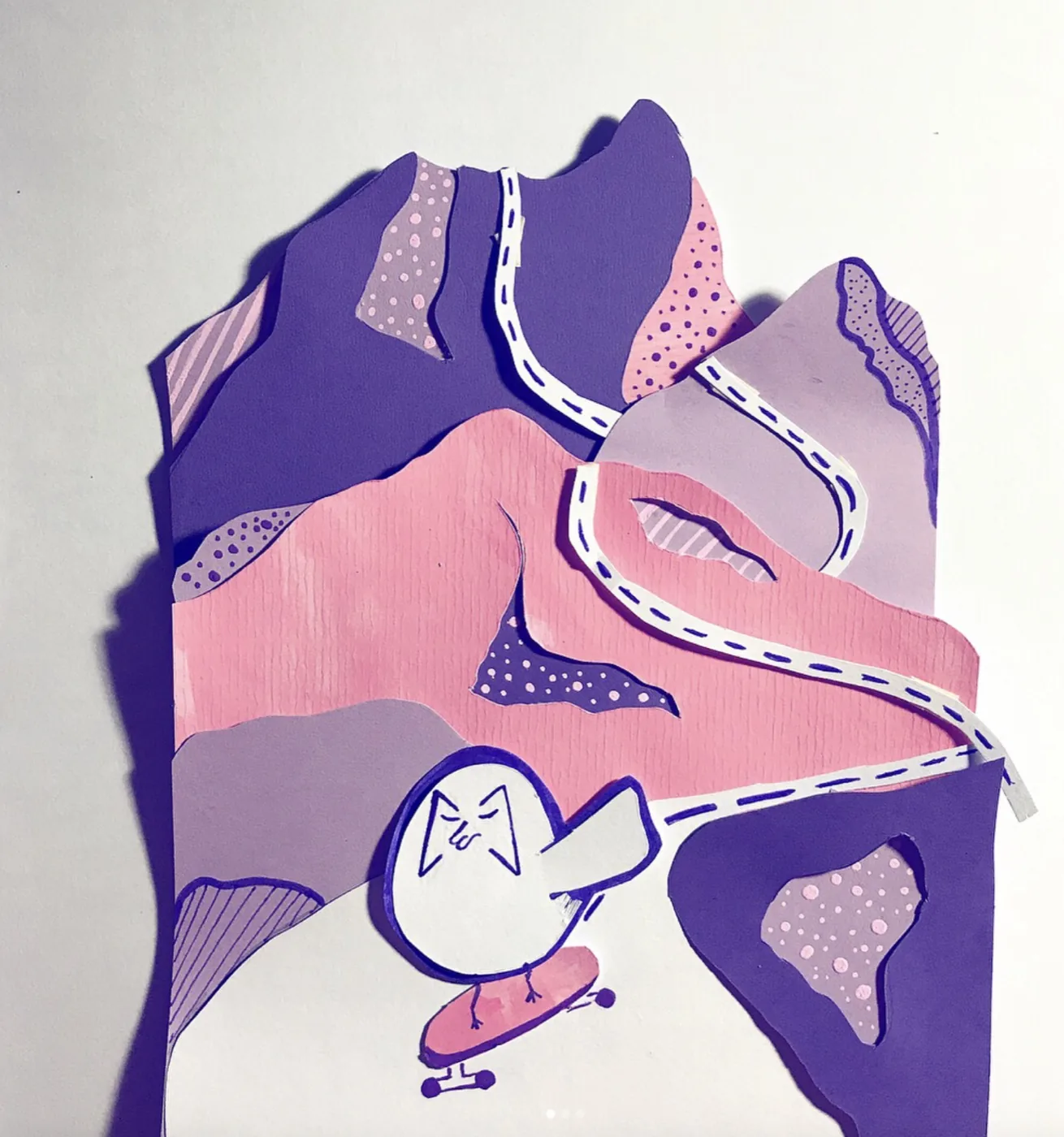
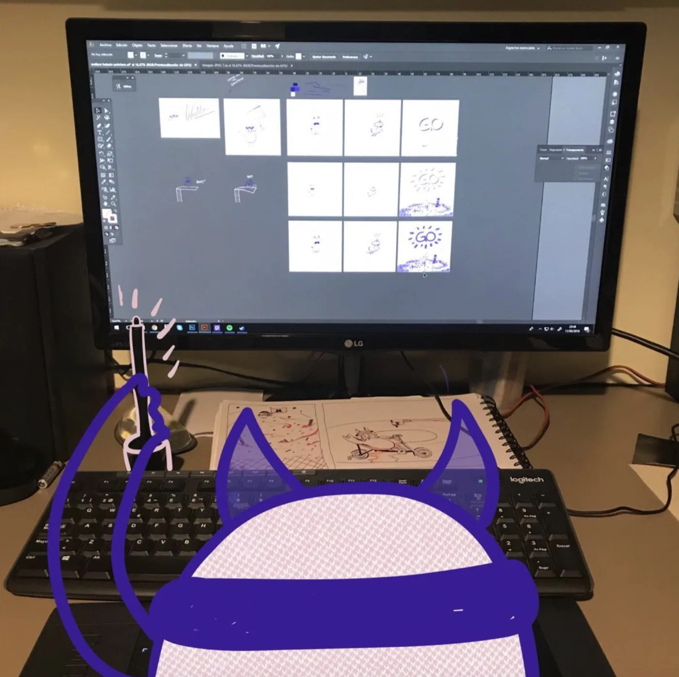
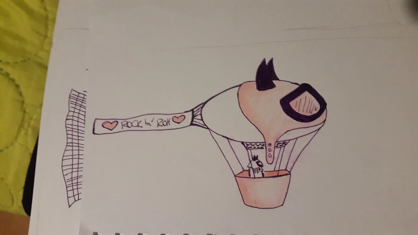
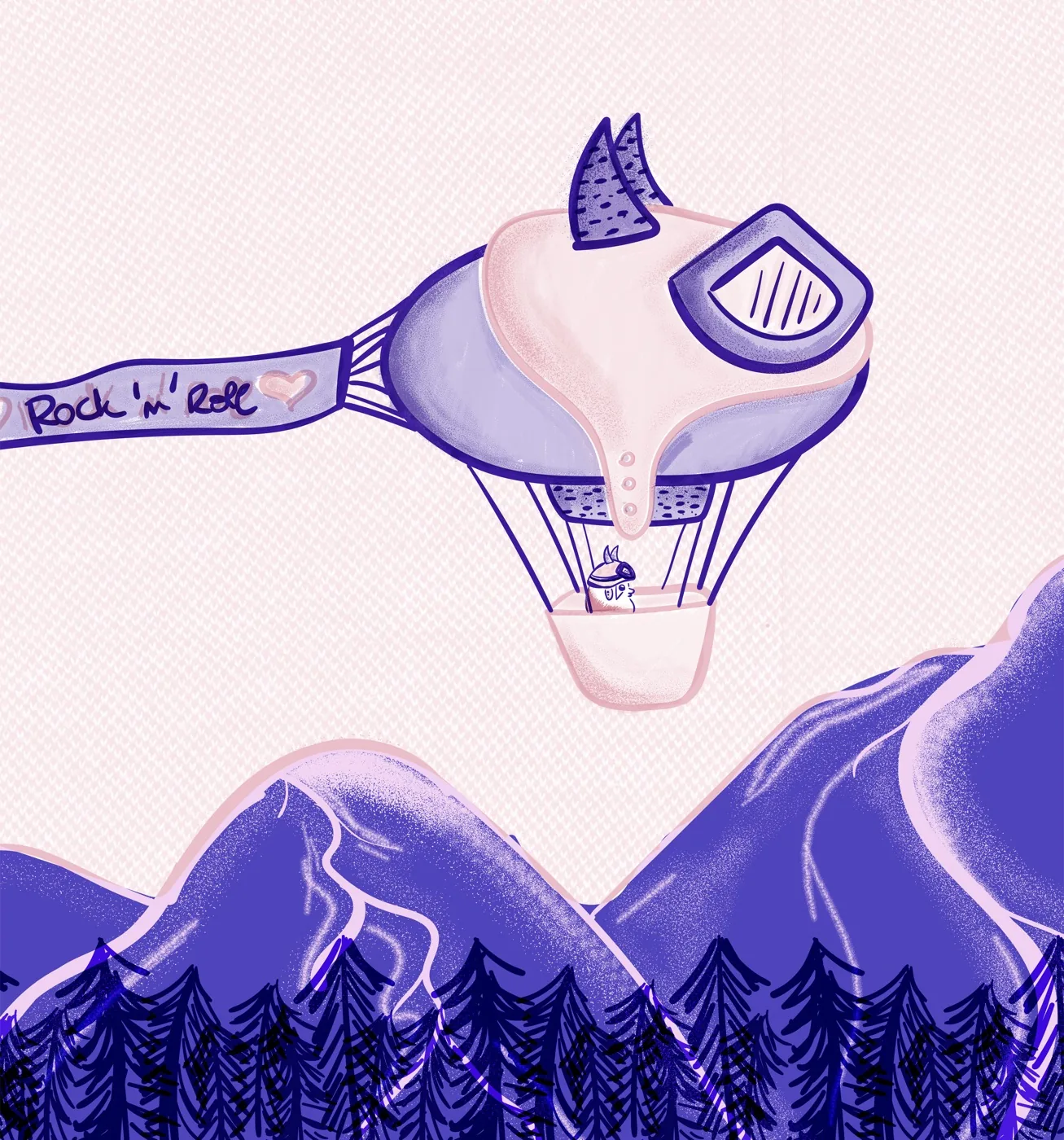
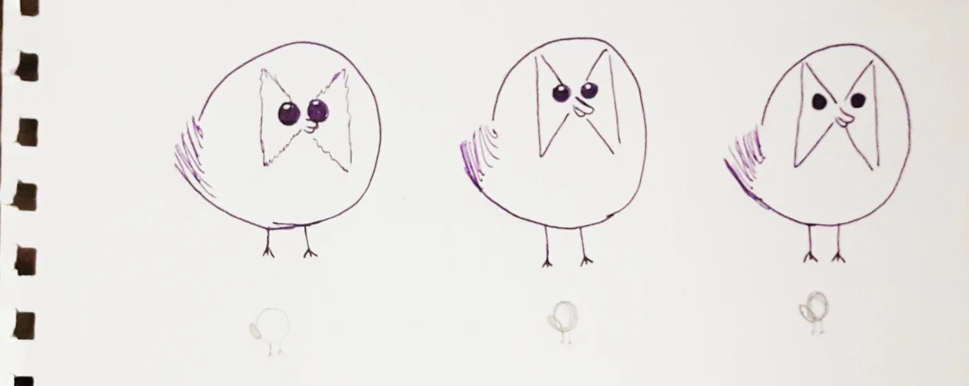
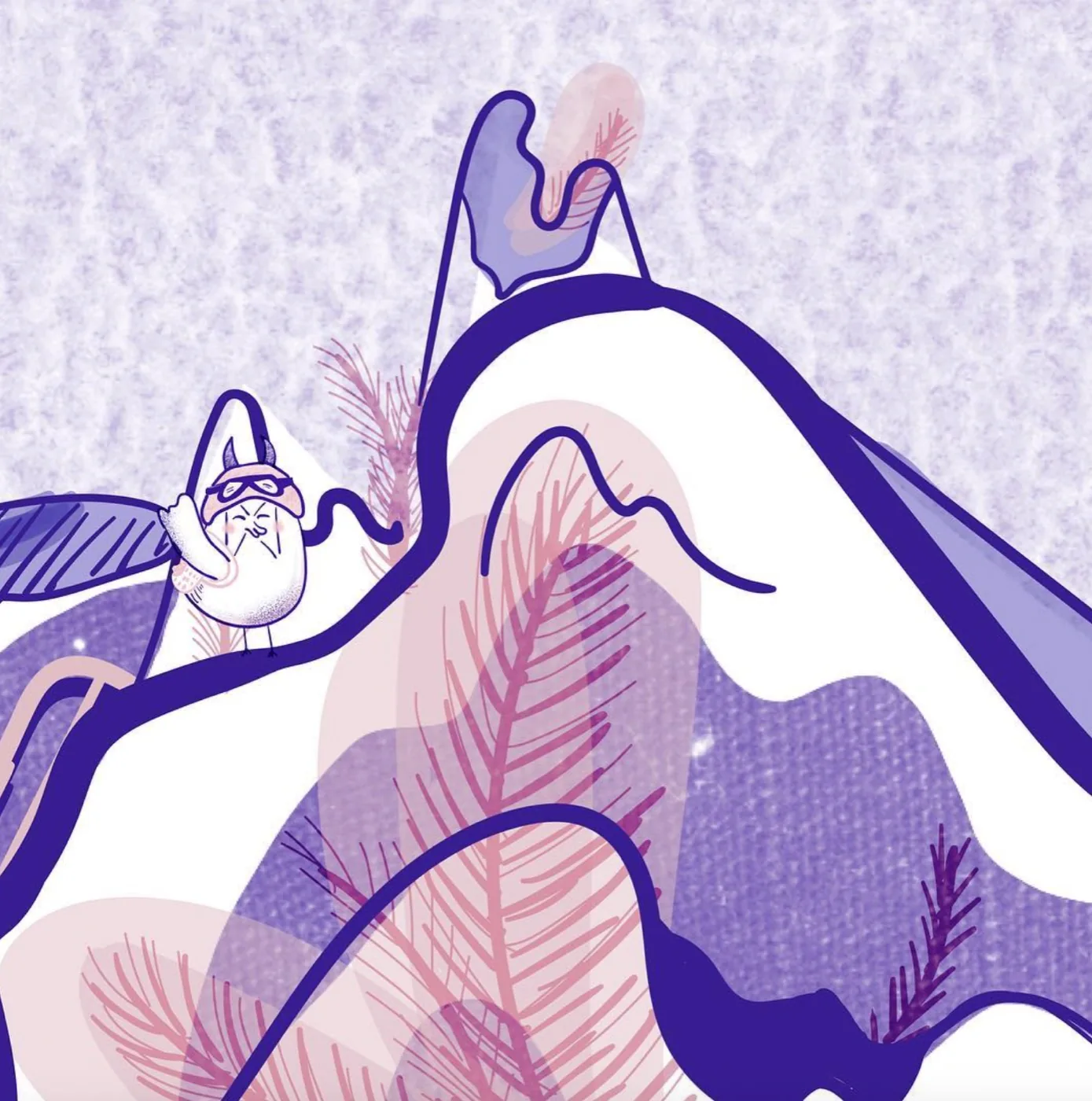
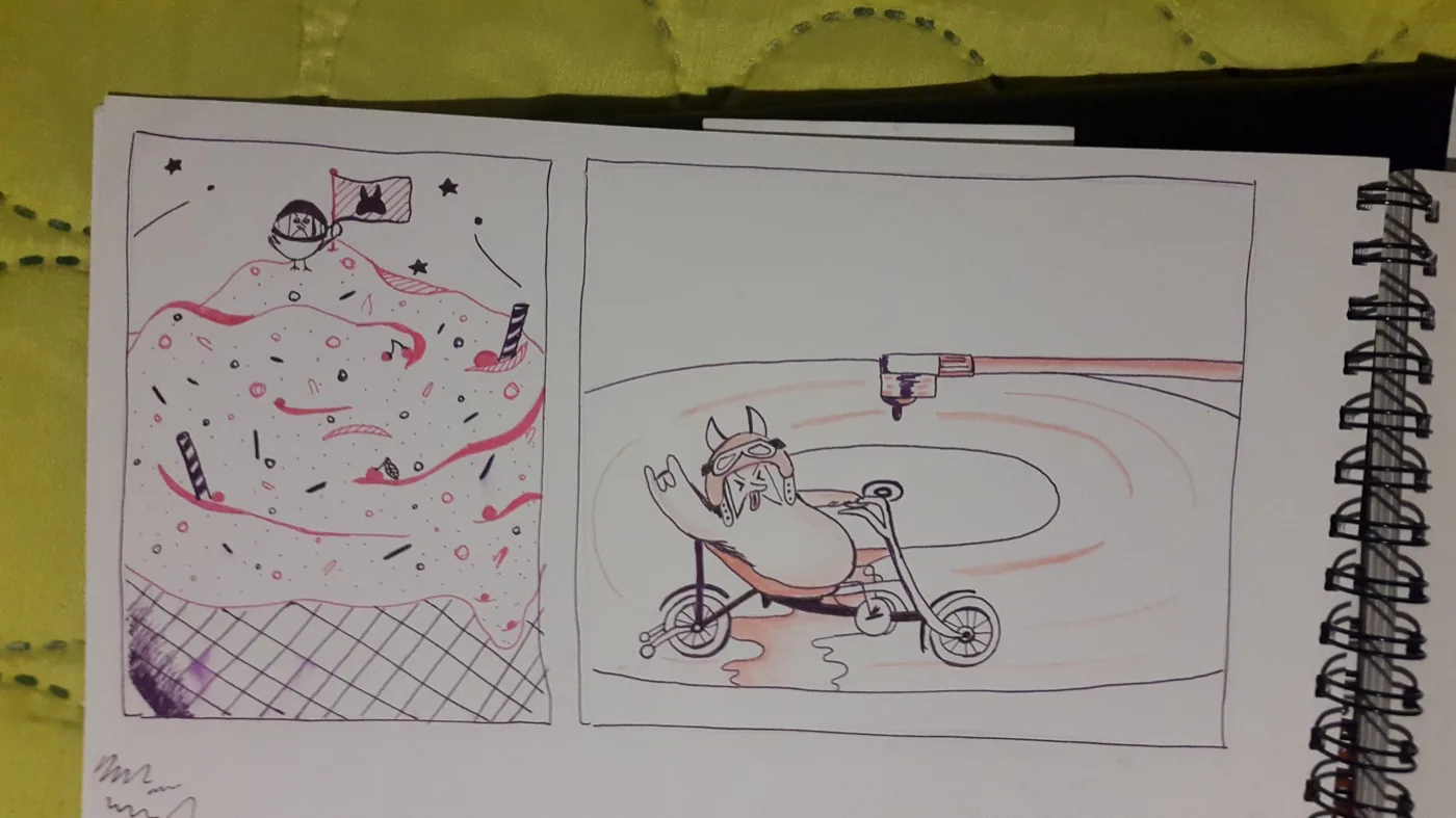
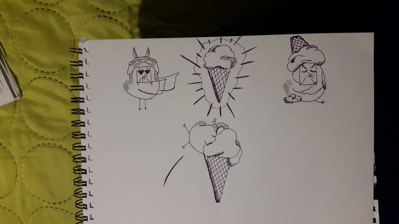
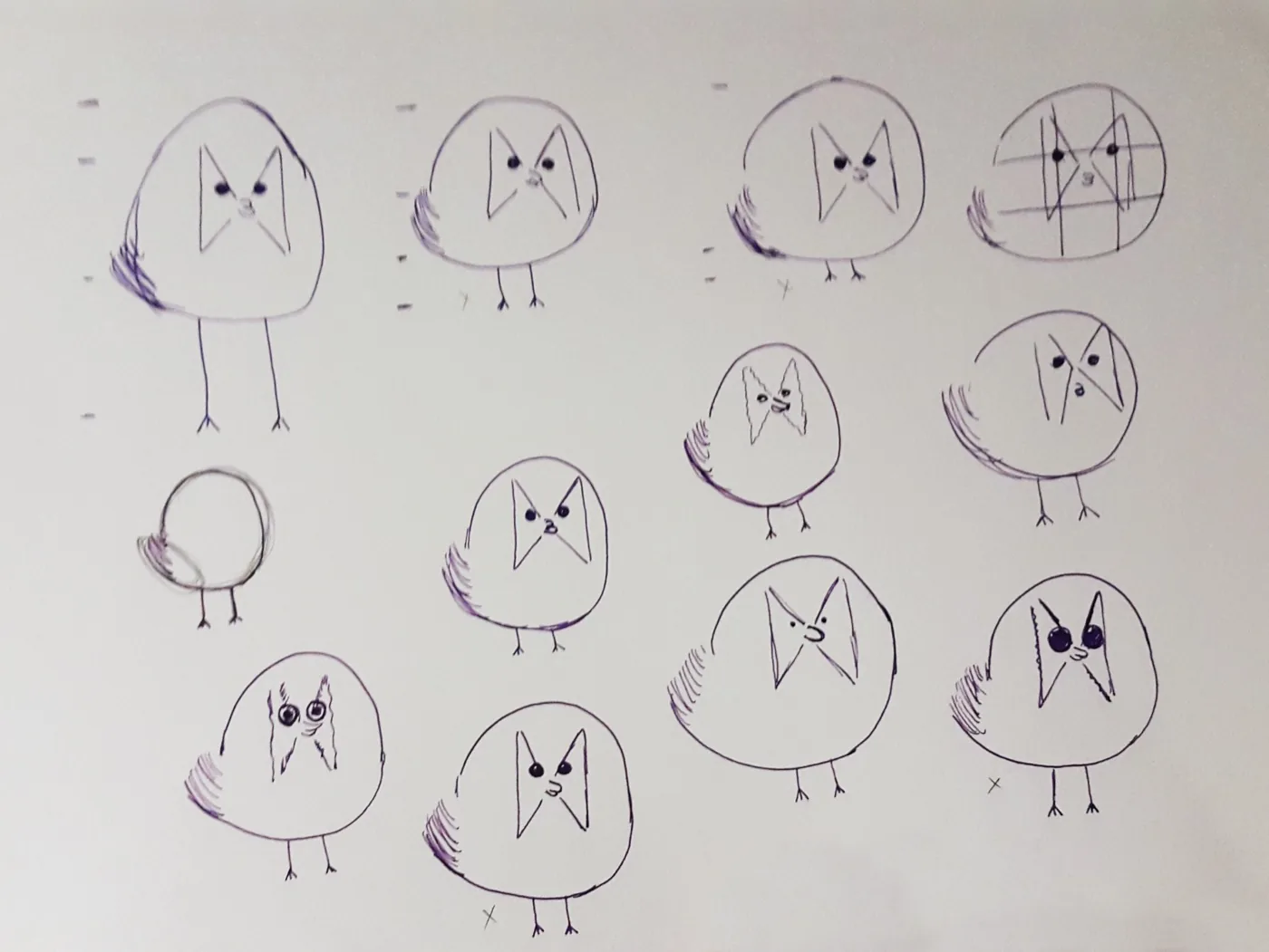
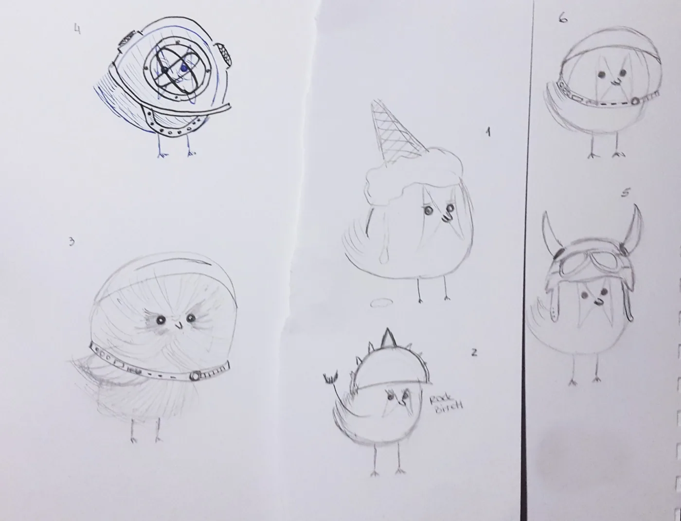
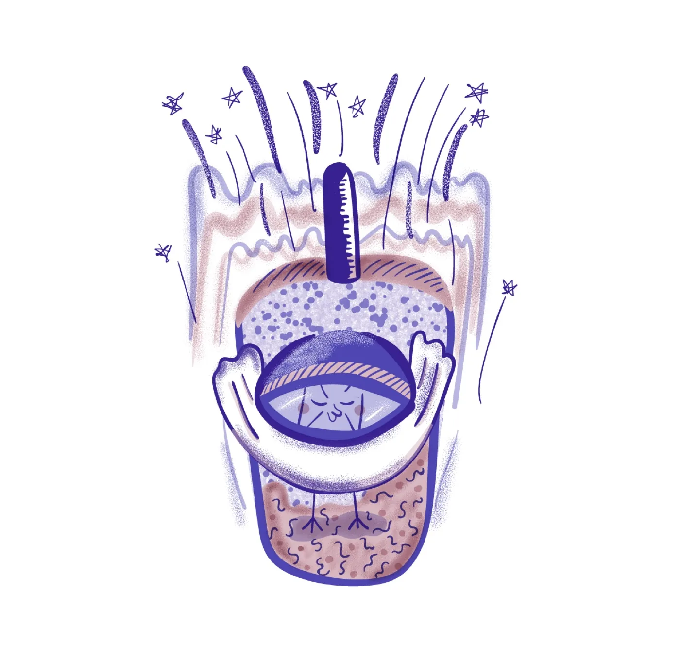
The question was never how to animate him. It was what to make him do.
Veo dropped the cost of execution far enough that the only thing left was the decision — and the decisions were already made.
So I split him: essential and negotiable. Essential was the teardrop, the helmet, the goggles, the face. Negotiable was everything else. Generation had a target instead of a hope.
Image first, motion second. I built each world and pose in Gemini, then animated in Veo. Directing the still gave me control the prompt alone never would.
He came out furry, blue and yellow, lit like a film. Still him.
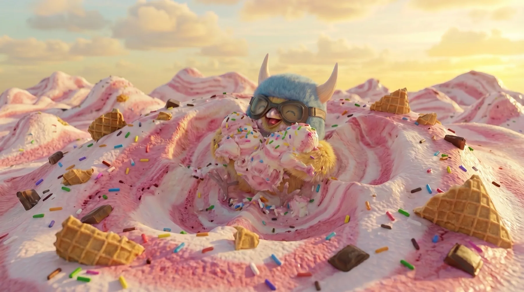
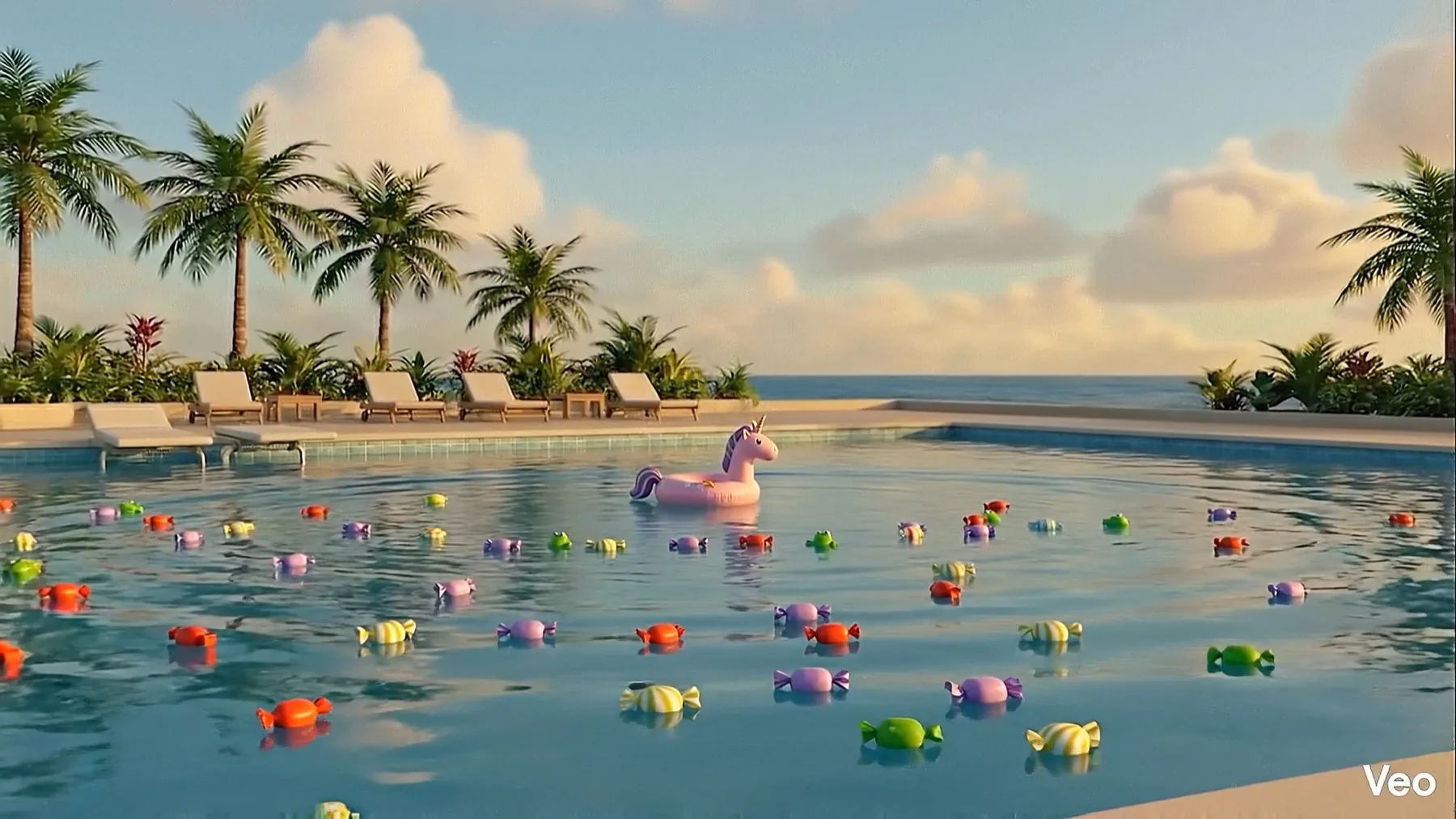
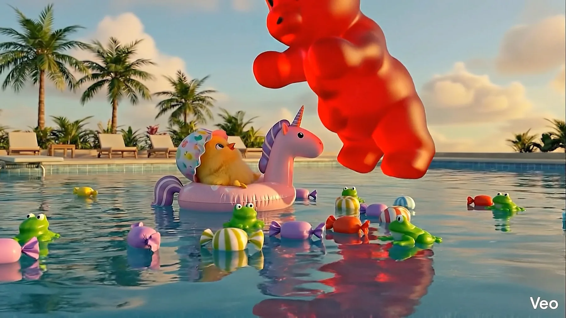
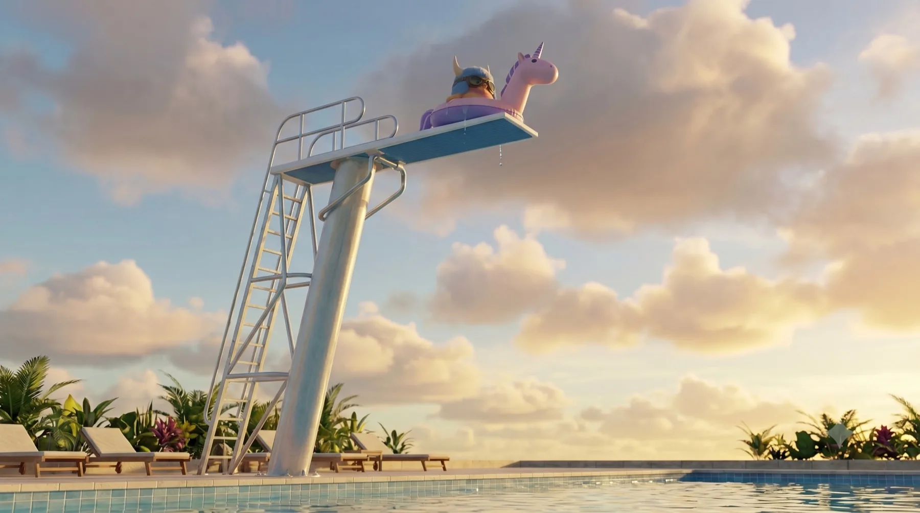
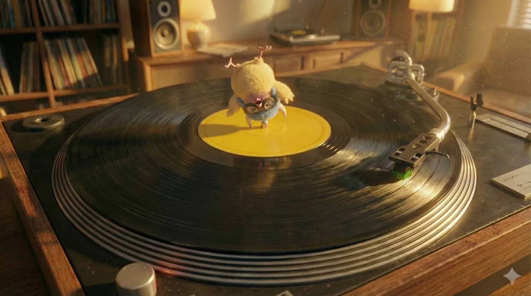
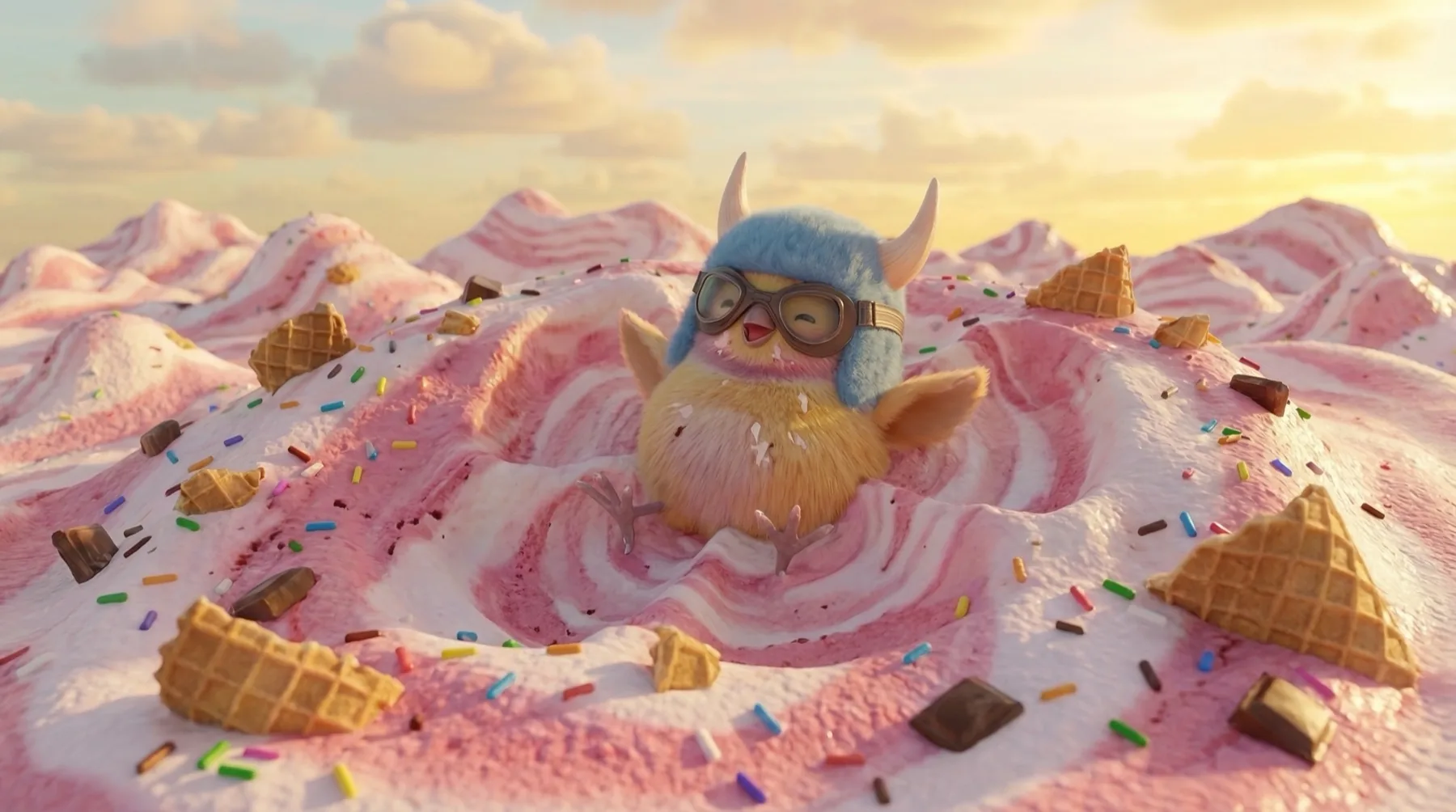
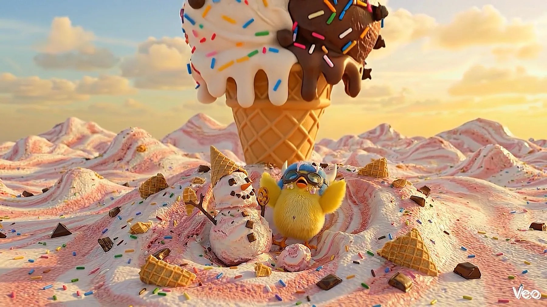
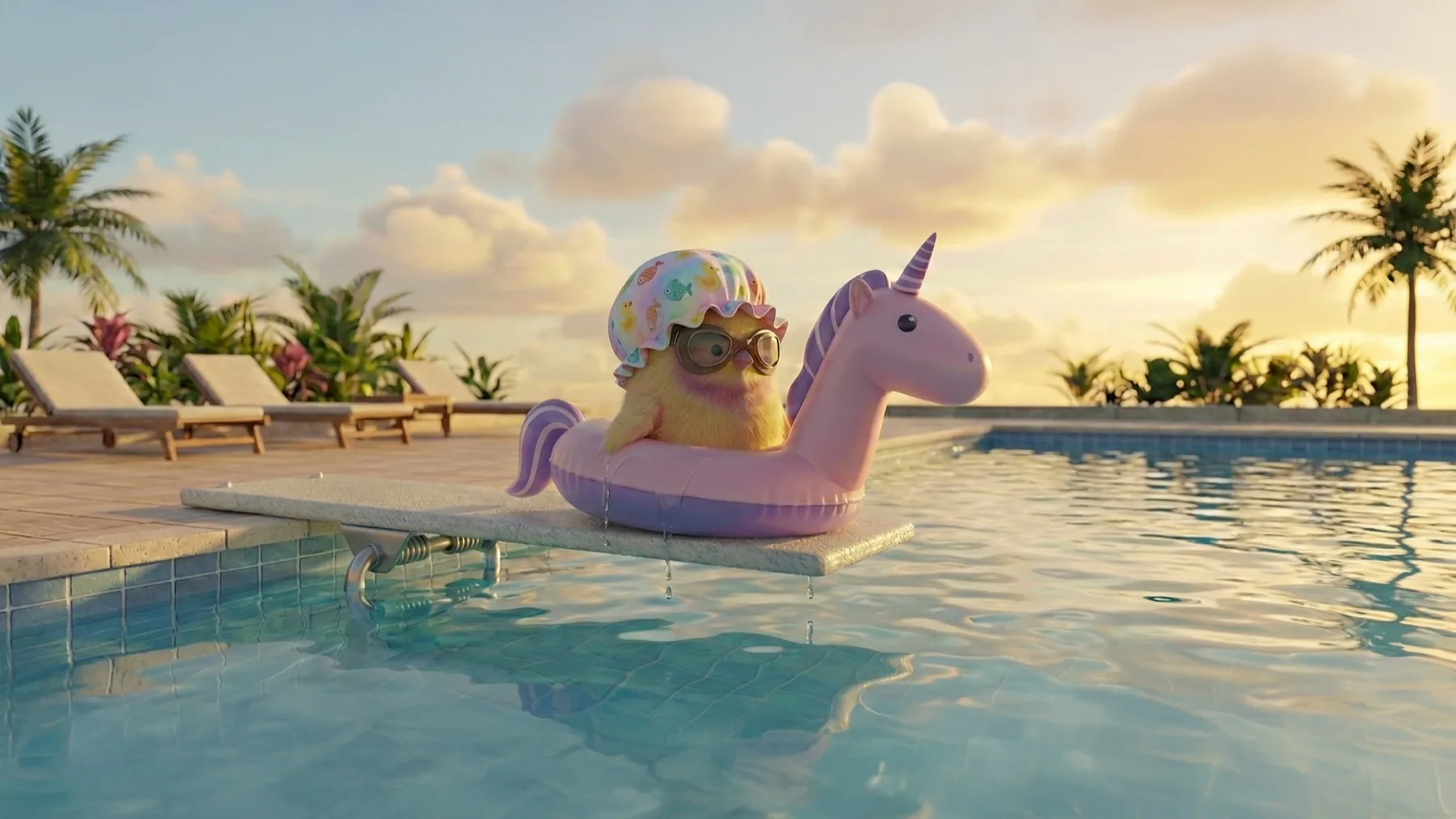
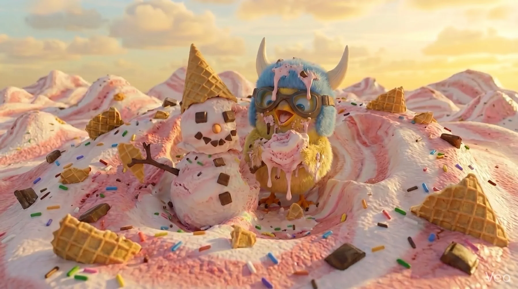
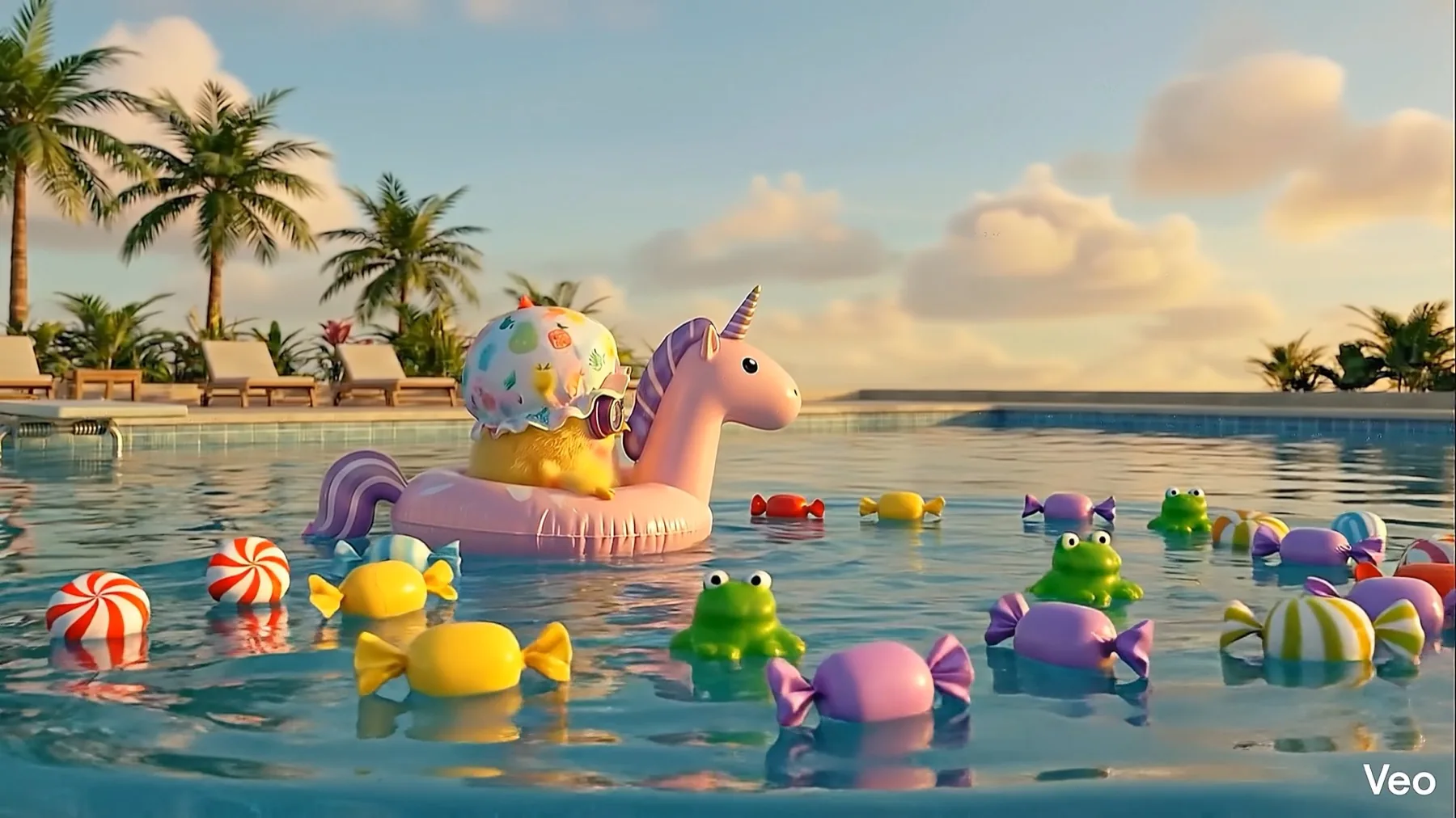
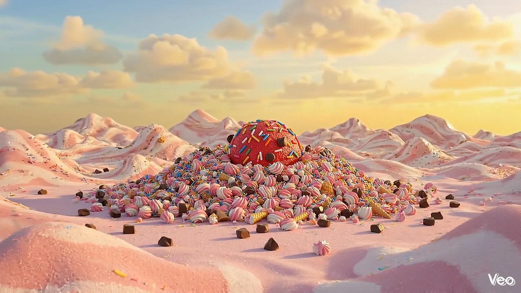
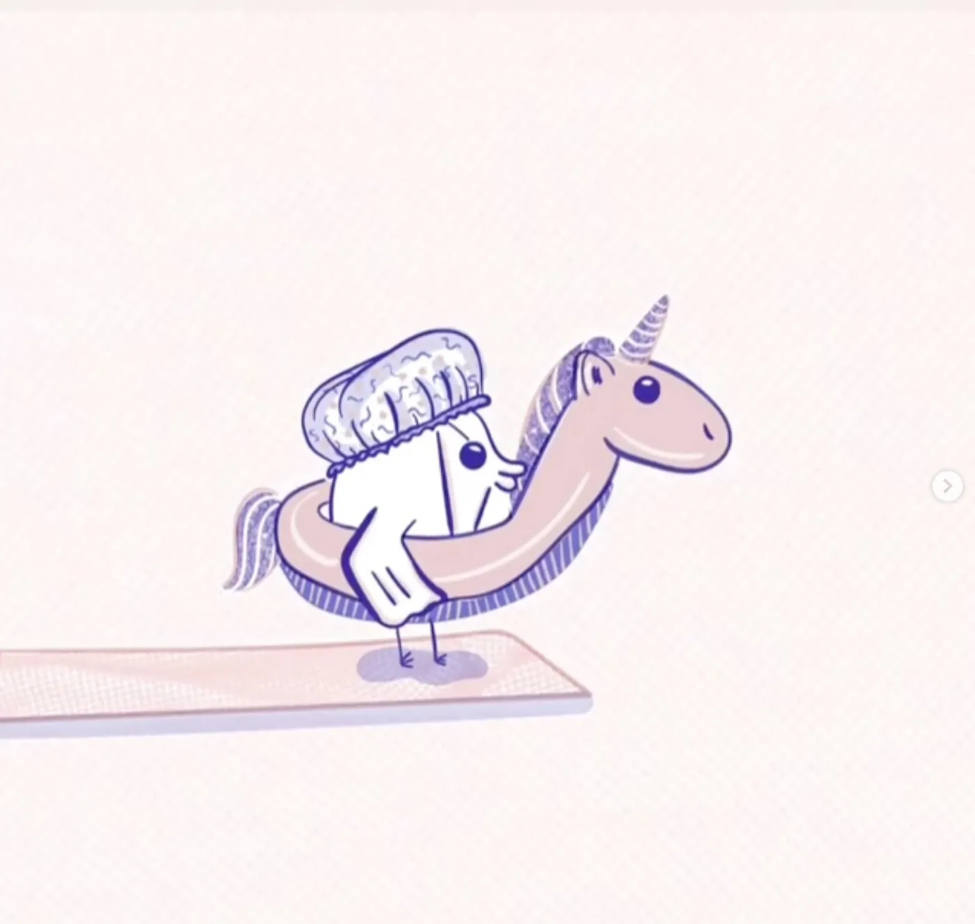
Wallace swaps the Viking helmet for a grandmother's swim cap — the one with the fish on it — and doesn't hesitate. He dives. He swims. He's happy. Gummy bears start floating in. More of them. Then one falls from the sky, the size of a building. Cut.
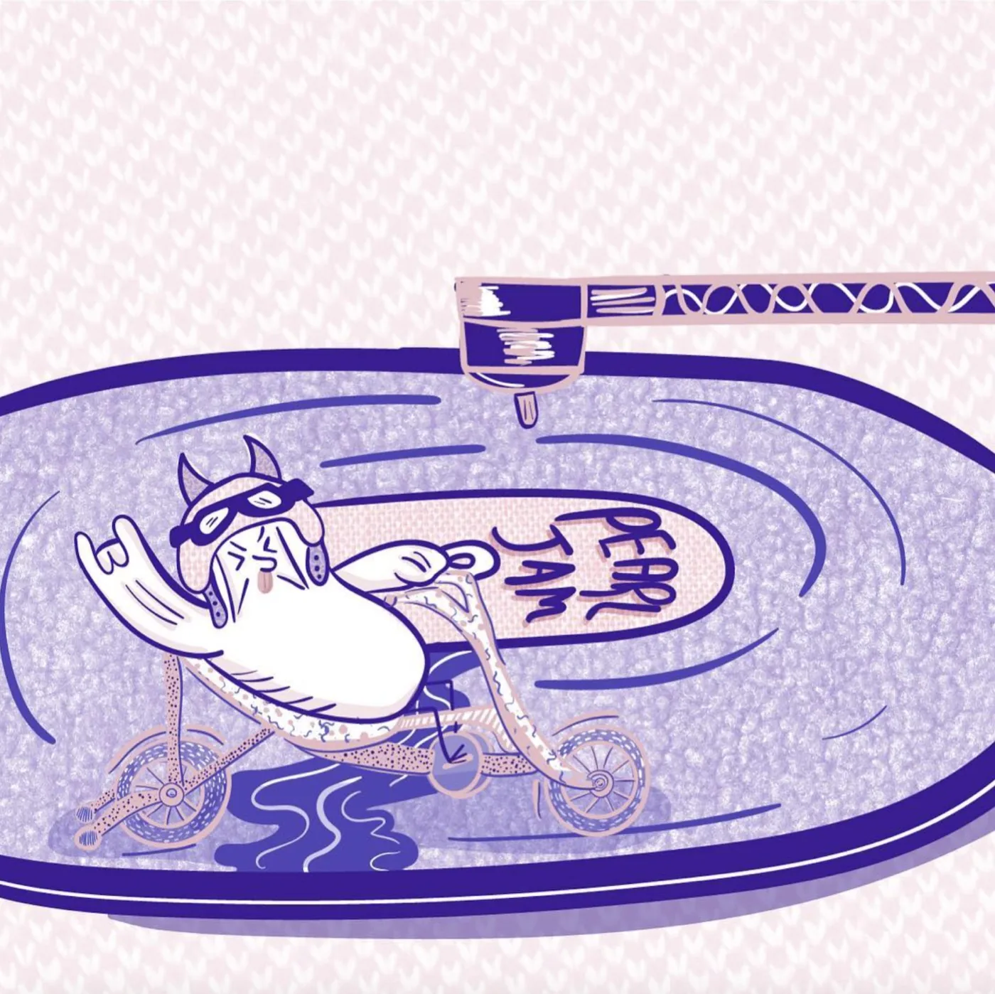
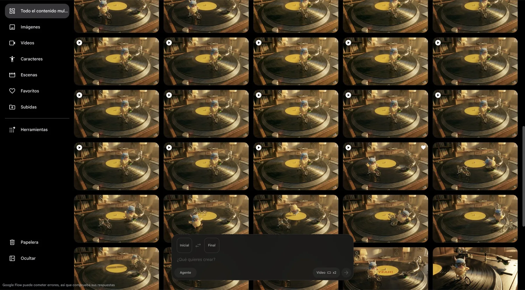
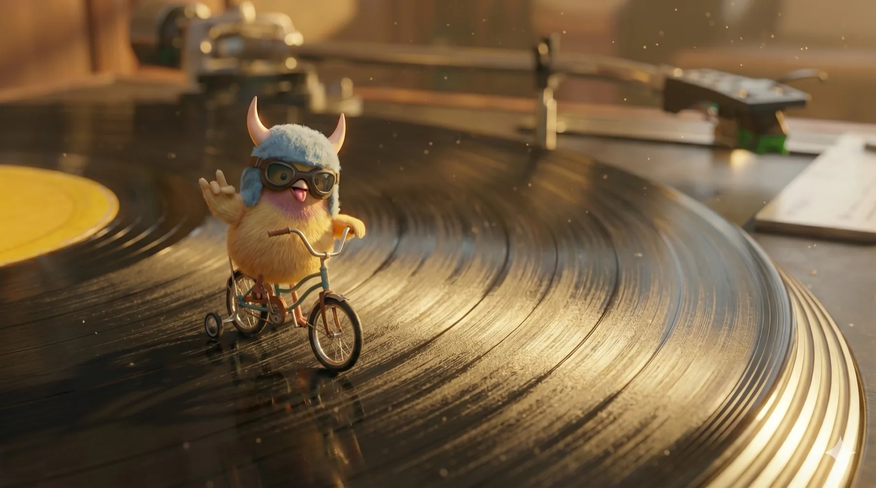
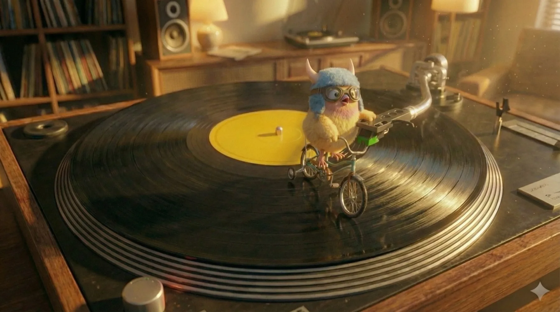
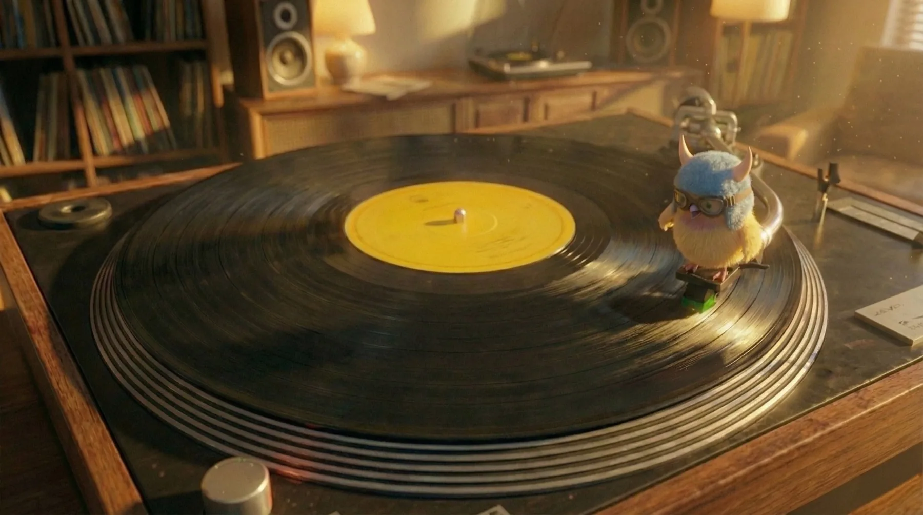
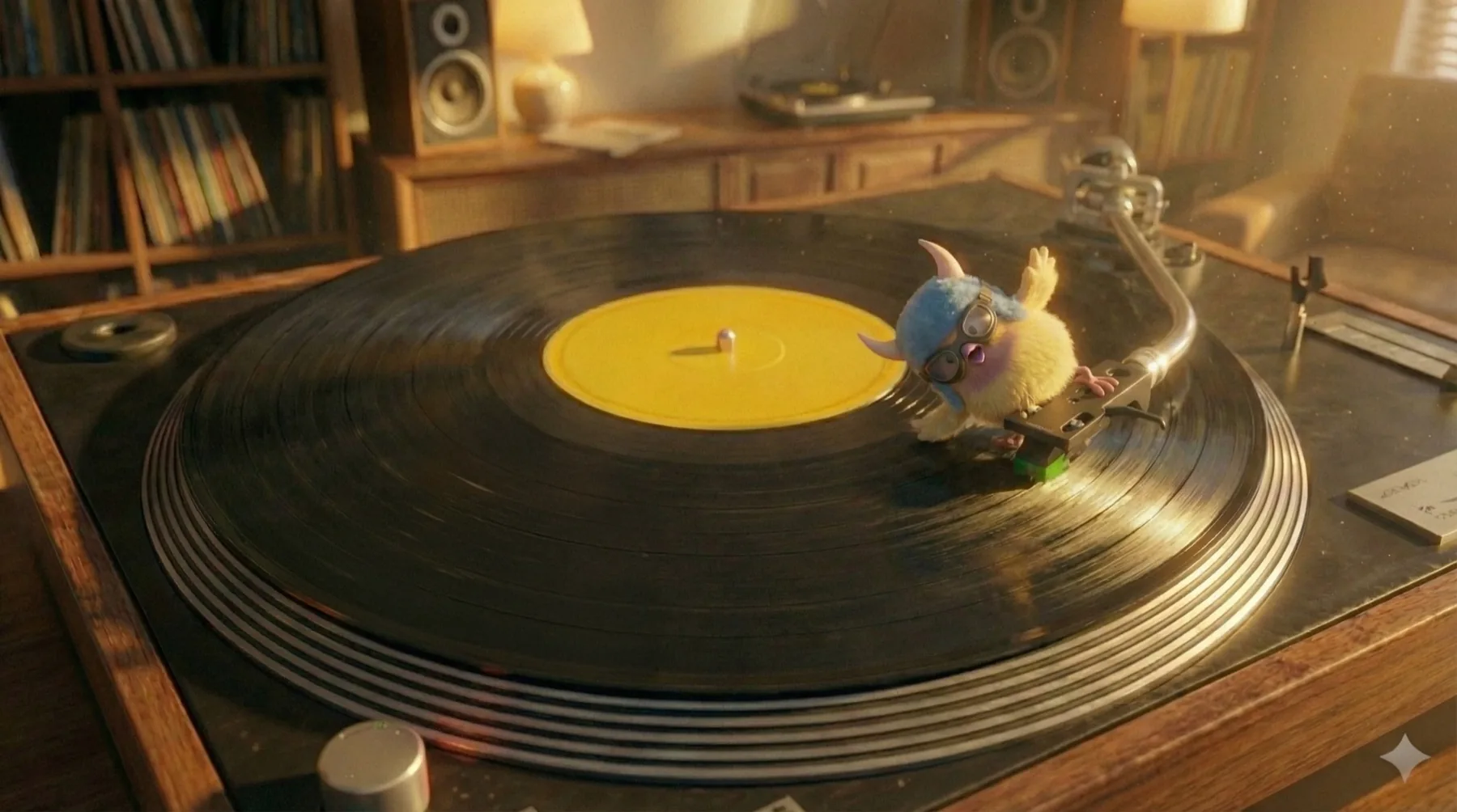
Wallace, miniature, riding a bicycle on a spinning record. The record speeds up. He loses control. He falls. Suddenly ballet. He tries again. He falls again. Ballet again.
Body dysmorphia doesn't change the body —
it changes the way you see it. I wanted to make that gap visible: the distance between what exists and what is perceived. And I chose a loaded subject on purpose: not just any body, but "the perfect one".
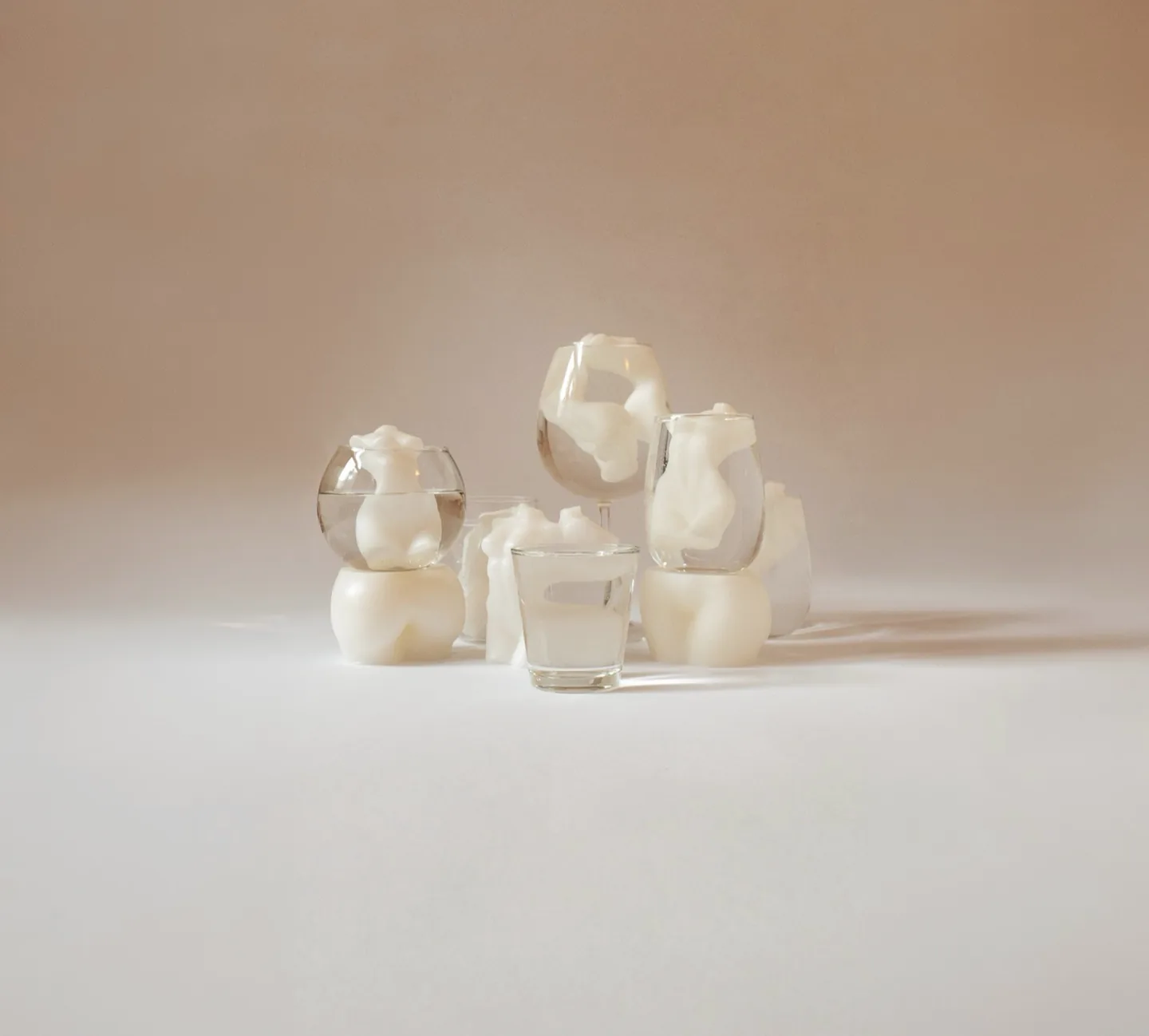
The still-life protagonists are mass-produced candles shaped like the idealized female body — slim, curvy in the right places, white. Bought off a shelf, like the ideal itself.
Glass and water do all the distorting. The same figure reads whole, stretched or fragmented depending on the vessel and the angle — nothing is retouched into deformity. Every distortion happens in-camera; post-production is limited to color, light and minor cleanup.
The glass puts you inside the distorted gaze:
you know the body is whole, and still you can't see it
that way.
The palette stays close to skin — warm neutrals, soft daylight — intimate rather than clinical, because the subject deserves tenderness, not spectacle.
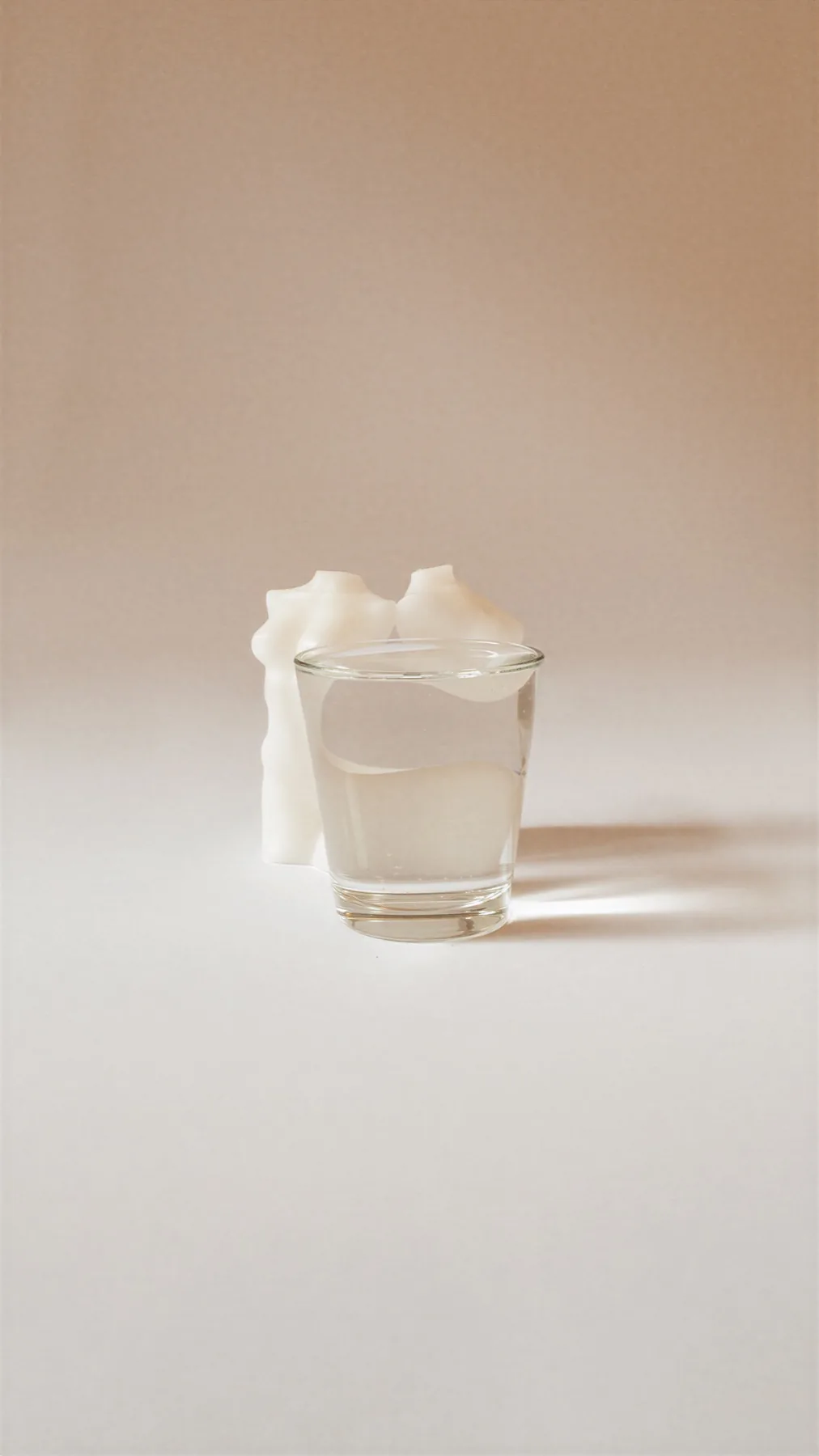
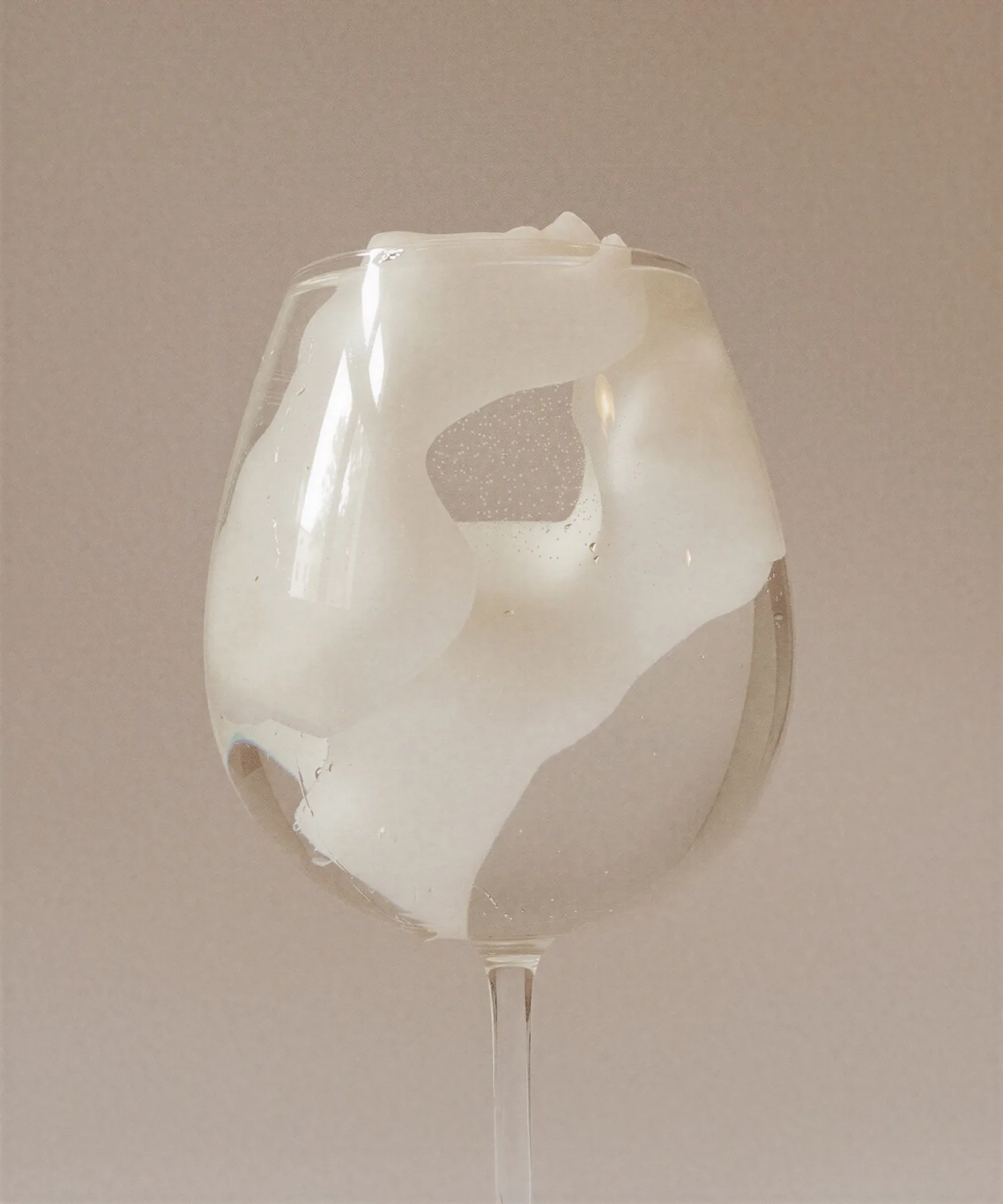
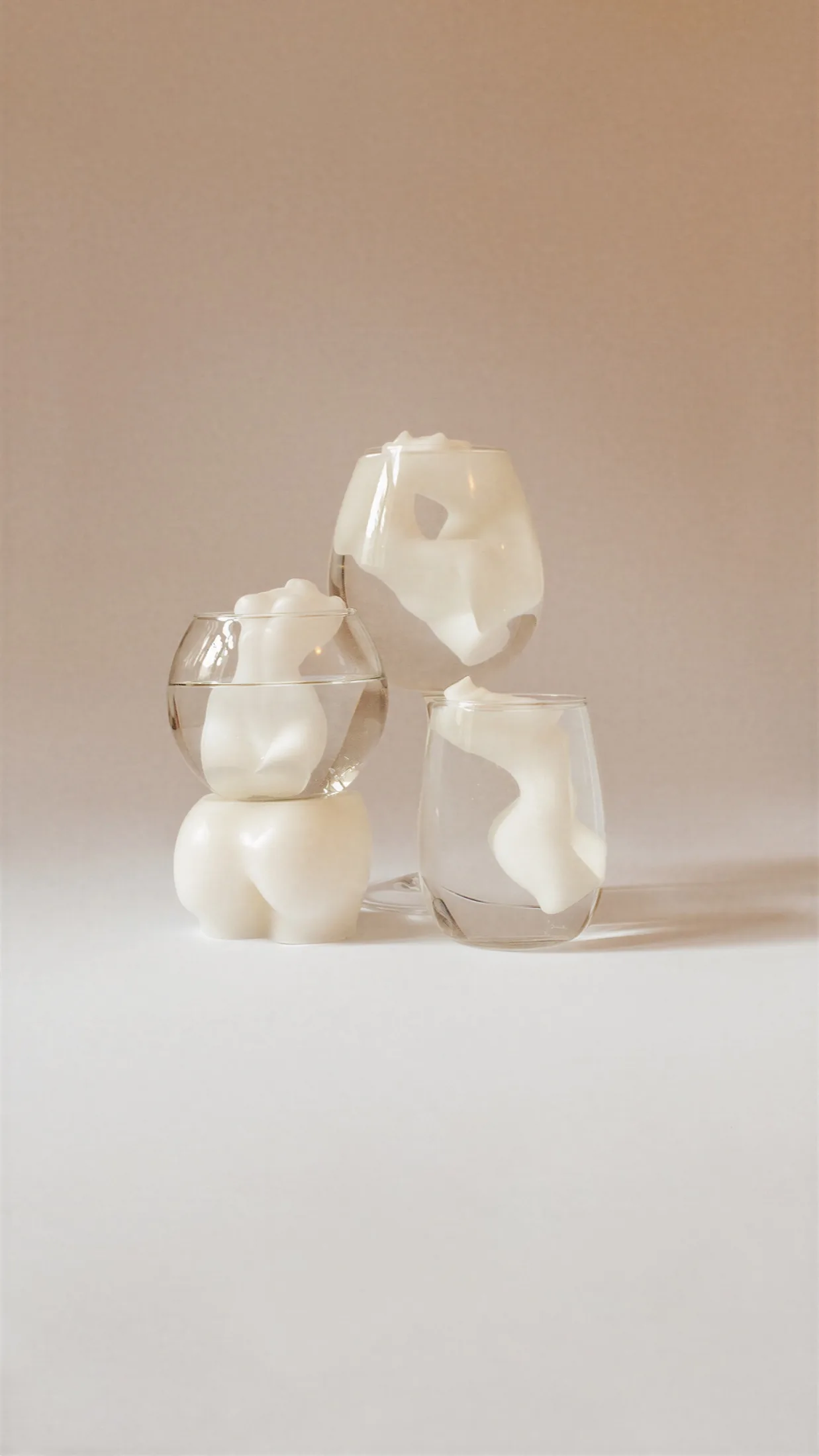
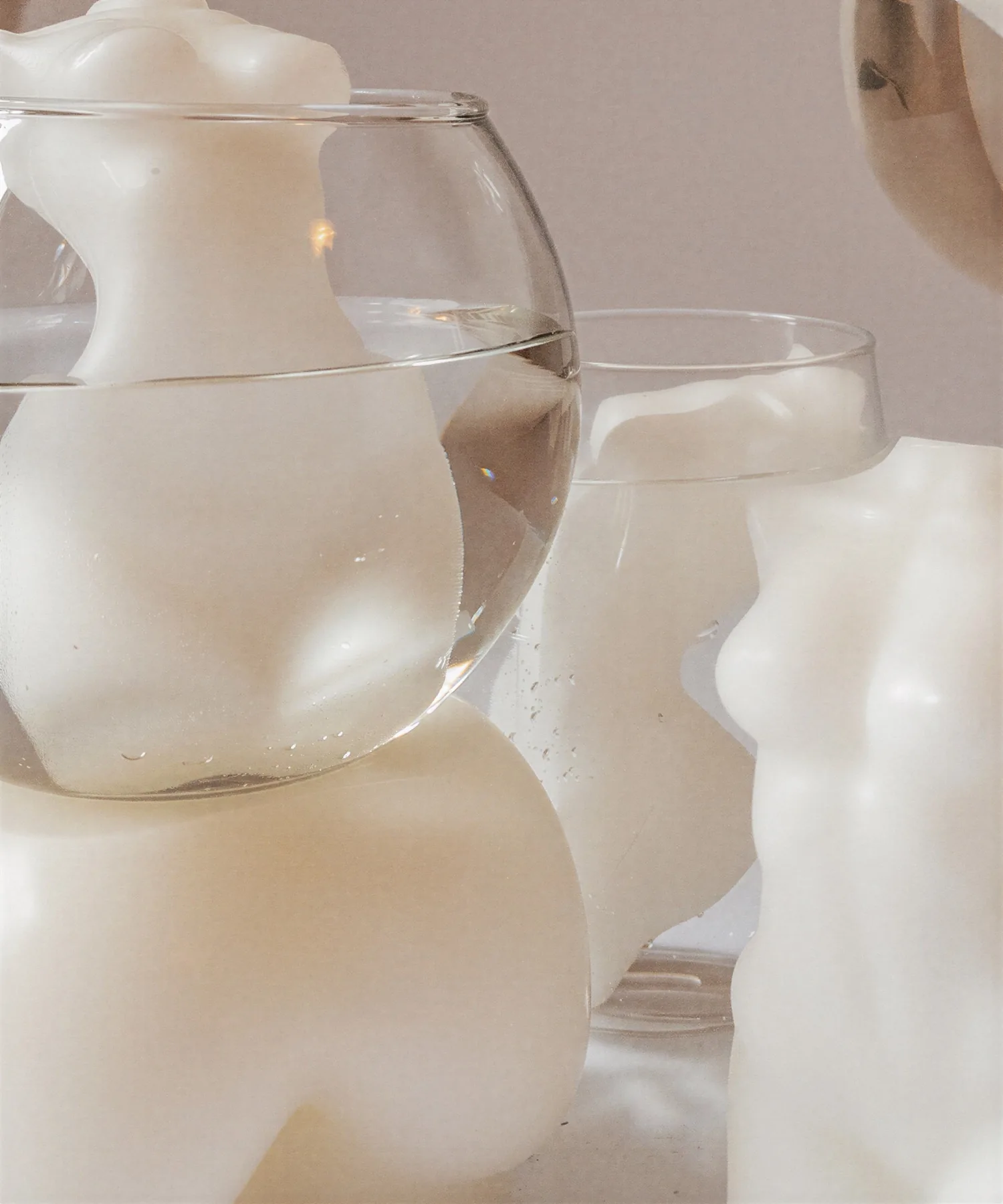
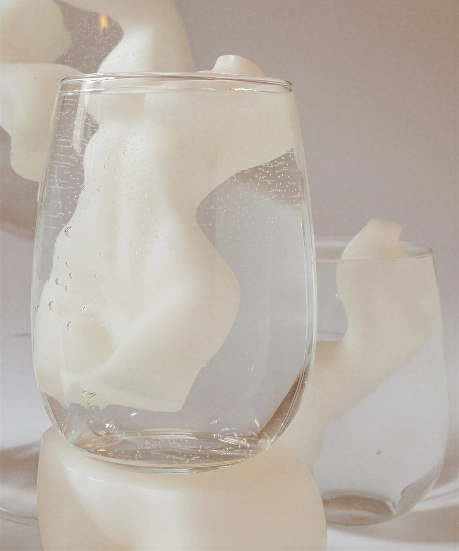
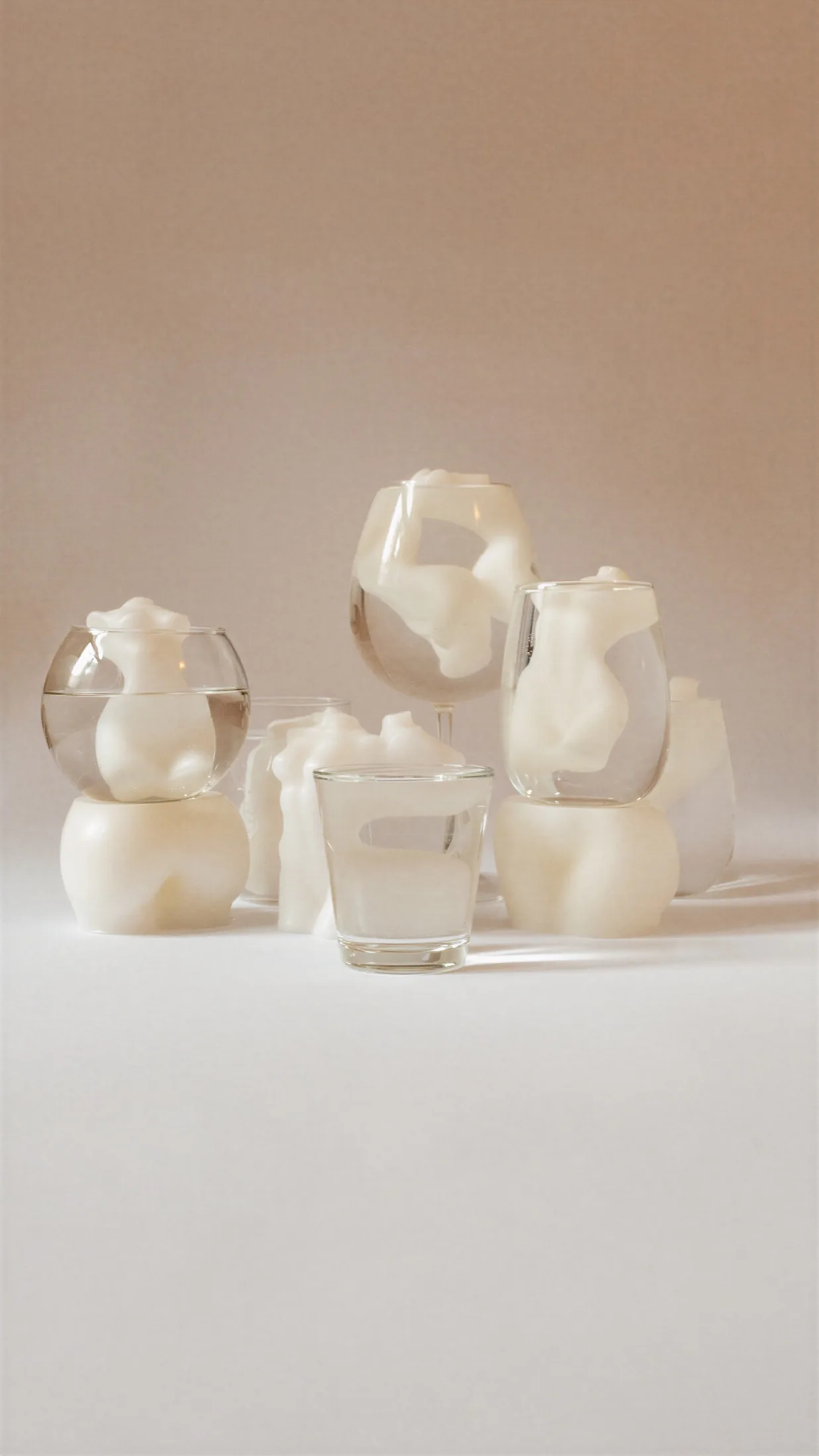
Concept, set design, styling, photography and post: all handmade, all mine.
A reminder that the most radical distortions don't need retouching — only a change of angle.
Color systems that everyone can see.
A custom GPT that builds accessible brand color systems — from palette to WCAG audit to developer-ready tokens.
It started with contrast. I was tired of choosing a palette I loved and then discovering, late, that half the combinations failed accessibility checks — and of doing that math by hand, one pair at a time.
So I built a tool to run the check for me. Then I realized contrast ratios were only half the problem: a palette can pass WCAG and still fall apart for someone with deuteranopia or protanopia. Color blindness affects roughly 1 in 12 people. If a color system doesn't hold up for them, it isn't finished.
From there it grew into something larger. Once the accessibility layer worked, the obvious next step was making the output usable — semantic tokens, a clean JSON export, a structure a developer could drop straight into a project without translating anything by hand.
ChromaWise now runs the full path: it asks about the brand, proposes three palette directions, builds the complete system around the one you choose, audits it, and hands it over ready to build with.
Answer four questions — product, audience, personality, any color you already have in mind — and it returns three palette directions, each with named colors, hex values, a stated vibe and a live preview you can open and edit.
Validates every combination against WCAG contrast ratios and flags the ones that fail. Then simulates the palette across protanopia, deuteranopia and grayscale, so you can see what it actually looks like to the people you might otherwise lose.
Translates the chosen palette into semantic design tokens — surfaces, text, actions, states — organized for light mode and dark mode. Colors named by what they do, not by what they look like.
Exports the full system as downloadable JSON tokens and Tailwind CSS config. What comes out is a working file, not a screenshot of a palette.
Skincare brand for Gen Z, brief to audited color system — one session.
ChromaWise is live and free to use.
Try ChromaWise →